What do eCommerce Customers Want: Creating an Excellent User Experience
With the benefits of same-day shipping, heaps of inventory, endless products, and services — all of that just a few clicks away — it’s no wonder e-commerce is skyrocketing. The title says it all. Sales are expected to rise to $5.5 trillion this year alone, and this number will only keep getting bigger and bigger. People are now used to shopping from their homes. It’s easier, more convenient, and time-saving.
So, what does that mean for you, dear designer? Well, it means you need to up your a-game or — start it! Now is the best time to improve your e-commerce design skills or, if you are a retailer, to create and optimize your online presence.
I’m sure you’ve come across articles and blogs telling you how to design a website. While established best practices can help you build a great website, creating e-commerce is a whole other level. The site needs to manage inventory, categorize items, secure and process payments, etc., and provide a great shopping experience for a customer from their first to last interaction with the site.
That is why I wanted to create this blog series for all of you who want to start with e-commerce design but are overwhelmed with articles and how-to’s that, quite frankly, make your head spin.
So, what do customers want? That is the first thing you need to ask yourself. Throw your assumptions out the window — it’s time to do some reading. Keep in mind every e-commerce is different, and while all of them need a unique approach, there is a generalized list of things to include.
Intuitive and Clutter-free Design
Some people might say the important thing is not how it looks, it’s how it performs.
Well, not anymore. In 2022, e-commerce is leveling up. Many retailers are going online exclusively and want to offer their customers a great experience, so they keep coming back.
Neil Patel made a great remark when it comes to visual appeal. When you walk into a physical store, do you care how it looks? If you do, which do you like better — a disorganized, a bit smelly store with everything thrown around, or a clean and spacious store? Which one gives the impression it’s better managed, and where would you rather shop?
The answers are evident. And It is pretty simple; caring about your website looks means you care about your customers. Prioritize speed, simplicity, and ease of use because, in this digital age, losing sales due to poor design is unacceptable.
Clean Design
Try not to overwhelm visitors with visual cues. Get rid of the ads and opt for a clean and attractive design that aligns with your brand.
Use hierarchy to distinguish between important and less relevant elements and utilize size, color, and typography to direct users toward where you want them to go.
If you have offers and discounts (and you should!), place them strategically above the product list, in place of a product card, or position them on the left side of your screen (80% of visitors tend to gravitate towards the left when screening a page).
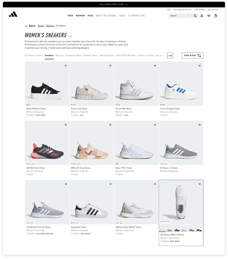
Image credits: www.adidas.com
Fast Loading Times
'Fast' in e-commerce means your website loads in less than 2 seconds. Every extra second your site needs means you'll lose customers, aka — your bounce rate will go up.
Here are some more statistics from Neil Patel:
-
47% of users expect a page to load in 2 seconds or less
-
40% of people abandon a page if it takes more than 3 seconds to load
-
A one-second delay in page response can result in a 7% reduction in conversions
-
If an e-commerce site is making $100,000 per day, a one-second page delay could potentially cost you $2.5 million in lost sales every year
Sounds daunting, eh? But have no fear. There are actually a lot of easy ways to optimize your website to load faster. We'll talk about it in this series, so stay tuned!
Straightforward Navigation
When judging the website's ease of use, visitors almost always refer to the site's navigation. If your customers can't find what they are looking for, they will likely move on to the competition, and you'll sit there wondering, "What just happened?".
A good UX practice is not to hide your money-makers behind anything. Especially on the desktop. On mobile, having the menu behind an icon isn't really a choice, but on desktop, it's a big no-no.
Remember, each extra click means more cognitive load. So, you should label your categories in a generalized and straightforward way and display them at the top of your page. This way, they're fully visible the first time someone opens your page. That is especially useful for a website that sells niche products.
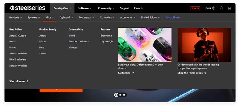
Steelseries has all categories displayed from the get go, with multiple subcategories displayed on mouse hover.
The extra room on the right is used to promote up to two products
Dynamic On-site Search
What about the search bar? I hear you ask.
Yes, yes, and yes. Users want to find things they want — fast!
A search bar allows users for a quick and targeted search for products and services. According to addearch.com, 30% of visitors will use internal search at some point, and those who use it tend to be highly motivated users that are further along in the sales funnel and are more willing to buy. That is why you'll want to optimize the site search accordingly.
Again, this is a topic for our next blog, 'How to make your e-commerce user-friendly?' coming out soon, so don't forget to revisit us.
A Great Mobile Experience
You need to design a website that offers the same quality experience across all devices, but let's focus on mobile specifically. Why? Because in 2022., consumers are using their mobile phones more than ever:
-
79% of mobile users made a purchase within the last six months
-
90% of users would likely shop again at a store that provided an excellent mobile experience
-
59% of shoppers prefer to frequent stores that offer a mobile shopping experience
More than 50% of all online traffic is sourced from a mobile phone. And how can you ensure your website is mobile-friendly?
Create a responsive design and ensure your page loading time is fast and all relevant information and CTA's are above the fold. To keep this article relevant and short, I will not venture into more detail about mobile e-commerce design. We talked about creating a mobile app checklist before, and while you head out on your own to explore more on this topic, keep in mind that a mobile e-commerce website is NOT the same as m-commerce — a native app for online shopping. One is a website that opens in a browser (whether desktop, tablet, or mobile), and the other one you install on your phone or tablet and have instant access to it.
Informative Product Pages
One of the main downsides when shopping online is that you can't really touch and feel the items you are looking at. That's why you, as a designer (or shop owner), must ensure you include good images and relevant information about the product.
Quality Images
The main product image is there to capture the user's attention, so make sure it represents the item as best as possible, preferably on a clean, bright background — feature different images depicting the item from all angles. You can even add a 360 view or a video showcasing the product itself (a model wearing the dress) or the use of it (setting up a tent). This last part depends on the client and the budget since they will be providing content, but you, as a designer, can always suggest an upgrade based on the results you get from tracking the website.
As for the layout itself, opt for a photo grid or a vertical list. Avoid photo carousels with a long loading time, as they restrict easy viewing. Remember, 26% of users abandon the purchase because of poor-quality images or too few images.
Relevant Information
Detailed information is essential. Approach it from the user's perspective: They want to buy something and know all there is about it. If you provide the customer with the right information, they will feel confident in their decision to purchase, and the higher the chances are they will go through with it. I'll give you more numbers to back this up:
-
77% of users say the product/service content on a site influences their decisions on whether or not to make a purchase.
-
42% of users have returned an online purchase because the product information did not match the items they received
-
86% of users say they would be unlikely to make a repeat purchase from an e-commerce site that provided inaccurate product/service details
Keep your descriptions short but informative. Don't include anything that doesn't provide some value for the user.
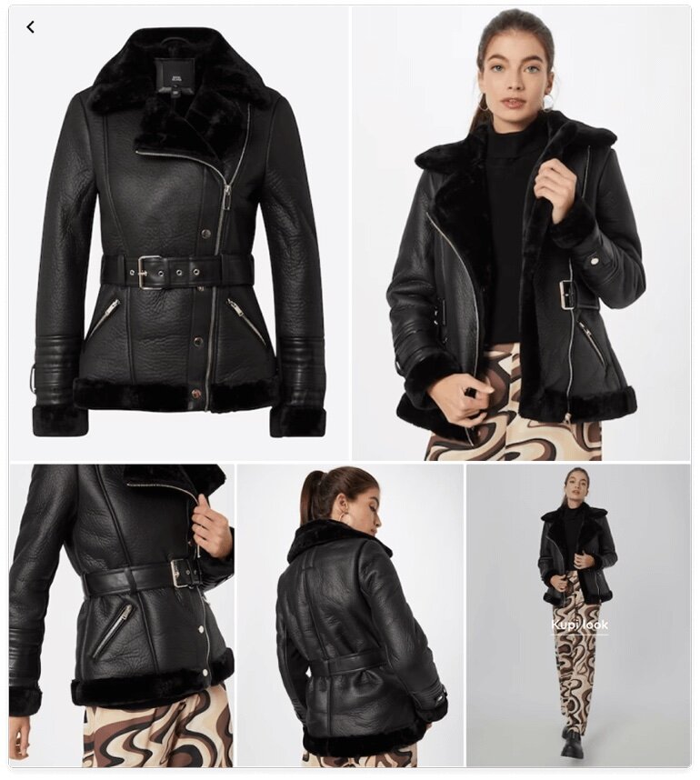
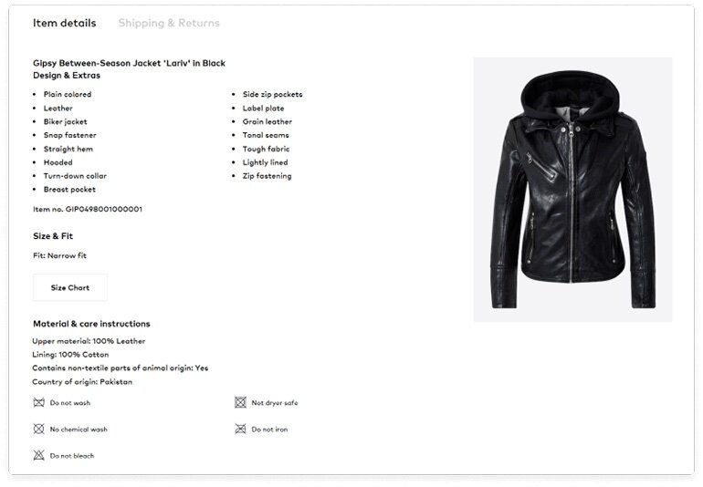
Image credits: www.aboutyou.com
Social Proof
There is nothing more reassuring than the reviews of other customers. Just like the quality photos and item info, reviews make users feel comfortable with their purchase. This social proof works on two levels:
-
It gives you extra information about the product itself and how it compares to what is presented on the website
-
It gives your website credibility
Since the customers can't see your product in person, 79% of them rely on what previous buyers have said about it because the buyers will tell the truth, the pros, and cons.
Include a section on the product page where users can read honest reviews from verified customers. Also, make it easy for them to leave one and — depending on the product type — add a photo upload option.
Multiple Payment Options
Shopping cart abandonment is a big issue for e-commerce. With the rise of cryptocurrencies and digital wallets, these days, it's not enough to accept just credit cards and Paypal. Alternative payment methods (APMs) are on the rise: the aforementioned digital wallets, mobile transfers, cryptocurrencies, and local cards.
People might opt for an APM to protect their data; a payment channel is down, their credit card is maxed out… Payment flexibility helps gain customer loyalty and can make or break a sale. Display multiple payment options across your website and not just the checkout. That helps with customer retention and builds security and trust since they know what to expect.
Guest Checkout
"Please don't make me register for another account I will rarely use." is what many customers think when they click on the 'Continue to the checkout' button and hit a roadblock — a registration form. That is the second biggest reason people abandon their carts. I've been there; I'm sure you've been there.
You want your customers to finish the checkout process as quickly and painlessly as possible. Even if they are in a hurry or will use your site only once, you'll still want them to make a purchase.
There will always be a percentage of users that won't come back, but you can still make an effort and encourage others to sign up.
Be a little discrete about it. Set up a 'Sign up' button on the cart review page. Maybe throw in a banner that promotes a discount for new customers. Or, if you want to be extra subtle about it, add the 'Express checkout' button, which guests can see but can't use unless they register.
There are a lot of ways to get your customers to sign up at their own pace. Definitely ask them one more time to create an account on the Thank-you-for-your-order page, and be sure to list some benefits or values they will get if they do this. Everybody likes to be rewarded for their effort, and in e-commerce, the competition is tough, so you need to go the extra mile to earn and keep your customer's loyalty.
Free Shipping & Easy Returns
Oh, I LOVE this. Nothing makes me want to buy an item more than free shipping. And if you add free returns into that mix — mwa! Chefs kiss!
Unexpected costs are the top reason for shopping cart abandonment. Nobody wants to go through hundreds of items, compare prices, and read reviews, only to go to the checkout and be surprised with additional charges. That is something that will definitely drive your customers away.
Shopify came to the conclusion that 75% of customers claim that free shipping dramatically influences their decision to check out an item and 68% of them prefer to see shipping costs upfront.
There are several ways you can go about this. As a designer, you don't really have jurisdiction over shipping costs since market strategies depend on the client and the stakeholders. What you can do, however, is inform the customer of every possibility that might influence their decision. Remember what we said in the previous section? Customers like to know all the information before making a purchase.
If the company offers free shipping, make sure to point it out on the homepage, product page, and checkout. You can even add it in the utility bar above the header, just in case. If the website does offer shipping, make sure the delivery information is visible on the product page and easily accessible. The client may even suggest a threshold for shipping. In that case, you should absolutely place that information on all relevant pages.
P.S. Don't forget to add expected arrival times.
Returns follow the same logic. If the site offers free returns, advertise it on the page as much as possible. Ensure you provide links to how the process works and what they must do to qualify for a refund. In the footer, display the shipping and return policy. Customers are more likely to complete a purchase if they have the option of returning the item for free.
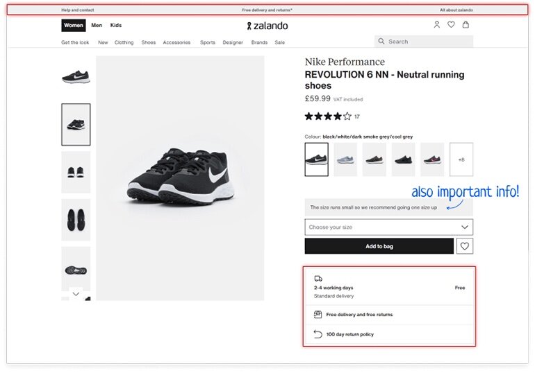
Image credits: www.zalando.com
24/7 Customer Service
A big part of providing a great user experience is to have accessible customer service. Chatbots (or live chats) are a great addition to your website since they act as friendly employees who will answer all your questions.
Live chat reassures customers that the website is not a scam as there is a real human being on the other side of the screen.
There's zero doubt someone will encounter a problem while shopping, but having always-ready customer support will remove this friction so the user can get further down the sales funnel. Aside from the live chat, add the brand's contact information on multiple places on the website so the customers can get help as soon as possible.
A Personalized Experience
Website personalization is when an online store utilizes customer data, such as demographics, browsing history, etc., to display dynamic content. I'm talking about product detail page recommendations, the continue shopping section, popular or bestseller lists, abandoned cart emails, loyalty programs, etc.
Product detail page recommendations show products that are similar or complementary to the ones the customer is already interested in. This type of cross-selling inspires customers to increase their cart size.
The Continue shopping section remembers the customer's selected items and preferences through previous sessions. This algorithm is simple to implement, and it's valuable because it makes it easier for customers to continue shopping where they left off.
Abandoned cart emails encourage customers to come back and finish the checkout, and the bestseller list draws people in and can lead to higher conversion. These are the tactics to retain their attention and generate more sales because you don't want your customers to go shopping elsewhere.
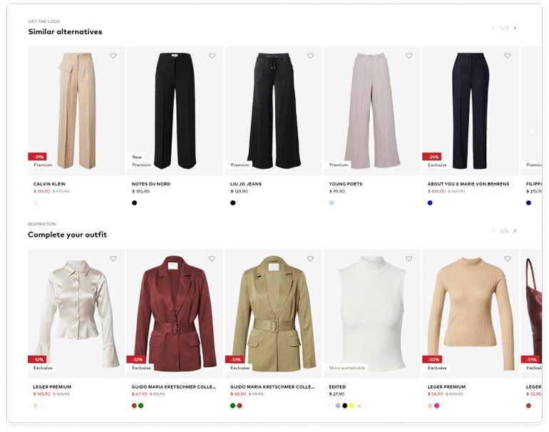
Image credits: www.aboutyou.com
Let's wrap this up
Creating an excellent e-commerce customer experience is never easy. Many more in-depth elements go into it, and the ones mentioned in this article are a good step in the right direction; They really are essential to gaining customer loyalty and generating sales. Focusing on quality content and creating an easy-to-use, fast website that works on all devices will guarantee success in this field. If you have additional questions on this topic or need our services, feel free to contact us!


