How to stop shopping cart abandonment in e-commerce
What is shopping cart abandonment?
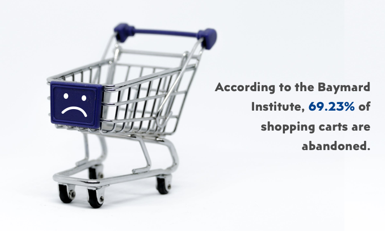
“Shopping cart abandonment is an e-commerce term used to describe a visitor on a web page or a mobile app that leaves that page before completing the desired action. Etc. complete the purchase of items he added to his/her cart.”
Shopping cart abandonment is a growing concern, since it accumulates loss to over 260 billion dollars a year, and is expected to grow even more in the following years.”
Where does shopping cart abandonment happen?
Shopping cart abandonment happens most frequently on the checkout section after the user has already started the purchase process. Moreover, it happens on all platforms, web, tablet, and mobile. However, on some platforms somewhat more than others. Yes, I’m looking at you mobile.
Yes, its no wonder that most abandoned carts happen on mobile since more and more people are starting to see benefits native mobile features provide. And that is a more streamlined experience, without the need for regular registration and login, and then there is also speed.
However, some E-commerce sellers still haven’t learned their lessons, because essential mobile benefits only work in theory if not correctly applied. Or they don’t know what are the reasons retail business needs a mobile app. So this is where mobile apps falter behind the rest.
Many e-commerce mobile apps are plagued with small buttons, bad “call to action ” decisions and small text, which only cause more shopper frustration and shopping cart abandonment… well amongst other things.
But, what can be done here to fix these problems? A lot of research time is being spent to discover where users falter during the shopping process and decide to leave their shopping carts for something better. Such organization that runs these usability tests and analytics is Baymard Institute, and they have discovered some interesting results, and they have put them all in one place to save you all the hassle.
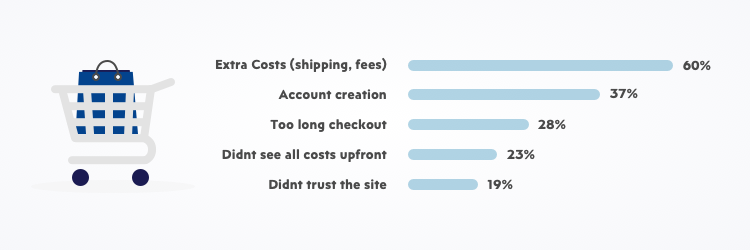
So what are the leading causes of mobile cart abandonment, and how can we fix it?
Well, the primary cause for cart abandonment is a poorly designed and confusing checkout user experience and slow performance by the site/mobile app itself.
However, fear not many of these problems can be fixed by fixing the user experience, which is why UX designers with knowledge of proper e-commerce are most sought of.
Number one cause measured by the Baymard Institute was extra costs and shipping fees or taxes, they didn’t see before
Its been statistically proven that 60% of users abandon their carts because of the hidden costs they didn’t see before applying for the payment. Which made them feel cheated and manipulated by the seller. However, don’t worry there are ways to fix these problems.
A simple fix that could have been avoided by just adding the price calculator at the beginning of checkout, if possible as soon as it was available by the backend response. Users will see all the costs upfront and won’t feel cheated upon by hidden fees, and their trust in your site will grow so they may return. It’s challenging to bring back a customer once they have lost trust in your site.
Second biggest cause for cart abandonment is forcing the user to create an account
Most users like to shop incognito or change apps and platforms in search of a better deal. So when they finally do, they are forced to go through an excruciating ordeal of creating an account and filling out countless forms and questionnaires… and let’s be honest, no one likes that. If the user is not registered, don’t force him to do it, at the expense of enhancing your SEO and risking losing your customer.
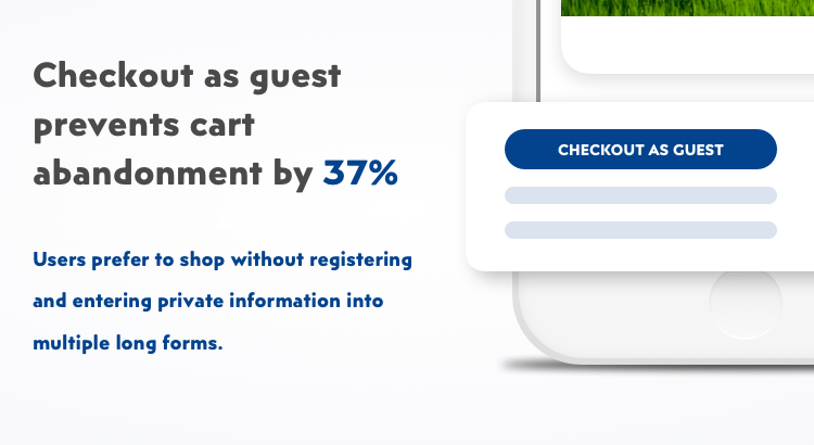
Add “Checkout as Guest option,” and try to make it as brief as possible. With as fewer input forms as possible, only the most necessary information (Email, Name, Address and Card number)
Simplified checkout forms
The third most prominent problem that causes cart abandonment is closely related to the second one, and that is a long and tedious checkout process. Many web e-commerce sites are implementing “one-page checkout” where the user can see all the necessary info without switching pages or losing focus.
Unfortunately, one-page checkouts are impossible to recreate on mobile, since there is far less real estate to work with… and that’s where most people stumble. They are forced to go through several pages of input forms and checkboxes until they finally give up and abandon their cart.
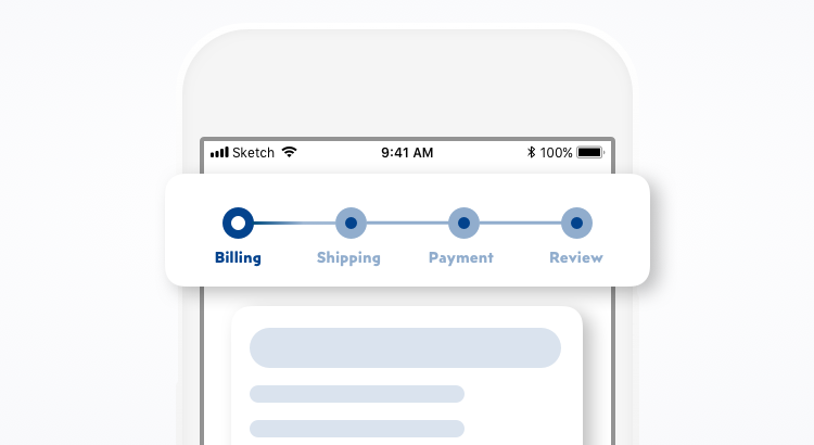
Include a progress indicator on checkout pages
By adding a progress timeline at the top of multiple page checkout, and removing unnecessary input fields, you can lower abandonment rate significantly. Also adding thumbnail photos during checkout can keep the shopper interested long enough to complete the checkout, as he is being reminded of what he is paying for.
Badges, badges everywhere
19% of all abandoned carts are abandoned because of the lack of trust shopper has into the site. Users don’t trust sites that don’t have security badges, even if those badges are fake, they provide a sense of security, …some badges more than others. As it’s said, no trust – no sale. Amongst most trusted badges are Norton, Verisign, McAfee and TrustE badge. So if you are secured by one of those companies be sure to show it.
For badges to have any real significance, they must have at least some security features. Many “trust badges” are associated with SSL. The details of how these certificates work get a bit complex, but mostly they create a secure information connection (e.g., credit card numbers) to be transmitted.
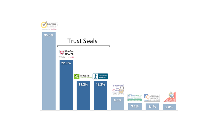
There are two general types of SSL: standard and extended validation SSL certificates. Although the differences are pretty small, EV certificates require a bit more effort to check out some additional information about the domains so that they will cost a bit more.
Customers need visual proof of trust
There is a significant amount of evidence that shows trust badges have a positive impact on a site’s conversion rate and sales. (It’s also nice if there’s any actual security behind the badge as well, although that might not matter too much though.) These badges make shoppers feel better about giving out their credit card information to an unfamiliar website, which generally results in a higher rate among new customers. (The impact on returning visitors is generally minimal since they are more likely to trust the site already.) These badges can also impact the average order value, indicating that customers feel better about placing larger orders with sites they trust.
Multiple payment options
A few other helpful tips for reducing abandoned carts include having multiple payment options available, which are proven to reduce cart abandonment by 8%, as well as “in-store credit” options. Users like having multiple options when it comes to payment, it increases the trust they have in the site.
If you own an e-commerce store, you should always take into consideration that your primary platform is native mobile and not web. The conversion rate from mobile web vs. native mobile is 6% vs. 21% which is 4x times higher in favor of native mobile.
That means your native mobile apps should be impeccable when it comes to performance and user experience. Especially when you take into consideration that for every 0.1 second your mobile app lags or slows down, equals roughly a 1% decrease in sales. So cutting corners on mobile platforms doesn’t pay off.
It’s not all lost though. You still have an email.
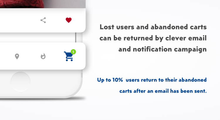
Moreover, even after you do all this, and improve your user experience and app performance, people might still abandon your cart for reasons unknown. However, don’t fret, we still have one more weapon in our arsenal, the good old trusted Email. Yes, the email is an excellent weapon against cart abandonment rates. It has been statistically averaged that over 10% of people who received an email reminding them of their abandoned cart have returned and made the purchase. Many e-commerce sites use this strategy with creative email campaigns that direct the email towards the user as personally as possible. Some sites are even providing discounts to returned users as a reward, which is a good idea but can drastically backfire because it can prompt users to abandon their carts to receive discounts deliberately. It’s a great idea to reward returned customers for their loyalty, but there are better ways of doing it via mini-games that randomize and offer such rewards.
Another great way for Abandoned Carts is Facebook Messenger with chatbots
Are you thinking why?
Facebook Messenger is the world’s largest mobile messaging app with 1.3+ billion monthly users and there is your huge marketing opportunity!
By automating conversations, your business can save time and money and allocate that money to other marketing efforts. The greatest opportunity of Facebook Messenger is generating leads and revenue. Automating initial interaction with users, you are making the first step and working on engagement with them.
After your first step, there is a huge opportunity to guide users to have better outcomes. Your customer don’t always know where to find all the information or don’t even know what they are looking to buy.
By asking a series of questions, you can easily guide users to the best pleace for them and ultimateliy they will make a purchase.
So there you go there is no problem a good user experience can’t fix, especially when it comes to e-commerce. There are mainly three things you need to focus on when designing your checkout and payment experience, that most designs fail to achieve:
- They fail to reduce fear.
- They fail to build trust and credibility.
- They fail to reinforce benefits.
Try reducing fear by improving how comfortable the user is with making a purchase (etc. high-quality thumbnails during the checkout process), and entering private information, like phone number and age. Try to understand their internal dialog when seeing “Phone Number Needed”. “Why do they need my phone number”? “Why should I give out my private information so easily”? Users will be more willing to fulfill such information if you state (For Shipping Needs) or something similar next to it.
Build trust with credible security badges and excellent return policies, and last but not least, show the benefits of making purchases through your store by offering discounts and friend referral coupons.
We are recognized as a top E-commerce Company on DesignRush and if you have an idea about your e-commerce business, we are here to help you out! Please, feel free to contact us!


