6 Essential Tips for Creating a User-Friendly Online Store
Have you ever opened a website and not known where to start looking? Were there too many things to click on? Maybe you couldn't find what you were looking for because of weird category names and a lack of filters. Did it even load? You only have a split second to make a good first impression.
This is what can either keep users browsing or make them leave. What is true for other websites is also true for e-commerce: Users are not just judging your website; they are judging your brand.
Everything you do on your website should be in the service of the customer. Prioritize simplicity and ease of use. Create a clean and high-quality homepage, incorporate a search bar, and filters, and focus on building a responsive website.
1. Cleanliness is Next to Good UX
Chances are the majority of customers' journey will start with your homepage. It's the first frontier in the ever-lasting online battle to make sales. Make it clean and in line with your brand. That means no ads, no clutter, and try to avoid too much animation and experimentation (unless that's what the brand is into).
Design page segments with clear labels, and don't forget to promote things like free shipping, free returns, or other perks that can lead to more conversions. Always remember that an e-commerce website serves one purpose: Selling products. Everything else is secondary.
You should try not to overwhelm your customers with visual cues. There is something called decision paralysis: If you give your customers too many choices and no clear path to stay on, conversions will drop. You know how sometimes you spend more time browsing Netflix than actually watching it? It's something like that.
Too much choice from the start can increase the cognitive load so much that your customer will just leave the page or make no sale at all.
There is a great website called abtestcases that conducts research on various design elements and publishes their findings. One of them states that you should reduce your banner count to keep your customers focused on the thing you want to promote the most. That could be a bestsellers list, special promotions, new ins, etc.
Also, don’t place them at the top of the page. I know it’s tempting to put a carousel on your homepage, but you need to be careful with those, as a lot of visitors overlook them if they aren’t designed correctly.
Reason? They trigger banner blindness; If the slide looks like an ad, most visitors will skip it, so you need to design them with special care. The area above the fold is precious and it should serve to showcase products at their best.
You can also opt to place the banners on the left side of the page, as this is the area customers naturally gravitate towards while scanning your website.
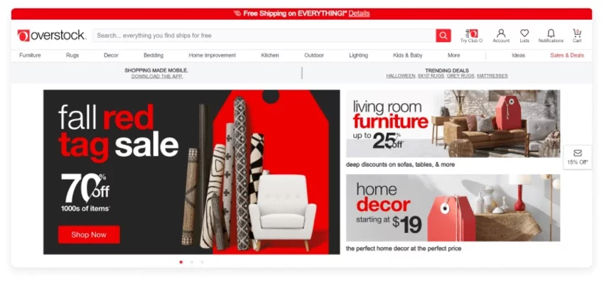
Another good idea is to add a product finder on your homepage, especially if the website sells niche products. This is basically a replica of the filters included in the category page, but compressed into a single bar.
If you are selling or promoting a single product, make it obvious what it is, as it can increase your conversion rate as high as 90%.
2. Accessible Navigation
If you throw everything you have on the homepage, visitors will probably get overwhelmed and leave for another website. This is especially true for websites that sell a variety of different products that measure in the thousands. Don’t hide your moneymakers, but don’t present a billion of them either.
What’s another problem with having a lot of choices? Each click represents a cognitive load - a mental effort it takes to take action. If you have a nested navigation which is also hidden behind a hamburger menu on the desktop, it just makes the user's job of finding what they are looking for that much harder.
What you may want to do is opt for a fully visible navigation from the get-go, especially if you sell niche products. Put your main categories in the header so your visitors can discover products easily. Open navigation reduces the number of clicks, for every click represents a tiny effort that accumulates throughout the website..
The NN group found out that visitors spend 80% of their viewing time on the left portion of your website. This is a thing you can leverage, and make your menu vertical. It’s easier to navigate and it makes the transition to mobile a lot more seamless.
Furthermore, use drop-down menus to reveal more options once the customer has made their initial selection. Make sure category and subcategory names are clear and logical.
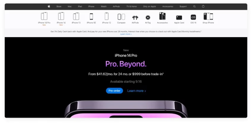
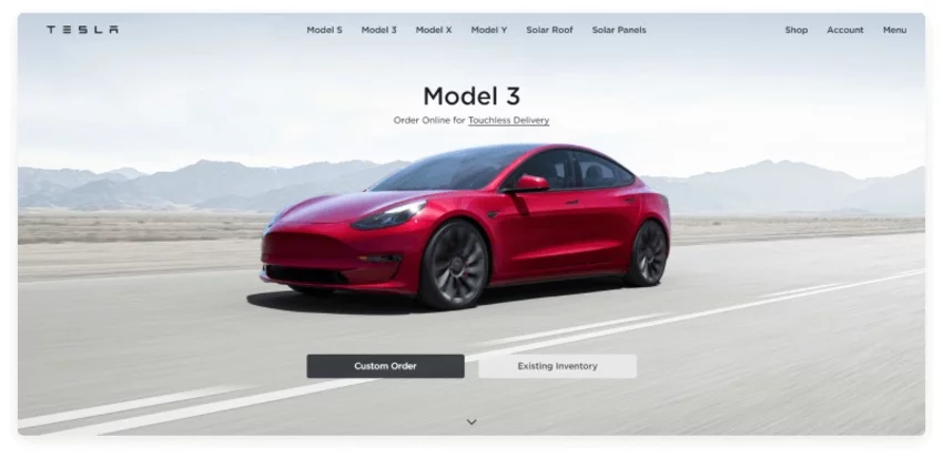
Breadcrumbs are another essential part of good navigation. They act as a roadmap, where the user can see their position in relation to the homepage. Place the breadcrumbs at the top of your page and make sure you include them in your mobile version too!
Another good thing to implement is the utility bar with basic contact information, language and currency switch. You don’t want to make it hard for the user to get in contact with you or to change the basic page settings. Most users automatically reach for the upper right corner when they encounter a website that’s in a foreign language.
3. An Omnipresent Search Bar
Users want to find things they want fast. With a search bar, users can get straight to the point and begin a targeted search for the item or service they’re looking for.
Make your search bar obvious. Most websites have their search icon placed on the right side of the header. It’s something visitors are used to and will automatically look for it there. For extra effectiveness, also add these:
-
Search bar autocomplete
-
Semantic search- to deliver better results
-
Present images and ratings within the results
-
Include breadcrumbs in the result pages
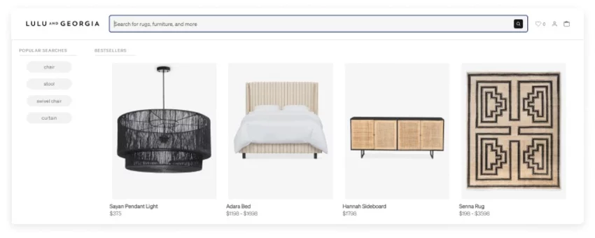
According to addearch.com 30% of visitors will use internal search at some point and those who use it tend to be highly motivated users that are further along in the sales funnel and are more willing to buy.
In fact, conversion rates through site search can be up to 50% higher than average.
When a visitor uses site search, they are more likely to be in the final stage of their buying process. They might just want to compare prices, check availability, or find out about delivery fees to decide on the product they want to buy.
Since voice search is on the rise, there’s no reason not to take advantage of this innovative technology. It’s more convenient and accessible than regular search where users have to type their query, and it provides a much faster and more practical experience. If you want to know more about it, our developers wrote an article where they explain how you can implement voice search to be your SEO secret weapon.
Here are some shocking numbers: Even though 68% of shoppers would not return to a site that provided a poor search experience, nearly 84% of companies don’t actively optimize or measure their on-site search. If you follow up on this and invest a bit of money in developing a great site search, you are gonna have a huge competitive advantage.
Customer Search Habits
Did you know that 50% of search queries are four words or longer?
Unlike short-tail keywords (‘black dress’), long-tail keywords, such as ‘black floral long sleeve dress’ are more specific and offer narrower and more relevant search results. They get less traffic, but they often have higher conversion rates because at this point, users know exactly what they are looking for and are willing to buy it.
Take me, for example. I’m a person who likes certain types of clothing, and I will always look for let’s say, a floral dress in specific colors. Now, a site like Asos literally has thousands of dresses, with new ones being added almost every day. At this moment, typing in something like ‘floral dress’ will get me 3,934 results. I ain’t got time for going through all of that.
Now, don’t be mad at Asos. They are trying to cater to a very large audience, and tagging the items correctly will go a long way when it comes to conversions, because the less time I spend searching for something remotely similar to what I want, the more I’m willing to buy it.
Now, when I type in ‘black floral long sleeve dress’ I get 232 results. That’s more like it. Plus I get the pleasure of narrowing down the results even more with various filters they have on the top of the page.
If you, for some reason, cannot implement a search like this, opt for more elaborate filters that will help narrow results. See the text below.
4. A Whole Bunch of Filters
No matter how big the inventory is, offer users additional filters that will narrow their search to specific parameters. Most fashion e-tailers have multiple filters like price, color, size, length, style, etc. Furniture stores add in height, width, and material. Think about what’s relevant to the products you’re selling and tailor your filters accordingly.
Filters save time and allow users to focus on a few items. They encourage customer engagement, add to easier product discoverability and drive sales. If you use this strategy, make sure all your products are clearly tagged with the appropriate labels. Then the search results will be accurately displayed for each shopper’s query.
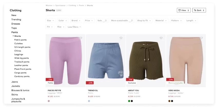
Given how much of a difference product filters make, it’s surprising that only 16% of major eCommerce sites provide customers with a good filtering experience, according to data from the Baymard Institute, which routinely conducts some of the most comprehensive, longitudinal studies on eCommerce sites’ usability.
5. Clear Category Names
E-commerce is not the type of website that allows for a witty label or funny imagery (unless it’s a part of your brand, but even then, it would need to be a niche market). Customers just want to navigate your shop to look if there is something interesting, or they came there to find a specific item.
Out-of-the-box labels may be a good way to catch the user’s attention, but they can get in the way of their objective: finding a specific product. Don’t make your users think (hard). In the world of e-commerce, time is king, and even a split-second delay can make or break a sale.
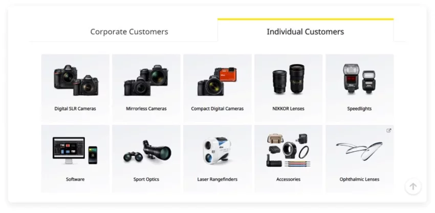
As Hoa Loranger puts it:
“Web users are task-oriented and want to satisfy their needs quickly. Deciding which category or link to click requires cognitive effort. For every page, people must review and compare the choices and then decide which one will most likely produce the desired effect. This process can be exhausting, especially if each decision causes doubt. The anguish of being wrong often leads to fatigue and frustration, which in turn causes people to abandon websites. Clever category names cause doubt and hinder site exploration. The more confident people feel about their decisions, the more likely they are to engage with your website.”
6. Optimize your CTAs
Call-to-action buttons (CTAs) are critical to a good user experience because they are the ones that drive action and lead the user to where you want them to go. They are also the easiest way to boost conversion rates, so be mindful of how you design them.
CTA’s should have a clear copy so the users know exactly what clicking that button will do. They need to be bold and powerful to stand out. Avoid generic phrasing like ‘View more’ or ‘New in’. Instead, opt for a copy that is closely related to the products or services you are selling. Abtestcases did a study where they switched from regular ‘Sign up now’ to ‘Show me outfits I love.’ Conversion rates went up 124%.
Secondly, mind the color. For example, red beats green anytime. While testing Performable’s website, 21% more people clicked on the red button than on the green button. Red creates a sense of urgency so keep that in mind next time you need to design a website.
Positioning is also key and depends on the type of your e-commerce website. If you have a standard e-tail shop with a straightforward or free service, placing CTAs above the fold is generally a good idea. But, if you offer more complex services the users first need to understand, place it slightly below the fold. Michael Aagaard optimized a CTA for a relatively complex subscription service by placing the button well below the fold. That CTA experienced a 304% increase in conversions.
To Wrap Things Up
Creating a user-friendly e-commerce website is essential for success in today's digital landscape. By prioritizing simplicity, cleanliness, and accessibility, you can enhance the browsing experience for your customers and increase conversions. Focus on designing a clean and visually appealing homepage, optimizing navigation with clear labels and logical menus, and implementing an omnipresent search bar for quick and targeted searches.
Additionally, leverage the power of product filters to help users narrow down their options and find exactly what they're looking for. Finally, pay attention to optimizing your call-to-action buttons with clear and compelling copy, attention-grabbing colors, and strategic placement on the page. By following these guidelines, you can create a user-friendly e-commerce website that not only impresses visitors but also drives sales and fosters customer loyalty.
If you need help with your e-commerce store or have any questions, contact us and our team will be happy to assist you in enhancing your online business.


