UI without UX is just an interface - raise product quality by focusing on experience
There are a lot of UI vs UX blogs out there - and this is not one of them. Yes, I will include the basic definition to introduce or remind you of both terms, but the path will lead us to concrete examples with more attention given to the user experience. So, let's begin!
When I first started my job as a designer in a small agency, my tasks were purely graphical. I was designing marketing visuals for social media posts, web and print-ready materials, in one world complete branding for web and live brand presence.
…and then everything went downhill, or maybe not?
One day my colleague said, “Hey, you have an eye for pretty, you should try to design a webpage for our new client.” I hastily said yes, and it was a turning point after which everything went downhill. I didn’t understand that designing a web page doesn’t have the same principles as designing a print flyer for our client.
Of course, the result looked beautiful, both the client and my colleagues were satisfied, but one important piece of the puzzle was missing - the user-centric component. I didn’t design a page for a user, for usefulness and enjoyment, I designed a page to be pretty.

Revelation
It wasn’t long before the business journey took me in a certain direction to the position I am currently in. With coming to the Factory begins my entry into the world of UI and UX. The first couple of weeks I was shocked by the fact that I knew so little about the job I was doing “good”.
I was aware that designing web pages in a way I was previously doing, wasn’t the best thing to do, but with all the job commitments, I didn’t have time to take a break, let alone learn new theories and software. Discovering Figma during my onboarding process in Factory was the invention of the wheel in my career :)
One of the most important things I learned was the principle of user-centric design. Designing is actually the process of resolving the user's problem. The solution we come up with is going to be used by users - will the user know what is on the screen, what to do, where to click, what to expect - these became my everyday questions.
Other design principles we follow in our design process, you can find in our previous blog post on design systems.
As the user-centric approach is the first lesson on our UX journey, it’s time to add some seasoning to our design casserole and explain both terms. The term user experience (UX) was coined by Don Norman who says that UX encompasses all aspects of the end-users interaction with the company, its services, and its products. UX has social components; it deals with the purpose and functionality while UI, on the other hand, is more artistic - it deals with the quality of the interaction between users and products.
UI is the cosmetics of the experience (typography, colors, grid, spacing, icons…) and plays an important role in the UX. The difference is explained very nicely in this short NN Group video, so give it a chance if you need more for understanding.
Pretty is not enough
Even top models need to answer some trivia questions, have volunteer experience or super talent. The same is with your product - pretty is not enough. I realized that I need to engage users with both eye-grabbing UI and excellent UX design.
As said before, UI without UX is an incomplete product, a house with a beautiful facade but without functional rooms and furniture. Some key responsibilities of a UX designer can be divided into three sections.
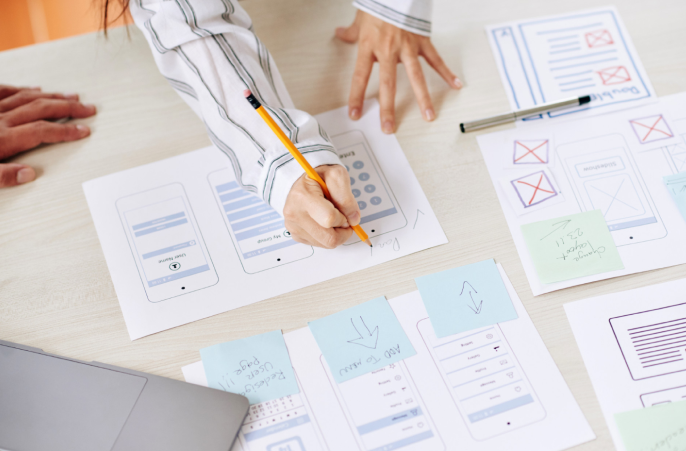
The first one is oriented toward strategy and content. UX designers should do competitor analysis, customer analysis, and user research, these help them to create product structure and strategy. The following steps are prototyping, wireframing, and testing.
Finally, comes the coordination with developers and UI designers and constant analysis and iteration in the agile process.
So here are some tips and examples on how to improve your UX design segment.
Understand your client and your users
First of all, make sure you understand your client. You can organize discovery workshops with the client to discuss major project requirements, objectives, and expected outcomes. In Factory, we customize these workshops for each client based on their project complexity, level of readiness and many other things.
We often use already proven methodologies, such as Design Thinking or Design Sprint, to define a project's goals and features together with the client.
You can also conduct a client and his competition analysis to recognize common characteristics, pain points, good and bad practices. If your product is new and doesn’t have real users, you can make fictional user personas to understand your potential users.
We usually make 3 personas - one general user, one advanced, and one with basic or simpler needs.
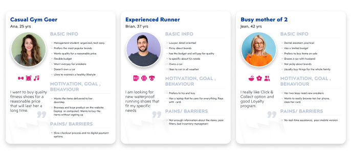
A user story is a next step in this phase. In short, a user story tells us what the user wants and needs from your product. Try to predict as many “scenarios'' as possible where a user will interact with your product and what they want to achieve from it.
For example, if you are building an e-commerce website, the user story might go like this: “I want to add items to favorites.” or “I want to complete the checkout without having to create a profile.” This helps you flesh out the functionalities, find the solutions to user problems and create a product that will ultimately cater to their needs.
Visualize all of your data
After you've discovered the problem you need to solve with your design product, it is time to visualize all the data you have collected. You can start with a wireframe and when the first version is done, create a prototype.
For both, we can use Figma, as it gives support in all the steps - in FigJam we can sketch low fidelity wireframes and collect all ideas from designers, product managers, and developers. In the Figma Design file, we create a wireframe and connect it to an interactive Prototype. The prototype then helps us to conduct usability testing.
You can learn about 5 crucial findings from usability testing in our recent post ;)
Coordinate with developers and UI designers
After you agree with developers and other stakeholders about functionalities, this is the step when the wireframe becomes design. UI designers do their magic to create a harmony of typography, colors, illustrations, animations, and other visual elements to bring your product to life.
This doesn’t mean that this is the last step, there are still a few rounds of reviews, updates, and tests before the final “cherry on top”. There are some extensive cheat sheets to help you start your UX journey, so don’t hesitate to explore more.
Small changes for a big impact
In the design phases (wireframing, prototyping, mockuping…) small decisions can have a big impact on conversion rate. The easiest way if you have doubts is to try A/B testing. Create two design examples and test it on your colleagues, coworkers, family, potential users…
The alternative is to search for similar test results on the internet and see if anyone conducts the same experiment and what the results were.
My favorite example is from British fashion and homeware retailer Malatan. They discovered that exposing the search bar on mobile increased user searches by 32% on mobile and 51% on tablet, consequently, it also led to an increase in sales.
It is also good to test in which pages on mobile this search bar should be shown, only on the homepage or anywhere? Could it be distractive on product single and unnecessary in cart etc.
Another cool example shows that removing a single element can bring great results. InsightSquared, an IT company from Boston realized that their long forms might be stopping users from completing them. After removing one optional field in a form for requesting a demo, the new form converted 112% better than the old one.
How did they find out what the problem was?
Firstly, they checked the metrics and discovered that only 15% of users filled an optional field for a phone number. Then they run an A/B test for 30 days to see if there is any difference between an old and a new form. The result was significant - 112% more demo requests.
The last but not the least example shows how one UX change to an existing design can improve the overall user experience and benefit the client. One Dutch luxury department store decided to remove the “Out of stock” disabled button and place the “Email me when back in stock” CTA button above the fold. This resulted in 42% more email sign-ups and 58% more “Back in stock” button clicks.
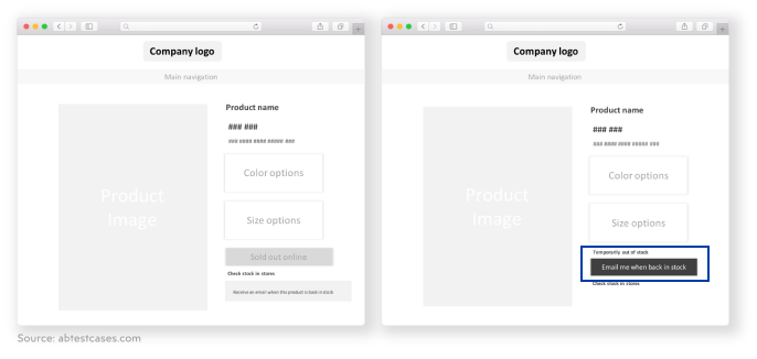
These examples show us the importance of UX and UI design decisions. Sometimes even small changes like button color can have a big impact on an overall product feel, usability and in the end the benefit they bring both the client and users.
Design is a dance for two - UX and UI
UX/UI design is an interesting field full of discovered and discovered knowledge, and every day is an opportunity to learn something new and to become a better designer.
One is not complete without the other, only together they help create a product that will reach its potential, and then again should come testing, upgrading, and more work because design shouldn’t be a linear process.
Through research and analysis, our team at Factory tries to provide our clients with the best possible solutions for their customers. We shared our knowledge on awesome eCommerce analytics earlier so don’t hesitate to inform yourself of this topic.
These tools allow you to follow the behavior patterns of your users. For example, it’s possible to see how much time is needed for a visitor to turn into a customer, what is your cart abandonment rate, the average checkout price, and many more.
If you are a designer, looking for more stories derived from our Factory pen, pencils and keyboards, read more in our Design blog category!
If you are searching for a solution to why your product is not performing well, the main challenges may lie in your product’s code and the user experience you’re providing. Contact our team of UX/UI designers and developers to uncover any issue that’s stopping your business from exponential growth and create a solution for every obstacle.


