Design System Series: Principles as the heart of your design system
Welcome to our second blog post in the Factory Design system series!
Before we start talking more about design system principles and which ones we chose, we’d like to offer our helping hand on your next project.
Our development and UX/UI design skills are top-notch, and we’re ready to provide you with any kind of solution your business needs!
And now, let’s take a look at what principles really are.
“Design principles are shared guidelines that capture the essence of what good design means for the team, and advice on how to achieve it.”
This quote is from Alla Kholmatova’s Design Systems book (if you want to check out our notes from the book, we’ve got you! The notes contain a chapter on Design Principles as well).
We also found a great quote (tweet really) from Nathan Curtis, founder of Eightshapes who specialized in Design systems:
“Design system principle #1: Systems solve the easy problems so products can solve hard problems more easily.”
This explains the essence of the design system so well. Beyond the quotes, the design principles can mean and be related to many things.
It should serve the company’s needs, and every company has its own needs as we already know, so design principles can focus more on the brand, the team culture, or the design process (also said by Alla Kholmatova).
And if you’d like to know more about starting your design system and some basics of the design system, check out our first article in our design system series!
Which types of principles known design systems have?
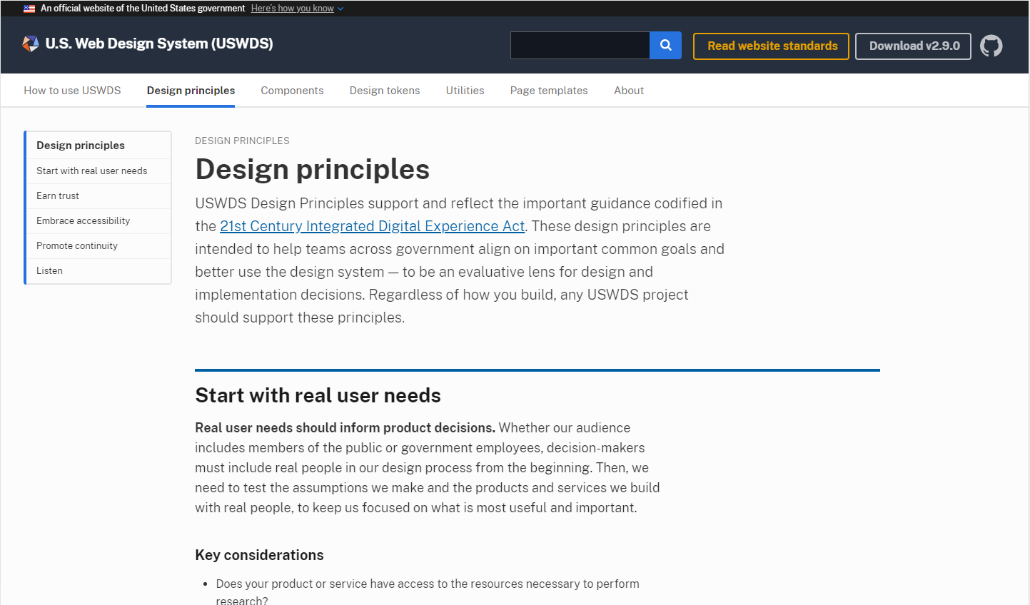
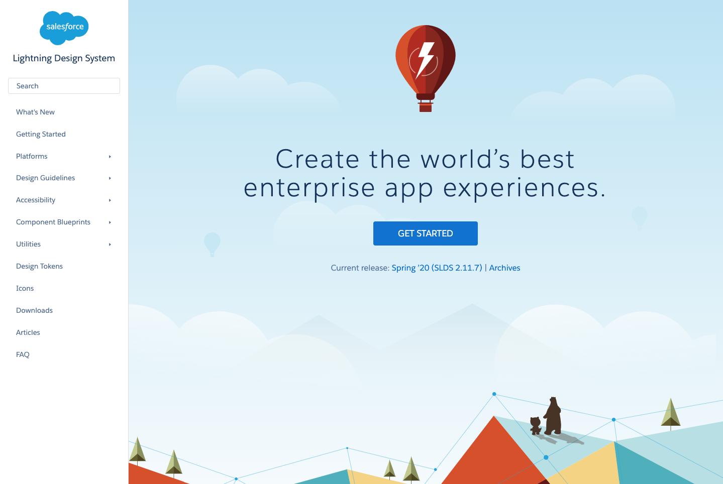
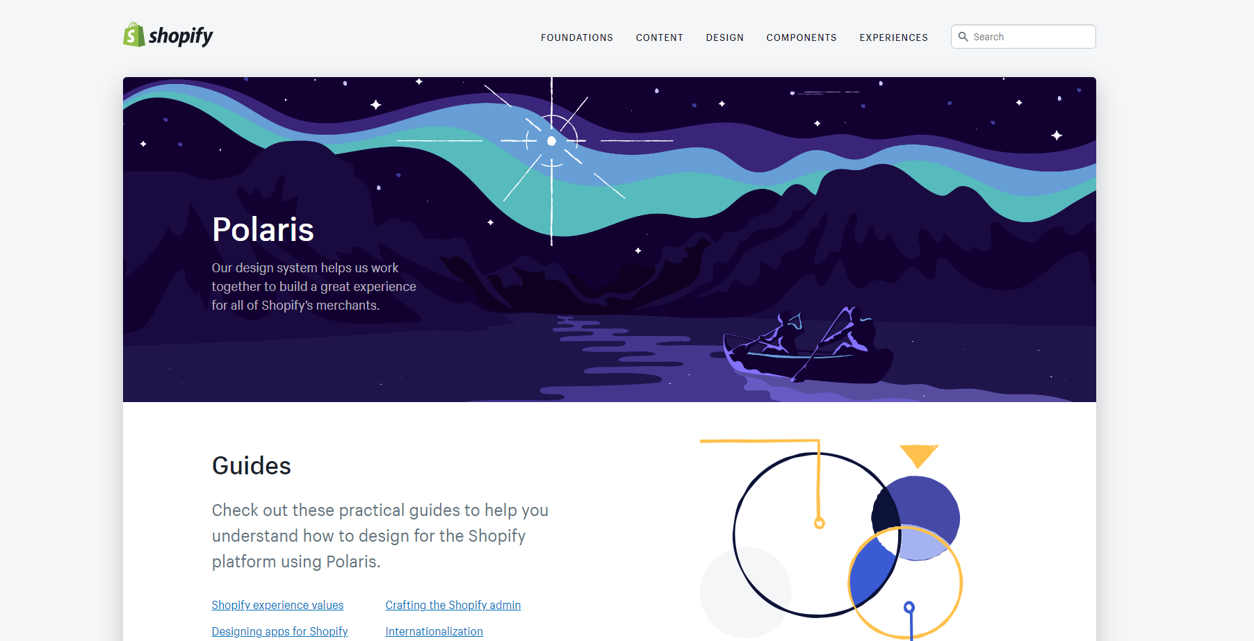
Some of the design systems that have principles are U.S. Web Design System (USWDS), Lightning Design System (Salesforce), Polaris Design System (Shopify).
U.S. Web Design System (USWDS)
USDWS’s design principles are:
- start with real user needs
- earn trust
- embrace accessibility
- promote continuity
- listen
These principles are more related to the team and what they should have in mind when they’re designing, even though they also cover their brand identity, encouraging trust and accessibility with it.

Any Government’s product shouldn’t be attractive, modern, or abstract, but clear and clean.
While reading these principles it is immediately clear what type of service is behind it.
They also have great practical actions for every principle and we think they nailed it. Read more about it at USWDS Design Principles page.
Lightning Design System (Salesforce)
Salesforce explained what design principles mean to them, and they wrote that they reflect the patterns and components inside their design system.

Their principles are:
- clarity
- efficiency
- consistency
- beauty
So whatever component they make for their design system, they should have those principles in mind, and with that, they get connectivity at a higher level.
That is especially practical where the team has more than one designer. You can read more about it in their Design Guidelines.
Polaris Design System (Shopify)
Polaris Design System doesn’t contain principles as such, but they do have a section Our approach where they explain their values (they can easily be principles.)
Their values are:
- considerate
- empowering
- crafted
- efficient
- trustworthy
- familiar
What is really interesting with Polaris is that they have principles inside certain elements inside the design system, such as Illustrations principles, Icon principles, Interaction states principles, and they also have Sounds consideration and Data visualization guidelines.

Principles are guidelines and values, so Polaris took a higher level and specified their design system even more.
Even if that suits them, maybe for another company that approach won’t be functional, and other companies (us included) will choose a couple of principles that they will follow in every aspect of their design system.
You can check out Polaris’s values and their principles, and guidelines of some aspects of the design system here.
Which approach did we choose?
When we were first introduced to the design system, we knew that design principles were a big part of it because they give that abstract but purposeful part to our elements.
We organized a workshop, following the UXPin process where every member of the design team had to come up with 10 principles and explain them.
And we were surprised how many principles matched, meaning in some parts we already had the same design process.
As we mentioned in our previous blog post, we had problems with consistency and goal setting as designers have their own ideas and style.
So these principles should redirect our thoughts on the same cause.
We were following another Alla Khalmotova’s quote in choosing our design principles:
“Design principles are shared guidelines that capture the essence of what good design means for the team, and advice on how to achieve it.”
Our design principles are more focused on our team culture and design process since we have different projects with different needs.
We chose principles that we’ll follow in our projects and can be connected to almost all projects.
In some projects, we will exclude some for the sake of the project’s needs and that is just fine.
Our design principles
In the end, we came up with 9 design principles arranged hierarchically (from the most important one to just important ones).
We know some experts would say that there are possibly too many principles and that we can get lost in them, but for that reason we structured them hierarchically.
It is possible that there will be changes in the near future if we see that they don’t fit our design system after all, which is fine too.
The design system is a process, but for now, we want to try to follow these ones.
“We look at our design principles as guidelines that will lead us to what we want to be.”
User-centric design

Meaning of the principle
This is our first and most important design principle. Everything we do, we have to do it with the user in mind.
Will the user know what he/she has to do on every screen? What does he/she want to do on a certain screen? How can we maximize his/her user experience?
Why this principle?
With every design we make we try to solve some problems. That solution will be used by users.
Regarding that, users should be our first priority (above developers, the client, us).
If you want to learn some basics about user-centric design, we’ll link it here for you.
Purposefulness

Meaning of the principle
Every element in the project has to have its own purpose.
We, as designers, have to have a background explanation for every decision we make and every process we choose.
We should also be able to explain why the flow we design is good for the user.
In case of any doubt, we have to give an advantage to a solution that is researched and proven to be good.
Why this principle?
It’s not enough to say that something is on the screen just because it’s pretty, or because it looks good.

Even the most beautiful element in the world shouldn’t be put in the project if it isn’t necessary and will only take up space.
The value of the decision is empirical, proven to be functional/best and users understand/love it the most.
Consistency

Meaning of the principle
The design of the elements and project as a whole should be consistent. The designer who is a newcomer in the project should be able to navigate easily in the design file and understand it.
Developers should understand and connect the design easily.
Users should be able to navigate easily through the website or the app. Consistency is the key to that.
Consistency is very important, but it shouldn’t be followed blindly, and sometimes it’s okay to step outside the box.
Why this principle?
A closely related principle with consistency is recognizability. These two principles together can relate to our design system, company, and visual identity.
A recognizable design system means a recognizable page/application, recognizable style of our company, and ultimately the recognizability of the company.
KISS (Keep It Simple Stupid)

Meaning of the principle
Simplicity and clarity above all. Minimalism is the key to the user’s understanding.
The smaller the process, the fewer elements on the screen will lead to the clarity of the page/screen.
Use only the elements needed for the process we designed.
Why this principle?
Facilitate the user experience, make it faster, and without too much thinking. The minimum content for maximum impact.
The more we complicate, the risk of a process that won’t be clear to the user is higher, as well as the other people involved in the process.
Accessibility

Meaning of the principle
A great explanation of accessibility in the design process can be found in the Interaction design article post on the very same topic.
Shortly said, accessibility is the concept that makes sure a product can be used by everyone.
There is no one particular user – we can have certain user persons in projects, follow their needs and desires, but we must not exclude any type of user.
Why this principle?
Even though accessibility focuses on people with disabilities, it benefits all.
By anticipating multiple users and scenarios, we raise the value of the design and the breadth of its application.
First of all, it takes care of whether all users are able to have an equivalent user experience.

And secondly, it helps your SEO and marketing in general by reaching out to people with visual, auditory, cognitive, or other disabilities who will find your product accessible and therefore useful.
According to WHO, 15% of the world population encounters some disabilities.
Trends Following

Meaning of the principle
Our design system is a living organism that evolves and changes with new trends emerging in the design world.
Larger shadows, micro-interactions, sound design, all this can mark the design world, including our design system, in which we can add a new trend or adapt an existing element whenever the opportunity arises.
Why this principle?
By following trends, we build our recognizable style and also keep up with the times.
Trends are indicators for change, and by choosing the right ones, both companies and users can benefit from them.
Friendly Language

Meaning of the principle
UX Writing in our projects is cheerful and relaxed.
It may be more professional in some projects, but still needs to sound ‘human.’ Wherever we can, a conversational language with a dose of humor is certainly welcome.
Generic language and messages that can be seen in many existing projects around the world often sound robot-like and should be avoided.
Why this principle?
UX Writing is a very important part of the design process and there is a whole psychology behind it.
Visual design rises to a new level with good content and if a copy speaks in a brand’s voice, it builds reliance and trust among users.
By working on this principle, we will improve our design skills, and thus the projects we are working on.
Hierarchy

Meaning of the principle
From the smallest details to the whole project, the hierarchy is well known.
Hierarchy of text, hierarchy on screen, in a project…
An important hierarchy is found in the information architecture, which talks about how the content is set up on the project, and strongly influences the navigation of the web/application.
The most important is always the most prominent, first, or greatest.
Why this principle?
Maybe you heard about the information pyramid – The information we want to give to everyone / that interests everyone – is more hierarchically prominent.
For those who want to know more, they are after the highlights. This principle works in journalism but also in the design process.
The design we make must make sense and we need to know why something is where it is, and what it is related to.
Only Light UX

Meaning of the principle
‘Light UX’ keeps the best intentions in the user’s favor.
Never manipulate and trick a user into something he himself does not want to do.
Every “push” we encourage will be for the good of the user (thus for ourselves).
Never work to the detriment of the customer to increase the performance of the company or customer’s product.
Why this principle?
‘Dark UX’ can be seen even at the largest companies in the world.
We do not want to “force” the user to spend more money, nor do we want to use tricks to force the user to spend as much time as possible on our site if it is not really necessary.

The user will continue to use our site/application, not because it is addictive, but because it gives him exactly what he wants, in the simplest possible way and in the shortest possible time.
Principles as guiding lights
Does our final product have purpose and consistency? Is it simple, accessible, and trendy with a creative copy?
When we ask these questions at the end, we realize that our principles are not just a list of rules we need to follow blindly, but can work as a design checklist for light UX and user-centric approach.
In words of Don Norman, the design presents a fascinating interplay of technology and psychology; great designers produce pleasurable experiences and this, our friends, is a much easier job to do if you have clean principles that are guiding lights in your design process!
Wanna know more about the design system? Check out our previous blog post on starting your design system.
Moreover, check out more articles on design-related topics in our blog section, such as designing from desktop to screen, web designing for Pimcore, or even basics of UX/UI design!
And if you’d like us to help you out on your project, reach out! We’re experts in development and UX/UI design, and we'd like to help. So, feel free to contact us!


