Design system series: How to start with your design system (Example)
Why the design system?
Have you ever come across an existing project and knew instantly that multiple designers worked on it?
There were like 10 styles of rounded corners, a couple of variations of primary colors, and don’t even get me started on how many variations of gray colors.
Imagine, you get to design a new feature in an existing project, and you want to follow the existing style, but there are so many of them that you don’t know which one to follow.
We don’t think it’s that uncommon. We as designers have a certain idea of what our design should look like, and that’s okay – we follow it, not wanting to be affected by other designers.
But with complete freedom that designers had in our company, the systematization of our designs was lost. Or in some cases, it never even existed in the first place.
We knew that we had to fix that. Just didn’t know exactly how.
Where do we start? And if we start, how can we be sure that we will cover everything with a couple of rules?
Let’s dive into this article and found out!
And if you’d like us to help you out on your next project, check out what we can do for you with our polished UX/UI design skills!
How did we start creating our design system?
We heard about the term design system, read a little about it, knew the idea of it, but it all looked so big and so much work, and we felt that we didn’t have the necessary time.
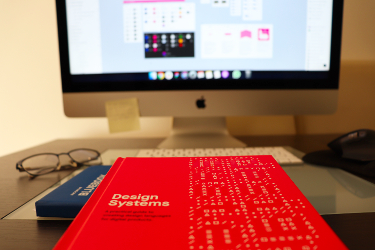
Then a friend of ours gave us Alla Kholmatova’s book, Design System. We started reading, and in it, we found, well, everything.
It gave us a better sense of what the design system is, started to understand it, what it contains, and just like that – the design system wasn’t just something that it would be nice to have, but something we must have.
We made the notes, shared it with other designers, and with the community.
The next step was creating one. We found UXPin’s journey of creating their own design system (God bless them!), where they explained their journey in 7 articles, divided into 6 parts of the design system. And we decided to follow it.
We knew that maybe it won’t fit our company exactly, maybe we will make some changes, but the main thing was that we finally start.
We learned from a book that the first version of our design system won’t be perfect, not even close (or any version of our design system really).
But the purpose of a design system isn’t perfection, but a dynamic process that is growing and becoming better and better with time.
So we made 6 workshops, where we just sat down together (through Google meet to be exact), and we have laid out the foundations and guidelines for the first version of our design system.
Now we want to share that process and foundations with you.
Creating components in the design system
The main difference that we have with UXPin is that they made a design system for one product, and our goal was to make one design system for all of our products.
Before, we thought that having multiple projects with a similar hierarchy or similar elements would prevent the project from telling its own story and having the unique look (some of us anyway).
But then we realized that the same or similar elements would give our company the recognizability and well-known style.
And if we find the best UX for our login process for example, why would we change it in the next project? We shouldn’t.
Of course, every project has its own needs, and its own style and we approach every project differently. The difference is that now we have the same background and guidelines for every project we work on.
We make something similar, but different at the same time.
Our goal is to make a list of components that repeat in our every project, such as:
- cards
- snack bars
- buttons
- top bars in mobile apps or input fields
- cart summary
- carousels
- accordions
- and so on…
Components are going to look the way they look in wireframe, and then we will adjust them in the project.
We are still working on them, and we wanted to make our guidelines in the design system first so that we can include them in our components.
We believe that we will change some of them with time when better solutions pop up, but we wouldn’t be able to find the best variation without trying the same variation in a couple of projects and seeing what is and what isn’t working.
With better systematization of our projects in the design process, just think how more simple that makes the development process as well.
So, developers, you are welcome. And sorry we didn’t make it sooner.
Also, check out the article we wrote on how we’re using our design system to improve our development process quality – it works!
We will write another article about this part only and share our thoughts on it with you, so don’t be a stranger to our blog section.
Artboard as a guideline for color palettes in the design system
Often the first thing that comes to mind when the word ‘design’ is mentioned is – color.
Research shows that 85% of customers think that color plays the main role when choosing a particular product and between 62% and 90% of a subconscious judgment about a product is based on color alone.
Now that we have realized the importance of colors in the business world, more specifically marketing and product sales, let’s dive into colors in our design system.
In order for all projects to have a recognizable shape and color list, we made an artboard for the light and dark mode.
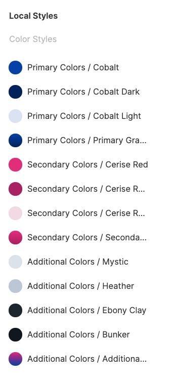
Our design system components are made in Figma, therefore the artboard is our color palette and we have three of them – two with colors that are specific to a project (one in light and one in dark mode), and another with gray hues.
With each new project, the artboard is taken from the Figma Design System file and placed in its own project, after which the designer changes colors with those from the project.
Each color listed in the artboard should be saved as a color style with a corresponding name.
All colors used in the design should be marked with a color style, and clicking on the item on the right in the menu should not display the hex colors, but the color name.
Sixteen Shades of Gray – pleasure in a color systematization
Yeah, everything is done, you chose great colors and made an awesome design! ‘Send to developers’ – of course, ‘click.’
And suddenly 50 shades of gray appear in your selection colors artboard.
You forgot to choose and save a few basic grays as a color style and every time you needed gray, you just took one from a color picker.
Or, as we mentioned in the introduction, multiple designers work on one project, and everyone chooses a gray tone he/she likes.
In order to prevent too many variations of gray in the project, but also to use the colors in a more systematized way, we made 16 variations of gray for our design system.
From these 16, we choose 3-5 variations that best suit our project. Black and white are not included in this number.
A project with light and dark mode can have up to 10 variations, 5 for each mode.
Now looking at the project artboards is a pleasure and the design is harmonious, uniform, and beautiful.
Project color palette
When starting a new mobile or web design project, clients often send us their brand book design with sets of distinct guidelines for maintaining brand identity, including color guidelines.
For example, for our company, the primary color is Cobalt Blue and the secondary is Cerine Red.
To get a set of primary colors, we added one darker and one lighter hue, and as addition, we have one gradient made of primary color and a darker tone.
The same principle works for palettes with secondary colors.
Additional colors are the ones we need for specific design elements or situations, such as text, background or hover state, specific buttons, and others.
Additional colors can be very light or very dark shades of the primary or secondary colors or some other color we need for a project. Their number is not strictly defined.
If we get colors for a certain project, but we do not have their variations (dark, light), we use the HSB formula.
For light color variation, we mark the color, set HSB color mode in Figma, and change Saturation and Brightness values according to our specified rules.
Same works for dark color variation. We highlight the color, in HSB color mode in Figma we reduce Brightness value by 20-30 points and get a darker version of the primary color.
The other two options are the use of the Pantone and the arbitrary method.
As we mentioned before, gray colors on our project palette are up to 5 gray shades from our Gray colors artboard that best suits a particular project.
Global colors are green, orange, and red. Those three are always defined by our color palette and are used for Success, Warning, and Error states and elements.
An exception in a hue can be made if a brand color is identical or similar to one of the Global colors. In that case, we need to choose another set of three for this particular project.
Ultramarine costs more than #120A8F
Does the word ‘lapis lazuli’ evoke a certain color in your mind? Probably not, but when you hear Ultramarine, it’s already a game-changer.
Endless blue, ripples of the waves, and the sound of fizzy bubbles in your cocktail come to your imagination immediately.
As the Lapis lazuli is the most expensive color pigment in the world, Ultramarine can be ‘the most expensive’ color in your color palette.
Naming colors can give them a whole set of meanings and associations that came to our mind – associations that can make our brand name recognizable, our image stronger, and tell a brand story to the customers.
Simple ‘Blue’ started to sound so boring, right?
How do we choose the name?
We decided to use unique names for each color and for them to be standardized, we use a website for generating color names.
This rule applies to Primary and Secondary colors in our design system.
Gray variations have a different type of name, we divide them into light and dark, and the number they contain indicates the light color which helps us to select the right for needed design assets.
Global colors are named by their purpose: success (green), error (red), and warning (orange).
Selecting a color palette for your business can be a challenging task, but is absolutely one of the most interesting.
A great starting point is Canva’s color palette generator, which can help you to choose awesome color combinations.
Color Hunt and My Colors are also great tools for choosing colors for your project.
Design system minions
Whether working on an existing project or a completely new one, defined user interface (UI) standards are a must-have.
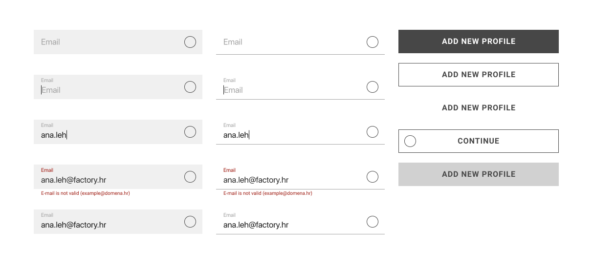
UI artboard in our projects consists of all variety of input fields, buttons, numeration elements, typography scale and paddings, borders, margins, shadows…
All of these elements are small units but they build a great structure of our design project.
Setting the artboard
When we are done with the color palette, it’s time to set the basics in the project file.
First of all, according to project specifications, we need to set a layout grid for certain devices.
There are three artboards in the design system: desktop, tablet, and mobile.
They all contain the size of the artboard, the size of the layout grid with and without gutters, and the formula for calculating the layout grid.
The formula is: (column width * number of columns) + (gutter width * number of inside gutters) + (half of the gutter width (outer gutter) * number of outer gutters) = result. (Admit you didn’t finish reading that!)
In our DS, that means, for example, the desktop artboard is 1920px wide with twelve 80px columns with 30px gutters inside a 1290px content area.
Spacing, shadows, borders…
When it comes to spacing, for iOS and Android design, we use Material Design and Human Interface Guidelines while in web design we developed our own spacing rules according to the desktop grid.
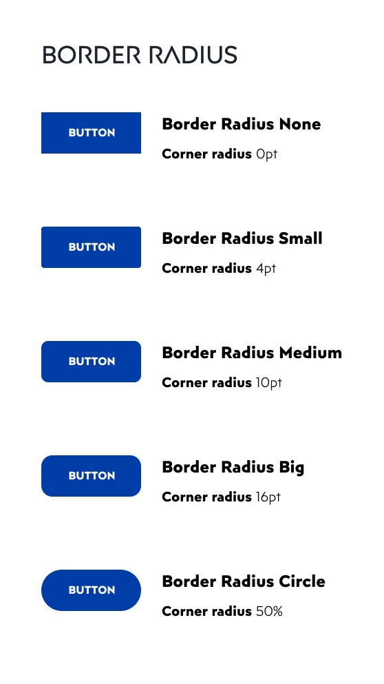
The border radius is most commonly used for buttons. Factory design system contains 5 different border radius styles.
When creating new projects, we choose the appropriate ones from these 5 border radiuses.
In one project we can use a maximum of 2 border radiuses and they must be of different styles (very rounded is combined with very sharp).
Border weight is limited to up to three in one project.
Shadow effects are set slightly different from the border radius in the design system.
There are three sizes: none, small and big shadow effect. Small and big shadow effects have two display modes: down and centered.
With a set of simple rules, we determined shadow options we will use in all of our projects.
We have to say that we already noticed that we’ll be needing more rounded corners, as well as more shadow effects.
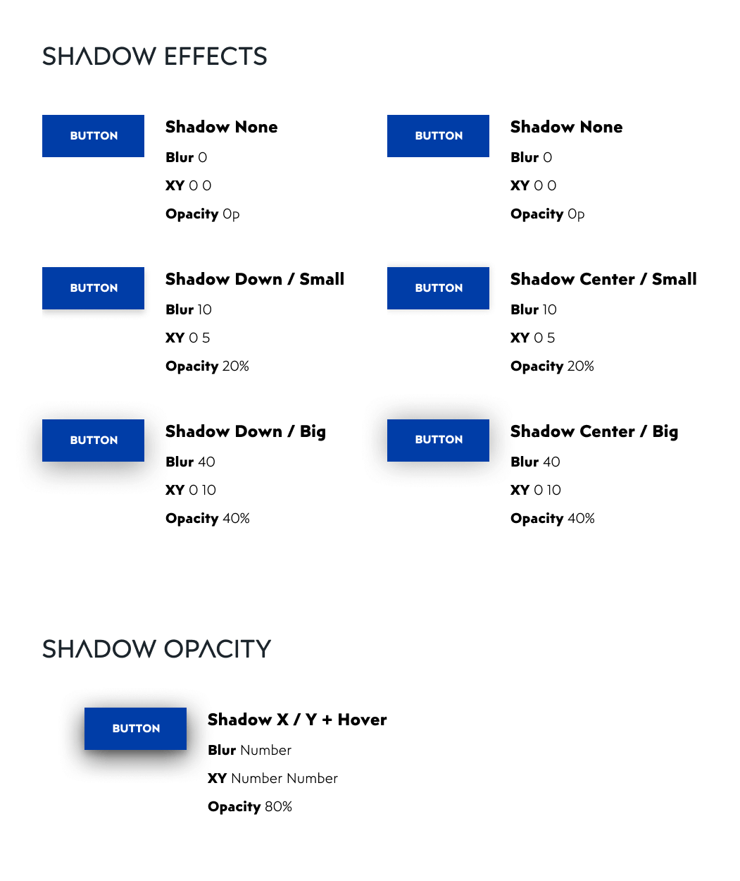
And we’ll probably add it to the design system in the near future, which is just fine, the design system is a dynamic process after all.
Why is it so important to have defined basics?
First of all, predefined basic elements reduce the time needed for the project UI setup.
They play the main role in the design consistency and make the job easier later in the development process because developers can see all UI elements at one artboard and with strict rules applied throughout the whole project.
Furthermore, if the client requires the development of an application in the future, the new designer would simply redesign UI elements for mobile or web, using established rules.
Principles – what we want to be
Bob Marley sang that everything in life got its purpose. Find its reason in every season. And we agree.
Every project we do has its own purpose, and our design system should too. Its purpose is to help the project achieve its purpose.
“How do we make sure that the purpose of the product is manifested through design? By establishing a few grounding values and principles”.
– Alla Kholmatova
So we gave ourselves a task to make design principles that we’ll follow in every project we design.
We are aware that we can’t take these principles literally and follow them blindly, but see them as something that we should have in our heads while we’re designing and try to follow them as much as we can.
We made a workshop where we came with dozens of principles that we found and studied, and talked about every one of them, deciding which ones we should choose for our design system.
In the end, we came up with 9 design principles, arranged hierarchically, from the most important one to just important.
We will list them here, but their explanation and why we chose them we’ll explain in yet another article so we can cover them properly.
So once again, don’t be a stranger to our blog section, this article will come in the near future.
Our design principles are:
- User-centric design
- Purposefulness
- Consistency
- KISS (Keep it Simple Stupid)
- Accessibility
- Trends Following
- Friendly Language
- Hierarchy
- Only Light UX
Similar typography system for every project
Typography was another example of inconsistency in our projects.
That wasn’t such a problem in our Web projects where we were already using type scale, but that approach wasn’t good for our mobile apps projects.
So we sat down and set the rules for Web, Android, and iOS typography.
What is a type scale and why do you need it
As we already said, regarding the Web, we just had to cement what we were already using.
We created one universal artboard where we have all the parts that make each font, wrote what typefaces we are using, and what characteristics headlines and paragraphs have.
Our web type scale is a modular scale that starts with baseline font size and increases by the same ratio.
For example, using the Major Third (multiplier 1.25) scale on Baseline font size of 16px, second bigger size will be 20px (16*1.25), third will be 25px (20*1.25) etc.
Sometimes, our type scale will be a combination of two or three rules, depending on the font characteristics we’re using.
If you are willing to know more about modular type scales, we recommend a great article on this topic. And we love this type scale tool.
And what about mobile typography?
Sizes from type scales are too wide for us to use in our mobile projects, so here we decided to follow similar scales that are used in Material Design and Human Interface Design.
For Android, we chose even numbers for our typeface styles, and for iOS, we chose uneven ones.
We divided our text styles into three categories: headlines, paragraphs, and labels.
Headlines and paragraphs have three subcategories: big, medium and small, and labels have their own purpose (button, error text etc.)
We do have problems with defining the same labels for every project, but we will definitely work on that.
Maybe we realize that we can’t define the same ones, and we have to have different ones, which is fine too.
Regarding line-height, we are using type scales for it, for Android headlines and paragraphs 1.2 (minor third), for paragraphs 1,414 (augmented fourth).
For iOS, we are using 1.25 (major third) for headlines and labels, and 1.5 (perfect fifth) for paragraphs.
Everything else, typefaces, letter spacing, etc. depends on the projects and their needs.
We are planning to use them in every project so we can achieve the recognizability of the typography hierarchy for ourselves and our developers as well.
Icon set for every occasion, at any moment
Let’s go back to the story from the introduction.
We get on an existing project, and the client wants new features. We add a new category in bottom navigation, and we need an icon.
There are a couple of possible scenarios.
The previous designer doesn’t work in the company anymore and you don’t know which set he/she used.
The designer is still on the team, but he/she doesn’t remember.
Or even the case where we designed it one year ago and we don’t know which set we used.
And then there is also the case where we know what set is used, but it is limited and we can’t find the right icon.
So we try to find the set (we lose an hour or two), we try to find a similar icon that can match the set (we lose an hour or two), or we try to make it our own, trying to match the weight of the icon, rounded corners, etc. (we again lose an hour or two).
Now imagine that three things combined, where we try to do one thing, don’t succeed, try to do another thing, same results. Three to six hours lost.
We have a great Material Design icon set, but we want another icon set to use it both on our Android and iOS projects.
Human Interface Design doesn’t really have their own icon set (at least not a big one).
Web is another problem, where we try to find a perfect fit.
Often we succeed, there are some great icon sets on Freepik and similar websites, but there is that feeling the process should be easier.
The perfect outcome would be to make our own icons, but honestly, we are not equipped for that task, nor do we have that kind of time.
Every company should decide for itself and choose whatever choice it seems best for them.
Our best choice was to find one ultimate icon set. So we gave ourselves a task, to try and find that one icon set that can meet all our needs, in every project we make.
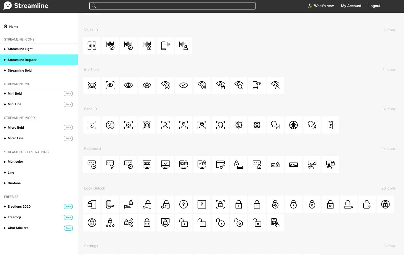
Task seemed impossible, but we found the right one. Streamline has more than 10 thousand icons, and what’s even better, all of them come in three versions: light, regular, and bold.
So, we paid for all three versions and whatever project we do, whatever needs we have for it, Streamline was there for us so far.
We’ll be honest, some things could be better, such as:
- Transforming strokes into vectors which we have in light and regular versions (some icons break in Figma when we outline stroke)
- Search can be quicker and easier to use
- Figma plugin as well
But we believe the Streamline team works really hard and our process is, either way, quicker than it was ever before.
Their app website offers free png versions of all icons, so you can check that out.
With that being said, we have only one thing to share about this part: future websites, Android and iOS apps, don’t worry, for every case we have a sign, and for that, we have to credit – Streamline (and also people at the company that agreed to buy them for us – cheers!)
Do you want to build a design system?
Making a design system isn’t something that can be done overnight.
Especially if you don’t understand it before that, but at the same time, it isn’t something that you can read a book or two, understand it completely and make a perfect fit for your company.
The design process is much more than a theory, as you already know, and errors are allowed, as long as you always try to make the most of it.
If you’re thinking about starting your own design system, we recommend the Design System book, Design System Sprint by UXPin, and there are other great resources like articles and handbooks that can help make your design system better (like InVision’s great videos about design system or Design Better’s handbook).
We know that all those design terms like design system, design thinking, design sprint, etc. can be overwhelming, especially for someone that is new to design.
And even though many of us read something about it and think we understand it, we really don’t.
We just understand the idea of it, and we will benefit from it only when we really start using it in our design process.
There is no shame in admitting that we don’t know how to use it, because when we do that, then we will start to make an effort to change it, look for benefits in it and try to make the most of it in our work.
All you have to do is – start. And just remember, making a design system is a never-ending process, it has to grow, and we have to grow with it.
When we make our first components inventory, we will show it to everyone in our company, show it to you, and then – we just might go to the beginning, starting with Alla Kholmatova’s Design System book.
And if you’d like us to help you out on your project, reach out to us! We’re experts in UX/UI design and we're happy to help. So, feel free to contact us!
See the latest updates on our social media channels