Desktop to Screen: How to be a Design Transformer
The world has changed.
And it is changing daily. The online world especially.
Once, we designers were told that we have to make design for smartphones having in mind what we should exclude, features that we have on the web but don’t fit on our small screens.
Today those small screens almost are the entire online world.
Mobile app design is equally, if not more important than design for the desktop.
A survey in 2018 showed that 51.3% of all website traffic in the world was generated through smartphones, many experts believing that number is even higher today.
People are using smartphones much more than PCs or laptops today. Meaning that mobile app design is one of the essential keys in UX/UI design today.
About 90% of smartphone use is app use. The need for a mobile app for any business today is no longer an assumption or wishful thinking, but a fact. App-like experience is possible today on some responsive websites. But still, many pros of mobile apps like personalization, notifications, offline use etc. are just hard to surpass.
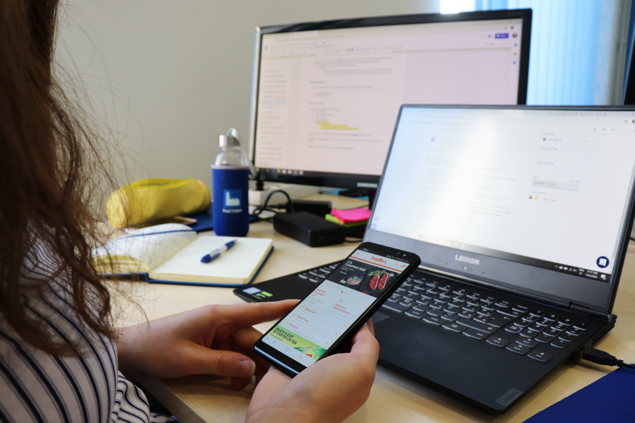
So, here are a couple of questions you might have about mobile apps and our answers to them.
Why make a mobile app when I have a perfectly fine mobile website?
First iPhone came with the first web browser in 2007. The website didn’t look good on the smartphones then. The first real solution was a well-known m. subdomain, which gave users the better experience, but a new problem for the developers.
Now, they had to have two codes for one website.
Enters responsive design. From 2010, when Ethan Marcotte introduced media queries to the world, websites changed a lot. Today we have sites that look great from 320 pixels to 1440+ pixels.
But from the user experience perspective, for a smartphone, a mobile app is a winner. Apps offer functionalities that users expect in chosen operating systems. Meaning, apps have a more intuitive user interface with smartphone use.
With that, the user recognizes certain features that are usual for the chosen design system. And using an app should be more accessible and familiar in a much shorter time than it is on a mobile website.
The one thing you definitely shouldn’t do when you design a mobile app based on your website is to imagine a mobile version of that website. Mobile apps can deliver so much more, and you should use that.
That includes the device’s features like the camera, GPS, and location. Try using them for the better user experience of your app, for example using GPS for showing jobs in user’s city or county.
There are more pros about why to make mobile apps, and of course, there are pros about mobile websites as well. But let’s end here with this part and move on to more important things for now.
What are the key differences between a website and a mobile app?
Now that we successfully made your mind about the mobile app, you probably ask yourself, and us as well, where to start.
But firstly, we want to talk about some of the most noticeable differences between a website and mobile apps (from a design perspective). Then we will move forward to the process of making a mobile app from the website, we promise.
Size of the screen
The first one, and of course, the obvious one.
We know that this doesn’t count when you open the website on a smartphone. Still, the site is designed with desktop in mind as well, and that affects design a lot. So for that reason, we will include it.
We can bet that most of the users if asked what the difference between smartphone and laptop is, would say the size. And it sure does affect the design a lot.
So, maybe you are now thinking “So what, it’s not a big deal, you just rearrange elements, make the font a little smaller, shrink pictures so that they can fit the screen and the job is done.”
Unfortunately, it’s not that simple.
Many elements are affected by size only. So, for instance, white space. White space is your pal for sure. The more the white space, the clearer the screen is, meaning the user will navigate the website better.
That doesn’t mean that you should use white space and white space only, but it is one of the essential elements of web design. The same can’t be said for mobile app design.
Because of less space, less white space is used too. But that doesn’t mean you should put too much on one screen. That will overwhelm the user with the information and too many elements. You have to be smart about it. You should decide what features are the most important ones and make them most visible on the screen.
Keyboard
With this one, we will also take an example of the website on a desktop because when it, for example, comes to the signing up process, the desktop won’t use more pages for the smartphone’s sake.
After all, it has enough space for all of the needed information. With that being said, we will include a keyboard as well.
This one may confuse some because everyone knows we have a physical keyboard on PC or laptop, and virtual one on smartphones. That much is clear for everyone, but a smartphone’s keyboard affects user experience a lot.
On the web where in some cases we have additional space where we could fit a keyboard, we don’t need it, and on smartphones, where we already have much less space, we get a virtual keyboard which takes almost half of that small screen.
So, we should be cautious with designing screens with for example inputs and buttons. While we can put a more significant number of inputs on the web, for the mobile apps there is a recommendation to use only 2-3 inputs on one screen and then the 2 or 3 on the next screen.
Reason for it is simple. You can fill all inputs on the screen and even click on the button (if we make it floating above the keyboard) without having to remove our keyboard first.
Brand Awareness
“Brand is an image created with a set of distinguishing features and promoting awareness and recognizability of the product or service on the market, it’s what people think and know about it.” – (quote from this great article about branding your mobile app).
This is a more abstract one.
It’s not only colors and logo and other recognizable UI elements, but it’s also the feeling that the brand gives you.
Facebook’s infinite scroll that saved us clicks and clicks to see more content. Twitter’s snappy tweets that changed social interaction as we know it (and it is still most known for character limit per tweet). TikTok’s videos have a limit of a maximum of 15 seconds.

The list goes on and on.
All those features are not included only in listed apps, but apps are recognizable for it. And those features define their brand a lot.
Brand strategy is important when businesses decide if they want a mobile app or the mobile web is enough. But the mobile app, with the app icon, splash screen, illustrations through the app, voice of tone and features that only smartphones can offer make a compact and recognizable brand that can take a business to the next step.
And since a mobile app is distinct from the website, it can offer a completely new branding experience for users. In some cases, companies build mobile apps specifically to transition into a new brand style.
Plus, the app can allow users to customize appearance, which can go a long distance from the company’s brand.
Simplicity
The website should have all the elements that are common for desktop, tablet and smartphone. It should contain all the information, as well as multi-level navigation, so the users don’t have 20 options on their menu.
The mobile app, on the other hand, must have a clear purpose.
If the user wants to buy a shirt, give the filters which will be included in the category, where the user can choose the shirt. When you show all the shirts, don’t show all the available sizes, all the available colours and lots of other information that can overwhelm the user.
Show only the essentials in your mobile app design, like picture, name and price. If the user likes the shirt, he/she will click on the item and see all the additional information about the item. And if the user wants to see only one size of the shirt, you can give him/her that filtering options.
So, what we want to say is – simplify the mobile app design process as much as you can. Don’t put all the information you can on the screen, try to focus on one single task that the user wishes to perform. Users don’t come to the app to seek some information – they come to make an action.
Give them that as soon and as simple as possible.
Can you show me an example?
Yes, yes, we can!
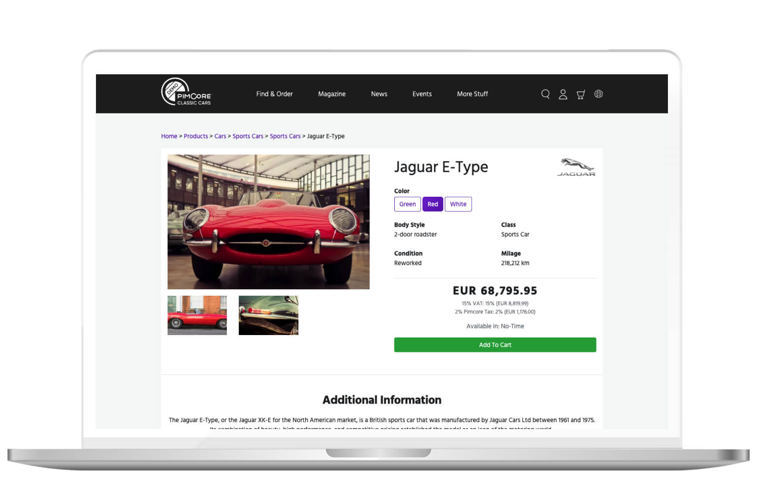
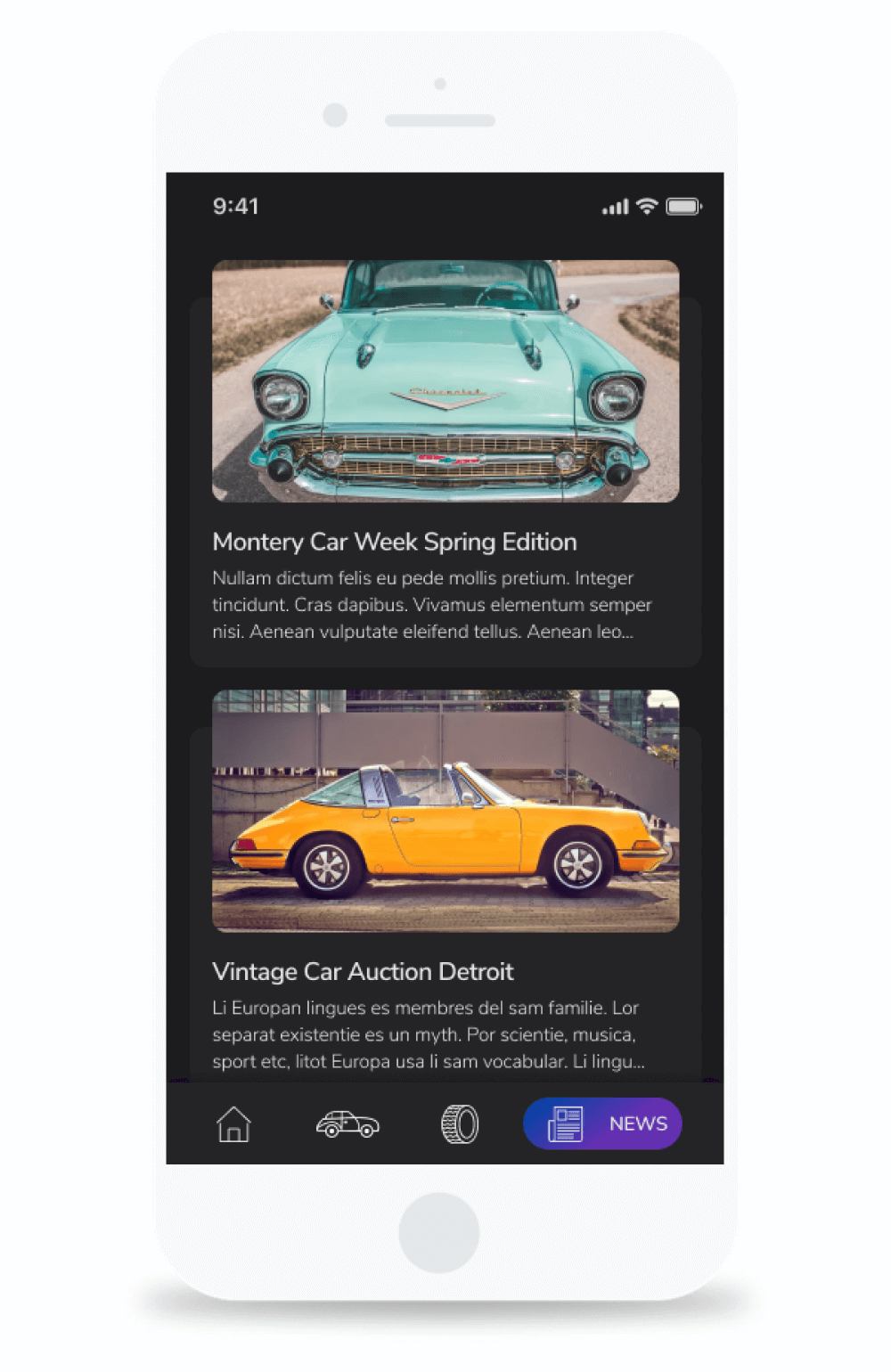
Recently we gave ourselves a task to make a mobile version of Pimcore Demo Website.
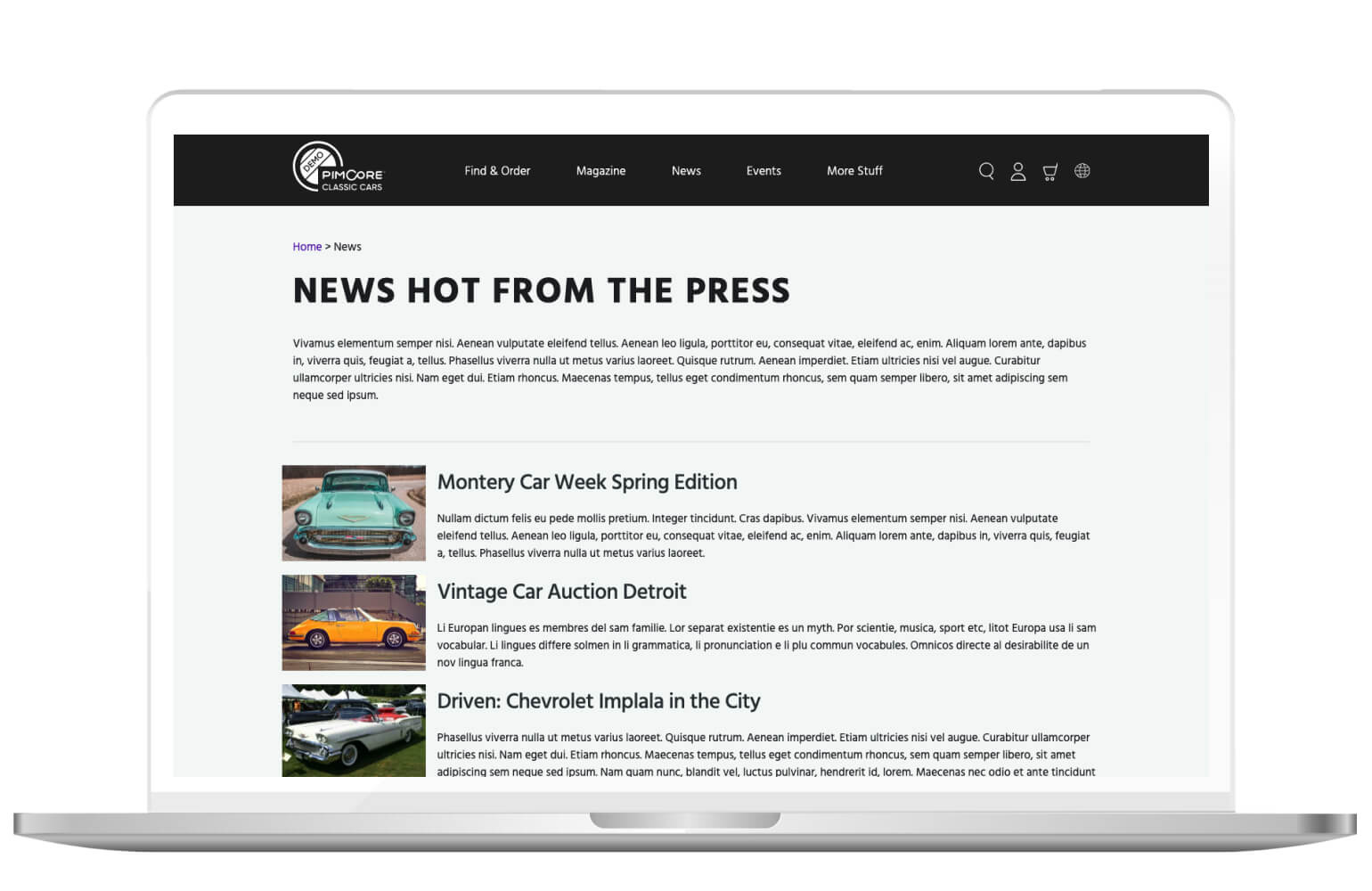
Website is an example of an eCommerce project made with Pimcore platform, and it “sells” classic cars and vintage trucks, as well as parts of those vehicles. Except that, it has news, magazine, events and more examples of elements Pimcore offers.
First of all, we chose to make this app on the iOS platform, meaning we followed Human Interface Guidelines where we could. We always must have in mind those guidelines (Material Design for Android), because apps made with those guidelines will be more intuitive to the user who uses a smartphone which is made with these guidelines.
Also, we wanted to experiment with the dark mode, and iOS system colours are used for the background colours, but iOS 13 has dark mode ability throughout the whole platform, so today both light and dark mode should be made for iOS apps.
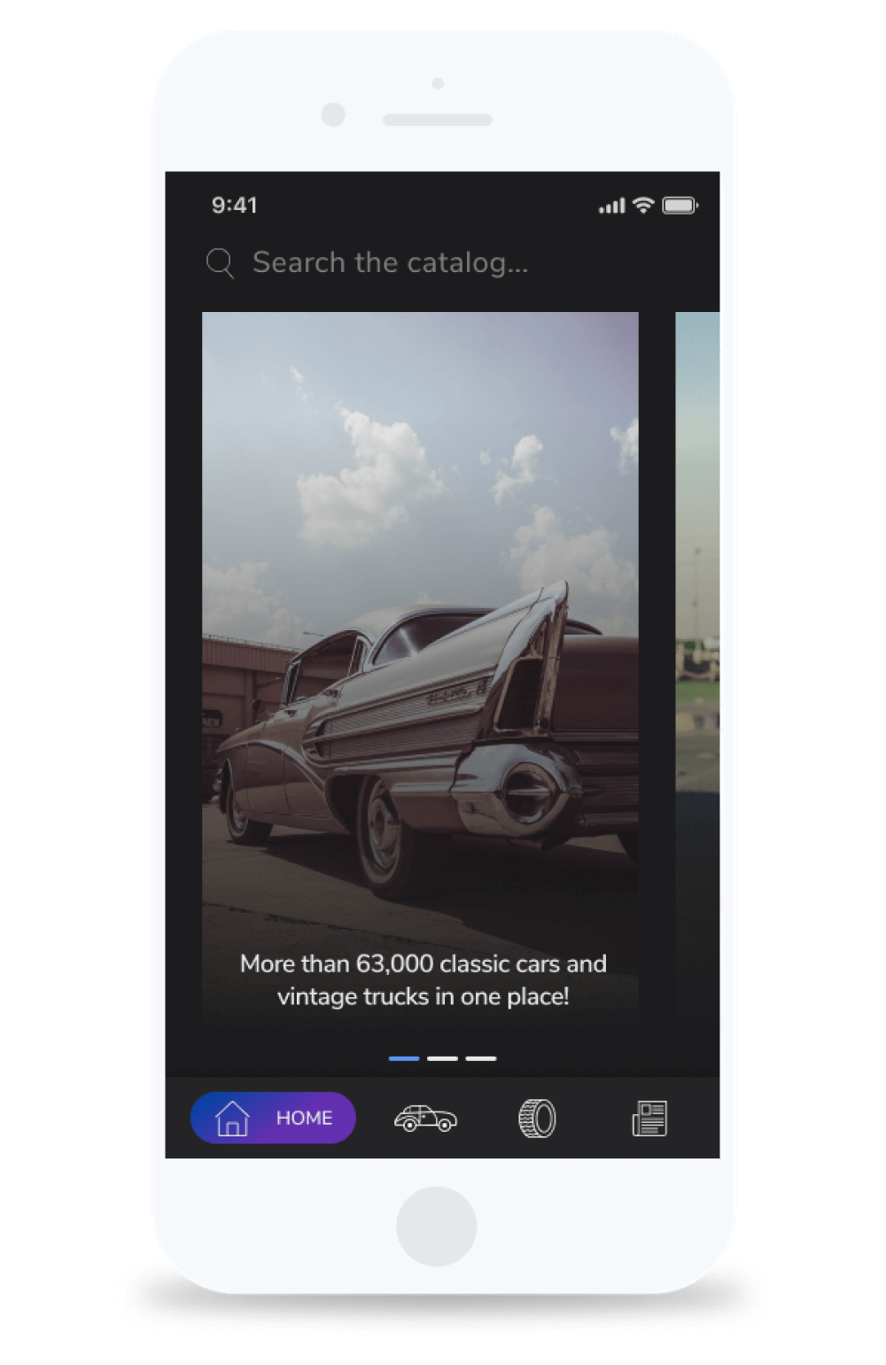
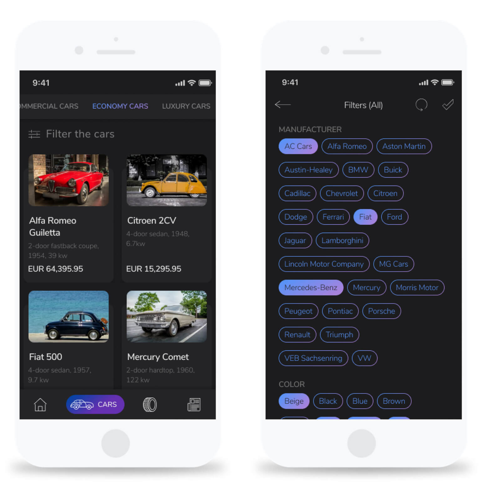
We chose to reflect only some of the features that are included on the website, so the app is designed as a catalogue of vintage and classic vehicles, the users can’t “buy” them, and we excluded magazine, events and other examples.
Additionally, we removed footer because it isn’t common in mobile apps. Especially since we nowadays have infinite scroll which makes footer in the apps impossible to have.
We had to see what the main purpose on the website is, and then what the main purpose on our app will be. On the website the main purpose is to see and buy cars/parts, on the mobile app it’s to view cars/parts.
After we sorted that out, we must see how we can simplify the content we had and show only the most important parts of the websites in our app.
And then, start with transforming the web into an app.
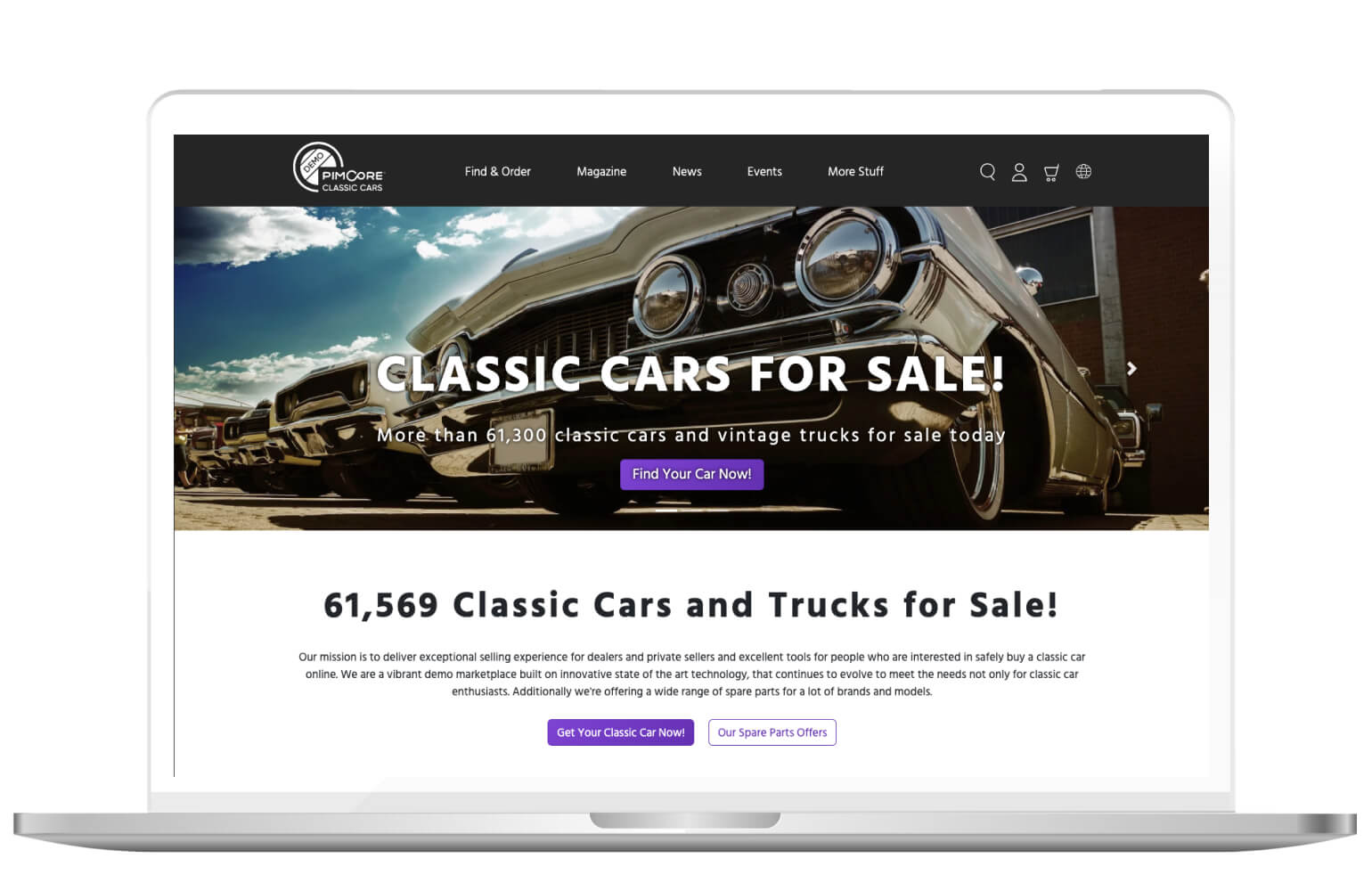
So the website’s homepage is a typical homepage:
- it has a slider that introduces us to parts of the website,
- it has a clear title that gives us clarity at once about what the website is,
- and if that is not enough for the user, they provide a mission as well, that describes the purpose of the site even more.
After that, it offers a variety of categories throughout the website. All of that information is not necessary for the mobile app design, because, as we said, the user wants action. So we made a simple Home with only a slider that can lead the user to different parts of the app.
Since we can’t buy vehicles, there is no need for login or signup, so we excluded that, as well as the cart. Also, the app will be only in English, so we excluded the icon for language selection.
We also removed buttons from the slider, because it is intuitive on smartphones that cards are clickable.
To be honest, “Home” probably isn’t necessary for the app at all, but we wanted a slider for educational purposes for developers.
On the web, we can find both “Cars” and “Parts” in the first menu item – Find & Order (as well as Popular Brands and On Sale, which we won’t include in our app).
Since we excluded most of the other items from the menu as well, we simply divided the “Find & Order” section and made two main sections, “Cars” and “Parts” in the bottom navigation. We mentioned that the web needs multi-level navigation, so we don’t overwhelm the user with too many options.
When it comes to the mobile app design, multi-level navigation should be avoided.
Focus on minimalistic design. People will want the same amount and quality of content they used to get through the website, so just keep the main purpose of the content with the following minimalism.
With the search icon, we added an explanation on the mobile app which clarifies what the user can search (catalogue of cars and parts, not news).
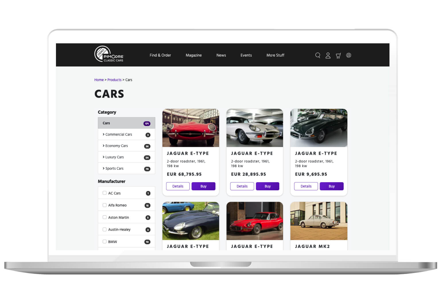
Category on the website has filters on the left and cards on the right. The page contains a title, which we have in bottom navigation, so it’s not necessary to have it in the rest of the screen in the app. Cards are simple, and not many pieces of information are in it.
It is intuitive for the user on the smartphones that cards are clickable.
So, we don’t need the button “Details” which we have on the website. We also removed the “Buy Now” button since we don’t have that option in the app.
On the top of the screen, we made navigation with which the user can easily choose the category of the cars he/she wants. On the website, the user can choose a category in the filters.
We replaced pagination from the website with infinite scroll. That way, the user has only one gesture while seeking for the item he/ she wants. The very similar process goes with the “Parts” section as well.
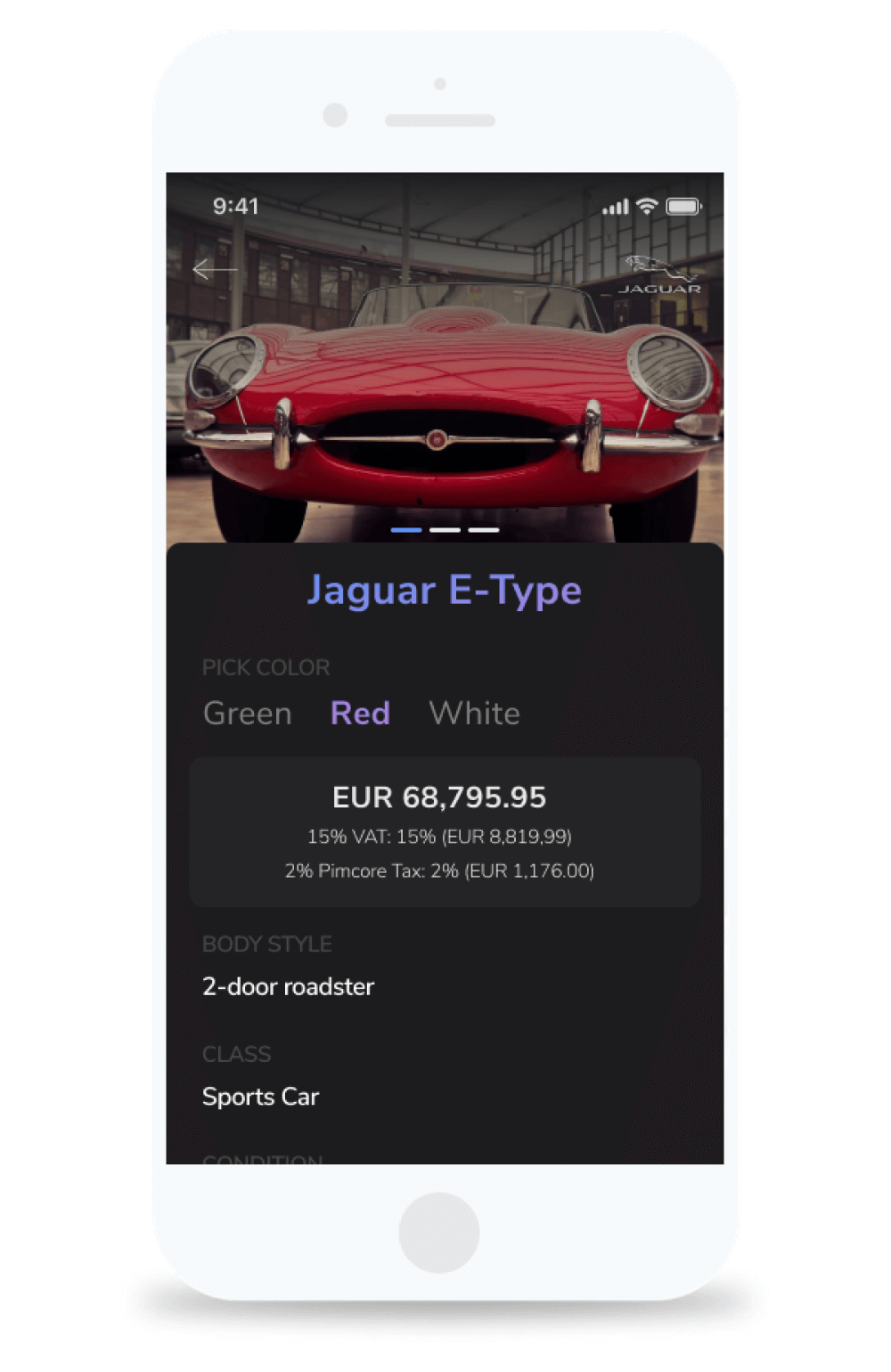
By clicking on one of the cards, a single page/screen of the item has been opened. Single page on the website and mobile app will have similar information because it’s main core is to describe the item as much as possible.
Elements are arranged differently because we followed some common practices in mobile app design. On the web, we can see the common elements of the website, breadcrumbs. They aren’t necessary for the app since we don’t have multi-level navigation (and we should avoid them in apps, remember?).
The last section in the bottom navigation is “News”. News looks different from cars and parts on the website. Pimcore probably wanted to show the different layout that it offers.
We wanted to stay consistent in our app, so we made a similar card for the news as we had in cars and parts.
We did change the size of the card, and instead of two cards in one row, we designed one card per row.
The reason is that, in the case of two cards, the text would be too short. And from a UX perspective, line length shouldn’t be shorter than 45 characters. The line that is too short breaks up words that should be read as a unit.
Single news is also similar to a single item (cars/parts), with different elements (text instead of information about the item).
Here are some useful tips to keep you going
With this post, we wanted to scratch the surface of transforming websites to mobile apps. Of course, it would be so much better if we could write everything about it in one article, but it’s not that simple.
Mobile app design isn’t that simple. There are a lot more cases and so much more details we have to think about when we are making a mobile app based on a website.
But with key differences from a design perspective, and an example of our simple Demo App, we hope we helped you understand the task a little better.
So, before you go, here are some of the tips that we already mentioned:
- throughout the whole design process, think of the purpose of the app
- see what elements of the website are really necessary for the mobile app design. Then, simplify them as much as you can
- exclude all the elements that aren’t common for the mobile app design or modify them
- transform your content, so it follows the platform’s guidelines, but don’t blindly follow guidelines only. Use your branding and make your app unique and recognizable
- use features that website can’t, like GPS, camera and location
- always follow best practices for mobile app design and keep in mind user experience. If you make an intuitive and useful app that users appreciate, you achieve your main purpose as a UX/UI designer.
So, tell us, did you ever transform web design into mobile app design? How was it?
Do you think we didn’t include some important tips in the article?
Please tell us more about it on [email protected].
See the latest updates on our social media channels