Design system series: Inventories of components (examples included)
Hi again – Factory design team here!
Ready to see the final products of every design system (but again, it’s just a beginning)?
Today we are going to show you the first components inside inventories.
With inventories, we finished the journey in making a design system, but again, really, we are just at the beginning.
But before that, we have to clarify how we are dealing with the naming and hierarchy of components.
If you want to find out more about the design system in general and how to start your design system, check out our first blog post in the Design system series.
And if you want to know more about principles in the design system, read our second blog post in the series.
If you wish to skip that for now, let’s dig into inventories.
Factory Naming
Atomic design is a well-known methodology for creating design systems, but it is maybe best known for naming its components.
Basic building blocks are atoms. Combined atoms are molecules, groups of molecules are organisms.
In the end, we have templates (something like a wireframe) and pages (our design).
We used naming in various projects, but we had a problem with organisms, not knowing which part of the screen is an organism exactly, so we started using only atoms and molecules.
When we started the design system, we wanted to make naming more personal, more “Factory”, so we came up with different names for the same methodology.
Here is Factory naming.
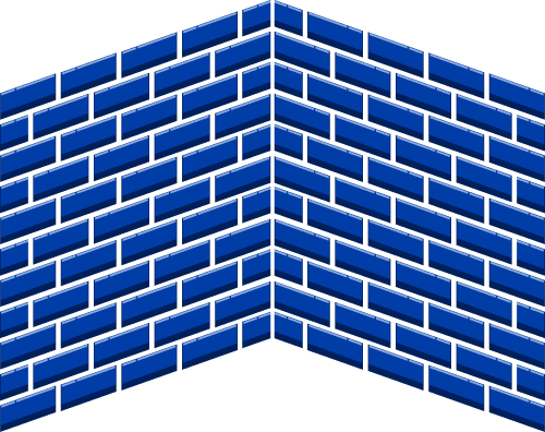
Bricks

Brick is the basic building block.
It is the element that can’t be divided, and in some rare cases, when it can, it can be divided only into two parts (like the case when we have the label and background that make the button).
Project elements that are bricks are buttons, inputs, labels, etc.
Text, illustrations, icons, and background are also bricks.
The right way to write the name of the bricks in the Factory Design System is:
Bricks / Button / Primary.
Walls
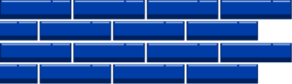
Wall is the building part combined with two or more bricks.
Walls are the foundation of projects and design systems.
Two walls can make one big wall, and we can have one grouped wall of two or more walls in the projects.
Wall is the biggest building part of the one screen of the project (in one room).
The right way to write the name of the walls in Factory Design System is:
Walls / Card / Default.
Room
The room represents screens in projects.
The room is a combination of walls.
One room can be differently set in various situations, and we can have more states of one room (screen).
We won’t use the expression Room in the names of the screen, but define them through numbers.
One room will have one number, and various states will have different numbers next to the number of the room.
The right way to write the name of the rooms in the Factory Design System is:
01.01.00. Home :: Search.
Factory
Factory is a project that is composed of various numbers of rooms.
It represents one version of the design system, which we adjusted according to the client’s wishes, the color palette of the particular project, and its visual identity.
Factory has the name of the project (web page or application).
Factory name can also contain the name of the platform (Web, iOS, Android).
It’s a work in progress. We’ve done some projects naming components like that, but we noticed that sometimes we aren’t sure which component is brick and which is a wall.
We learned that we would get it more exact with more experience, and we already did get the feeling of what some components are.
Again, with the design system, the most important thing is to start. We’ll see the best practices with – practicing!
What is inventory?
“An interface inventory is a comprehensive collection of the bits and pieces that make up your interface.”
- Brad Frost
When we started with the design system, the first task was to take screenshots of similar elements of the interface.
What we got wasn’t a surprise because we were aware of our inconsistencies, but seeing it all on one page was like accepting reality because the proof was undeniable.
Only with buttons, we could see many variations of styles.
Even though the colors are similar, and when you open your app and open one screen with that one button, the button will look good.
But when we put all buttons on one screen, we noticed we have seven border-radius styles, at least two styles of gradient background fill, many different heights of buttons, many different fonts, etc.
Like many other design systems, we decided to make an inventory of components consistent.
The challenge here is that we have multiple projects, not just one. So, we came up with an idea of wireframe look-alike components that have the same functionality and behavior.
We can reuse those components in all projects but change their style (color, border-radius, typography, etc.).
Our inventories don’t have many compoents yet, but we did make the most common ones that make most of the interface.
We will explain how they look now and can be changed on them in every project.
We have Android, iOS, and Web inventories, but we will describe only Android ones because it’s pretty similar, with some size changes.
If we see that a specific component is not suitable for any of the projects, it’s unnecessary to use it, and we can make a custom one.
Mobile inventory
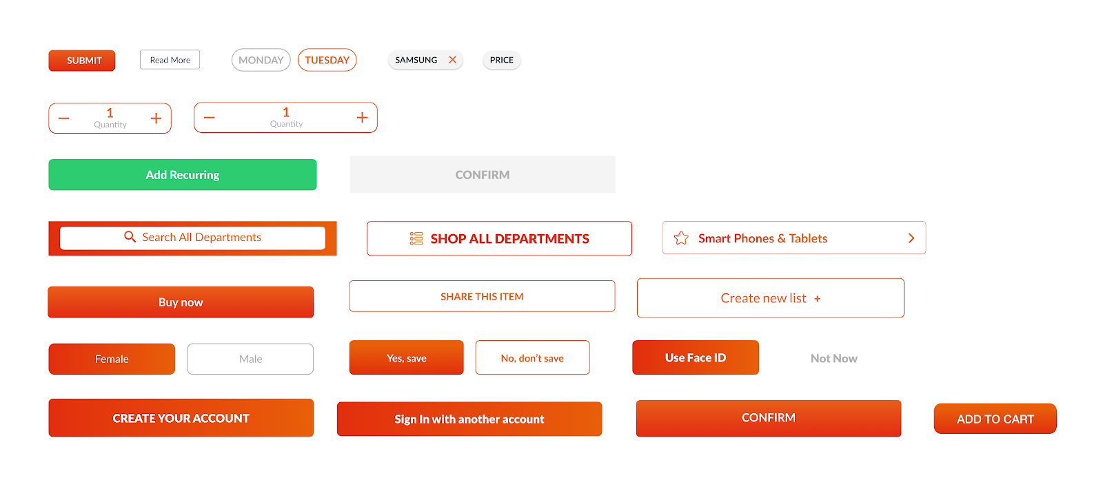
Buttons
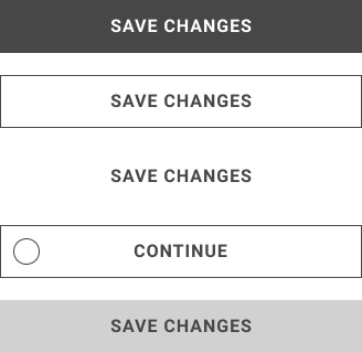
In Figma file, the name of the component is Bricks / Button / Specific state.
The height of the button should always be 48px, and the width should be 100%. Font size should be 16px, and letter spacing 6%.
We have a couple of button states:
- primary button has a fill that in most cases will be the primary color
- the secondary button doesn’t have a fill, but the primary color stroke
- the tertiary button has neither fill nor stroke
- external login button has an icon on the left side
- disabled button is filled with one of our gray colors
If the screen background is gray or has some other color, the secondary and tertiary button can have white fill with shadow.
Buttons can and don’t need to have shadows.
In this component, we can edit the color of the fill, stroke, and text.
We can change the typeface of the text and typeface style (uppercase or lowercase). Changeable parts are also an icon, rounded corners, and a shadow.
Text Input
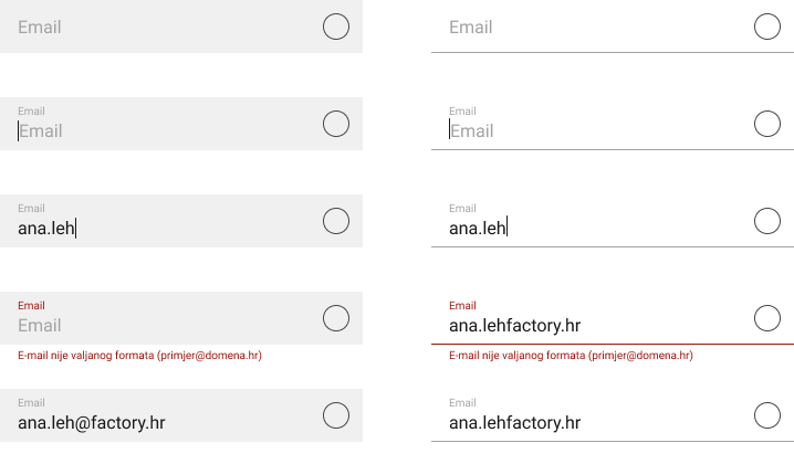
The name of this component is Bricks / Text Field / Specific State.
Width is the same as internal content with defined padding. Big placeholder and input text should be 16px, and small placeholder and error 10px.
Icon size should be about 22px, but with spacing, it is 48px.
Input should always be the same height, so we would still have the same space between elements, with or without error message. On the right, we have a circle, which is space for the button.
We have two styles of text fields, with fill and with the bottom line. Characteristics stay the same, except the border-radius, which we can have in the filled button. Shadows are optional.
In this component, we can change typefaces, indicator color, fill and stroke color, and a line’s color.
We can change the icon and its color, color of any text. Rounded corners and shadows are also applicable and changeable.
Date Input
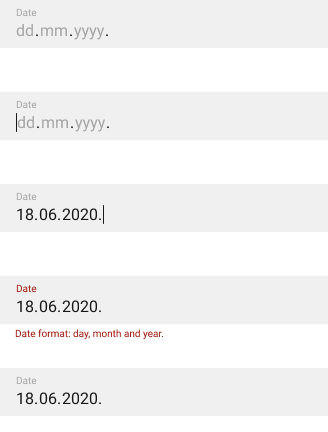
The name of this component is Bricks / Date Input / Specific state.
Characteristics with date inputs are the same as text fields, except for a small placeholder that is always visible.
The date format depends on the country.
Instead of native date pickers, which we had until now, users will type numbers, and we give them a number pad.
The users will write the first value, then we will send them to the second one and after that on the last one.
We show them error the moment we recognize that the number is more significant than it’s allowed.
We should also display error messages if the user types date in the future or year is not allowed (if the user is not 18 years old and must use the app).
Tab Menu
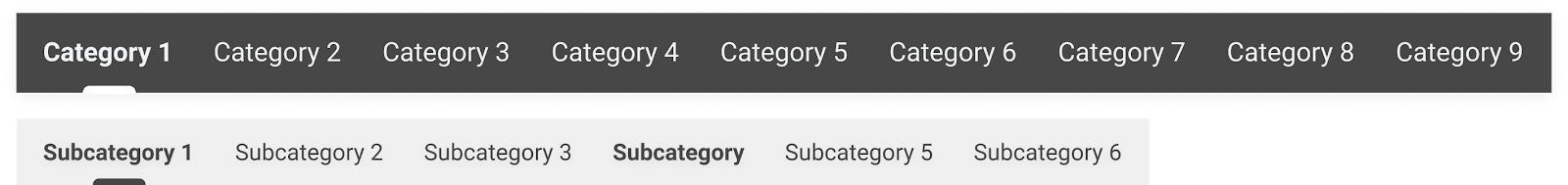
The name of this component is Bricks / Tab Menu / Primary (or Secondary).
The primary tab menu always has to be 48px high and mostly 100% of the screen’s width. The height of the secondary tab menu should be 40px.
The font size of the primary tab menu should be 16px and 14px for the secondary tab menu. Spacing between items should be 24px.
If we have several categories that can fit on the screen, the width should be divided into several categories, and the category should be centered in its space.
Indicators can have different sizes and styles, with a couple of rules; maximum height is 4px, the width can be a little bigger than the text displayed.
Also, the indicator is mostly on the lower border, but sometimes it can be outside the border or in between.
Changeable parts of these components are background fill, text color, typography, indicator style, space between items, shadow.
Web components
Basics
Similar to mobile inventory components, we have created basic components for web design projects.
Buttons and Input fields for various forms are one of them, and as mentioned before, they are created in Figma as blank, wireframe look-ish Bricks and Walls.
We adapt these components to every project individually with specific UI features (borders, brand colors, shadows, etc.)
We assume that you already know that we are a Pimcore development company, but don’t worry if this is not the case.
For this article, you need to know that Pimcore is the only open-source digital experience platform with inbuilt data management and experience management capabilities.
Most importantly, it allows you to create custom-made complex components called bundles and reuse them on all your future projects.
Great, right?!
To this day, we have created a few bundles for web inventory, and some of them are carousels and sliders.
Carousel
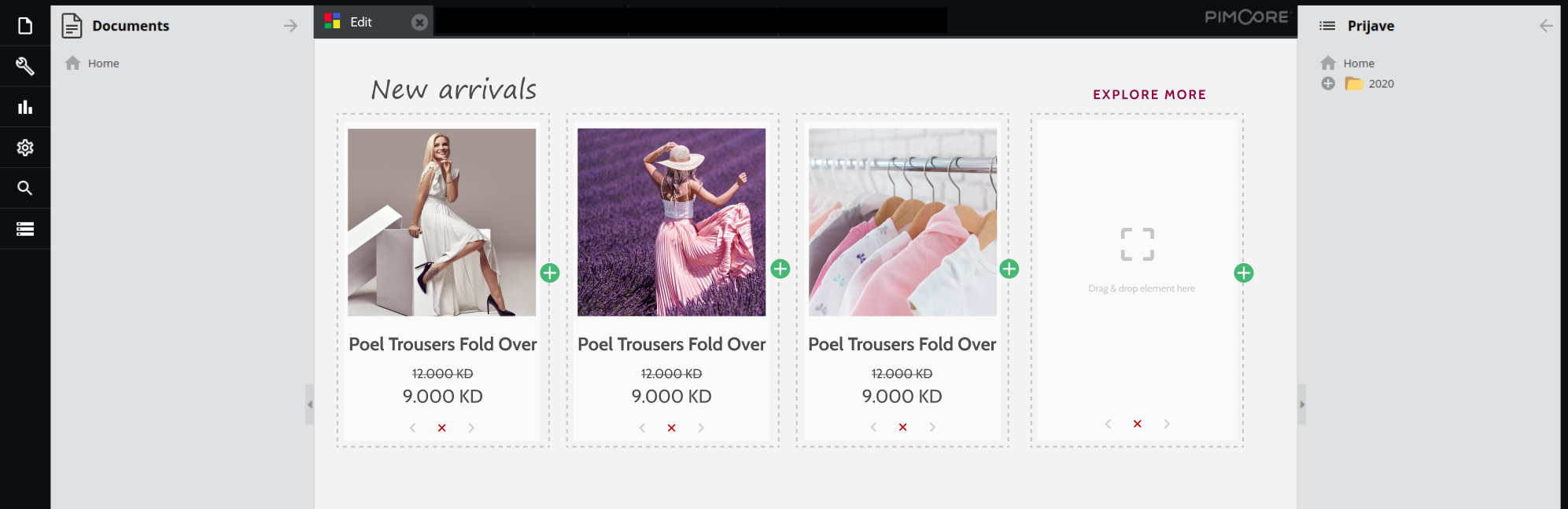
This component’s name varies depending on the content so that it could be Walls / Carousel Blog or Walls / Carousel Products.
Our carousel component consists of a title, a button that leads us to the category page, and an item card.
Each card inside the carousel wall is also a wall consisting of image, title, and needed text for that concrete case.
Card name is, for example, Walls / Product Card. Dimensions are corresponding to the agreed web grid.
Slider
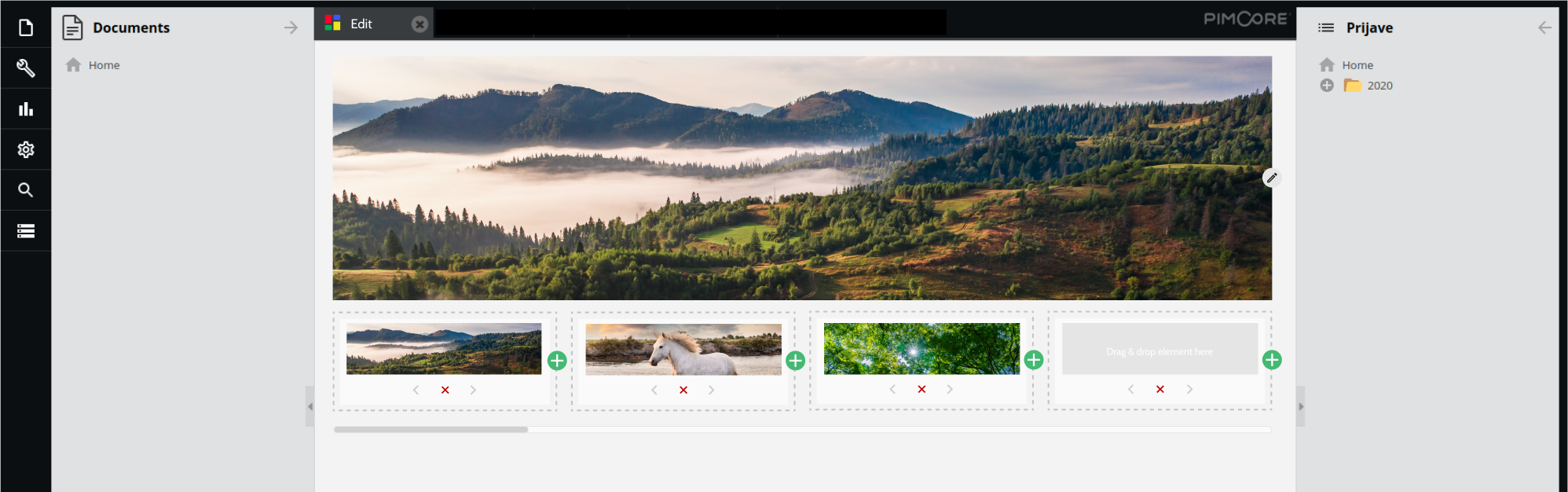
Similar to the carousel, the slider is also a bundle for our Pimcore projects.
The name of this component is, for example, Walls / Slider / Homepage.
It consists of high-resolution photographs or images and navigational elements such as left and right arrows or navigational dots at the bottom.
We can choose animation effects, the maximum number of images, slider height, and other functionalities.
Once implemented, the client can easily add or remove pictures through administration.
Once created, those bundles with all functionalities can be used in all of our future projects on the Pimcore platform, adapting only the design elements saving us time in the development process.
Benefits of inventories
These components aren’t made for the sake of a design system.
We already used them, somewhat different in various projects, and we figured out if we find the best practices for some components, there is no need to change them.
We have these components in our Figma template files and since then, making wireframe is much more comfortable. Also, we used native elements for Android and iOS projects, but in this case, we have ours.
Another significant benefit of these inventories is that we can use them for development as well, and some of our teams already made their libraries with those components.
They will be reusing them in projects, changing the style.
With that, the component looks different in every project, but on the other hand, it is similar, and it has some recognizability with the behavior and practices we used.
With it, we lost some time initially, but in the long term, we saved time, we are more consistent in all projects, as well in every single project individually.
What’s next in our design system story?
As we said a couple of times, the design system isn’t static, and it’s always growing and changing (not too much and too often though, you don’t want to change your components with every project, it would be inconsistent, and your developers won’t be happy).
We have first inventories of components (mentioning only a couple of them in the post).
Also, we’re planning to add more, but not just to make it bigger.
Gradually with time, we’ll see in various projects which components are reusable and we’ll simply continue to follow the best practices.
We are also in the process of making our first Pimcore inventory for Pimcore projects so – wish us luck!
And if you’d like some help with developing your next project – our team can help you a great deal!
Our Pimcore development experts will develop any kind of project your company needs! So, reach out to us, and let’s chat about your ideas!
And in the meantime – check out more of our design-related articles and – see you next time!
See the latest updates on our social media channels