What have we learned in 2019 in the UX/UI design world?
2020 is just around the corner and we are already wondering what new things it will bring for the User experience and User interface world.
But let’s first look back at 2019, which has surprised us with many trends – new, old, and what we thought would never happen again.
We collected our favorite UX/UI design trends to present to you what have we learned and implemented in some of our projects.
Take a look at some of our favorite 2019 UX/UI trends!
Bright, bold colors and gradients
We have come across bright, bold colors and palettes before, and they seem to be gaining in popularity. Bright colors are everywhere – from wallpapers, illustrations, photos, gradients, and animations.
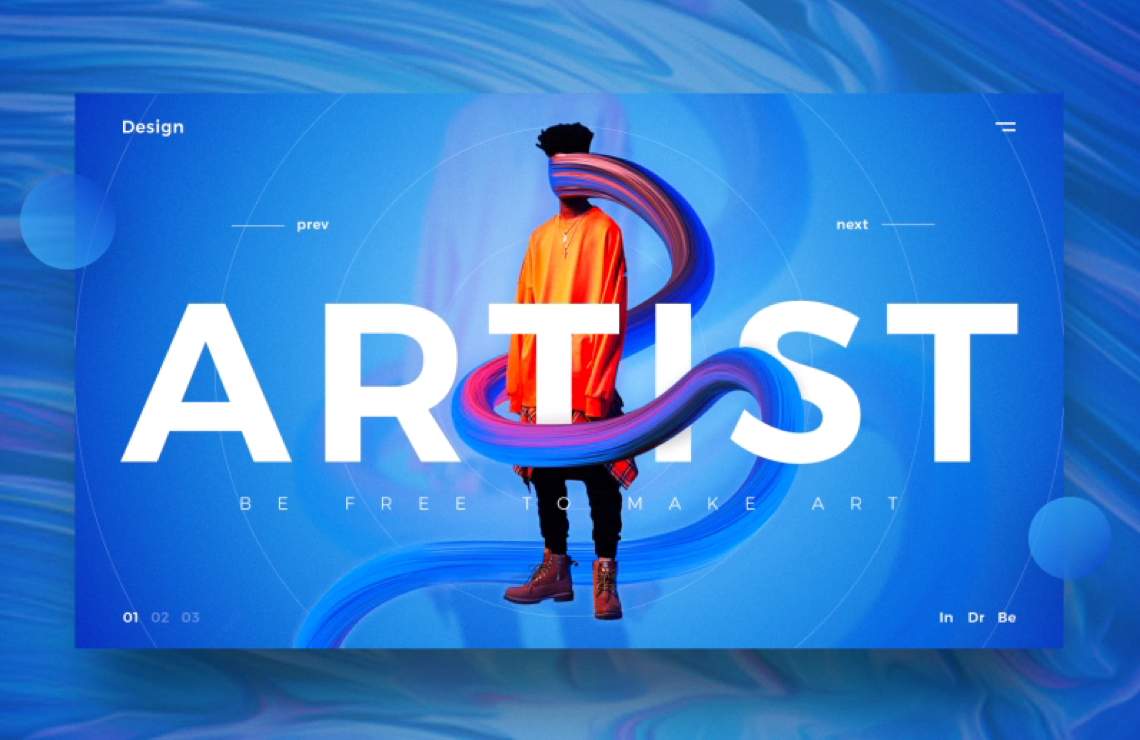
The gradient, which was thought to be outdated, is being used more and more often in combination with light, bold colors and makes the design modern, fresh, playful, positive and eye-catching. It looks like this trend will stick around for a while and we don’t mind.
Typography in UX/UI design
We have noticed an increase in the popularity of using large, bold, san serif fonts over the past few years that have characterized almost every page. As soon as we open a page – BAM – big clean headlines that first come to mind. In addition to being such a grateful font for screen reading, it looks great and will certainly still linger on pages and applications.
But 2019 has brought a real refresh – the use of serif vintage decorative fonts.
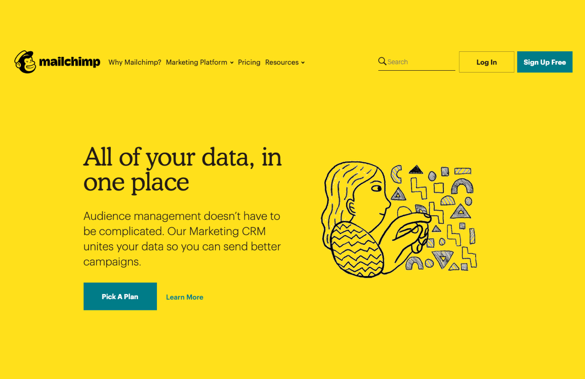
The famous Mailchimp brand has chosen just such a font to decorate its vibrant design. Maybe for the reason that he acts warm, personal, friendly and knowledgeable.
What can we conclude? As a brand, you need to think about who you are, what kind of message and feeling you want to convey to your audience and then decide on such a design. You may not need to choose the current design trend but the one that best suits your brand and customers.
Dark themes
Our team really loves dark themes – we think they are relaxing on the eyes, easy to read content on, look powerful, elegant and therefore act completely differently on the UX.
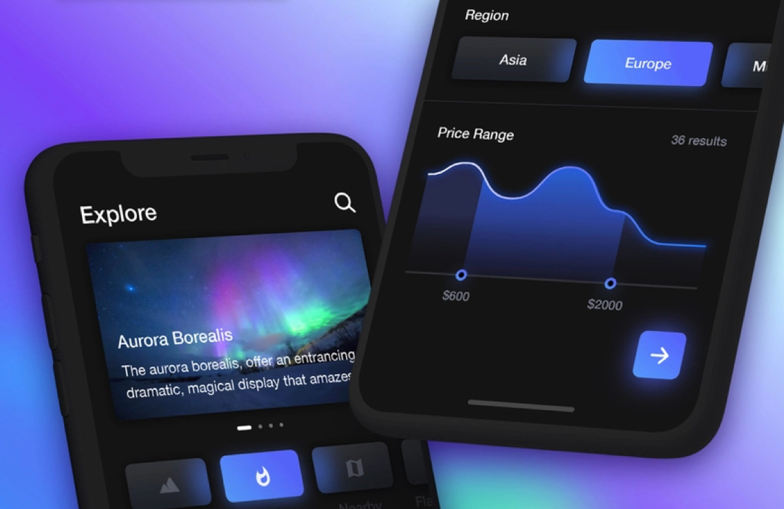
There is some comfort in using dark themes on our devices that we feel more than using a bright theme and we think this is just the beginning of dark themes and will appear more and more frequently in design.
Also, we noticed that dark themes are great for interfaces that require fast reading or scanning. Especially when we work on some financial or analytical tools; the dark theme can be a perfect solution to scan all needed information and quickly understand the situation.
Minimalism in UX/UI design
One of the main benefits we see in minimalism UX/UI design is in the loading time of the website and in better compatibility on all sizes of devices. Combined with great usability, it’s some kind of jackpot for clients!
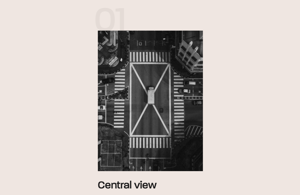
Minimalism is a classic, timeless design trend that is already known to everyone. It is characterized by whitespace, few elements and text, modern, interesting photographs, clean typography, and through 2019 as part of minimalist pages, we could see the animations and effects that appear when scrolling and make the design even more attractive and modern.
Scrolling becomes smooth and elements like photos, illustrations, geometric shapes get effects.
Micro-interactions
Micro-interactions are still an important design trend and people love them.
They can make your design-friendly, engaging, dynamic, they can positively surprise the user and make it easier for them to understand the use of the site or application.
Micro-interactions are increasing in number, but let’s remember the known ones: swipe, data input, current system status, call to action, tutorials with the help of micro-interaction, animated buttons. We think micro-interactions make the user experience better and if we can fit them into the design – we always do it!
Emotion in UX/UI design
The design we do communicates, conveys a specific message and tone. With the design, we connect emotionally with customers.
According to Design Slack, emotional connections fall into four basics categories: joy and sadness, trust and disgust, fear and anger, and surprise and anticipation. The visual elements should be accompanied by the message we want to convey to the users.
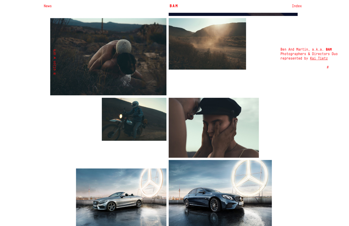
For example, if we are designing for a clothing webshop for the younger population – we will use modern, fresh and high-quality photos and videos of young, smiling, energetic people who are dressed in those clothes and tell us they are happy and satisfied.
The design should impress the user, elicit a reaction and make him / her return to the page or app.
The year 2019 brought many emotional designs that achieved excellent communication with customers and if we want to stand out in the market, communicating emotionally through design will be a necessity, not just a trend.
Purposeful animations
2019 is the year of animations, but these animations must have a purpose in the design you are doing by telling users the story, explaining to them where they came, and what to do next on your page or app. With super animation you can help, intrigue, entertain, surprise and connect with the user. The use of animation has a positive impact on the user experience as well as micro-interactions.
UX writing
Content is an integral part of every page/app and we want to convey a quality, simple and meaningful message to our users. In addition to the visual elements, we must attract, interest and retain them with content, and link them to the product or service we offer.
In order to do this, we need to know our users, or what kind of users we are addressing – the younger or older population, business people, parents or retirees. We also need to be aware of how people read content and how long they can concentrate on reading.
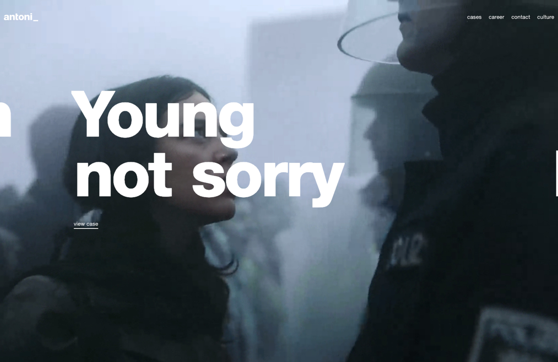
UX writing is a very important and challenging part of the design that, although it may seem easy, can be quite tricky.
Skeleton screens
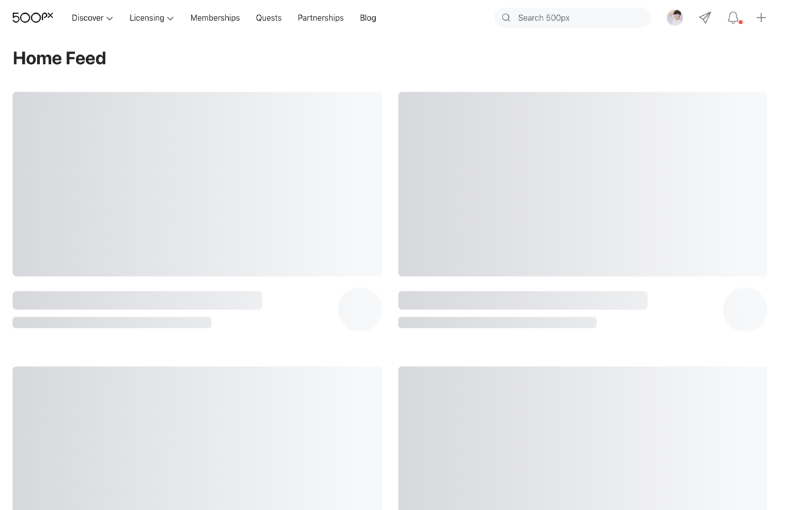
Although skeleton screens are no longer such a new trend, we can see that they are increasingly used and look better. They give users a sense of smooth operation and fluid, and they make your project fast.
3D graphics in UX/UI design
The 3D trend is a significant trend that marked 2019. The possibilities of this trend are endless, and thanks to new technologies, designers are improvising and creating a real and unreal world of surreal dimensions that adorn pages as the main visual element. 3D also included typography whose creation has no rules.
We think this is the beginning of the masterpieces that designers are creating, and that in the future we will see more beautiful 3D visuals.
Natural-looking photos
The era of stock photography is coming to an end. Yeah, finally!
Photos, where people are perfectly positioned, smiling and posing while doing a particular action, are no longer in use.
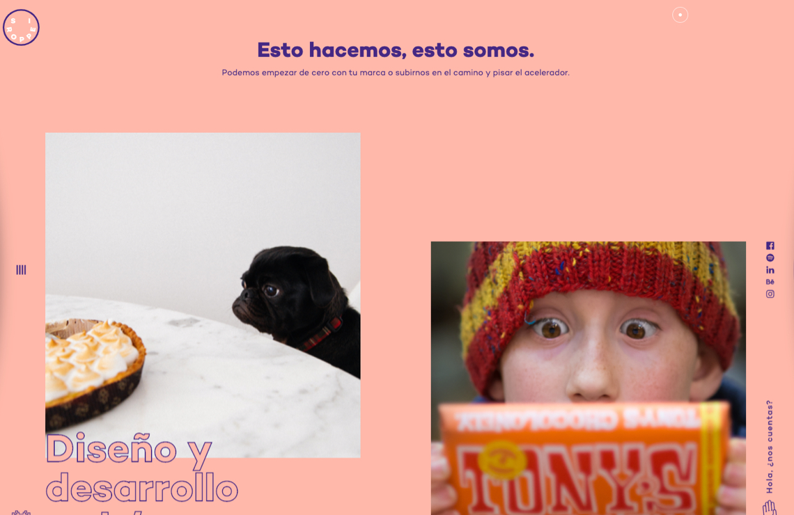
Designers are looking for photos that are natural and relaxed with real people and situations. Quality cameras and lenses are accessible to more and more people who capture fascinating, diverse and colorful moments from the world around them.
Such photographs cannot be compared to stock photographs that were once in use. They are modern and close to the people, attractive to the eye and accessible to designers.
Custom made illustrations
Illustrations are a huge trend that has emerged over the last few years and is getting bigger and better and taking over the web industry. Colorful custom made illustrations in bold colors can highlight your project and present it perhaps better than photos.
Custom illustrations can look incredibly good and are always a great choice for a landing page or a whole website. This is a trend we want to see in implementation for a long time.
We really enjoyed these new and evergreen UX/UI design trends in 2019!
Illustrations, colors and gradients, typography, photos, and animations have never been better or more interesting!
There are many websites and app design trends that have prevailed in 2019. For some of them, we can be sure that they will still hold on, and for some, it may already feel like they are shutting down.
If you’d like to do some further reading, Toptal made an excellent post on the topic of how to hire a great UI designer. They explained the differences between UX and UI and some key challenges of an UI designer so – check it out!
In any case, the trends are unpredictable, they come back, they are born or they are lost, but they certainly progress every day and make the design more interesting, enjoyable and more humane. We are thrilled with the trends in 2019 and can’t wait to see what is coming in 2020.


