Ultimate list of eCommerce website features
Thanks to the ever-increasing number of online shoppers, an eCommerce website has become a very powerful channel for online businesses.
In the USA only, there are already more than 1.3 million registered eCommerce companies.
But not all of them are successful.
For your eCommerce website to be successful, it needs to work outstanding and look outstanding.
To make sure your eCommerce website looks outstanding it needs to have a specific set of features.
Which features, you might ask. That’s exactly what we’ll tell you in this article.
So let’s see how we can help you prepare better for your next meeting with an eCommerce development agency and get you on the right track. By the way, if you’re looking for an eCommerce development company – reach out to us, we’re more than happy to help!
We’re working on one of the newest platforms available today – Pimcore. We’re a professional Pimcore development company and a certified Pimcore Gold partner, so we can guarantee you the highest quality of your project.
Why do you even need to have an eCommerce website?
Well, according to Statista, by 2021 there will be more than 2 billion people online using eCommerce websites.
If there ever was a time for you to start your online business and open your eCommerce website – it is now.
Over the course of the past few years, we have witnessed a rapid growth in the eCommerce industry.
Research conducted by Statista states that global eCommerce companies revenue is predicted to reach more than 6.5 trillion dollars by 2022.
You sure don’t want to miss this opportunity. There are plenty of advantages of eCommerce to both businesses and customers so if you’re not fully familiar with them, we strongly recommend that you check out our article on the benefits of eCommerce for businesses and customers.
Nevertheless, there are some terms every eCommerce website owner should be familiar with and we’ll go through them in this article, so keep reading!
Homepage
Homepage of an eCommerce website is one of the most important pages. Usually, it’s the primary landing page for direct traffic, because the majority of users just type in the domain name and not the whole URL.
It needs to perform a certain amount of tasks. It should provide the users with information such as the purpose of the website and pave the way for them to use the website as easy as possible.
Now, let’s see what makes a remarkable homepage. There are many features that an eCommerce website should have on its homepage, so keep reading.
Language option
Having several language options on an eCommerce website has become a trend. For every language option you add to your store, you increase the number of potential customers.
Many shoppers don’t feel comfortable buying from websites that don’t operate in their native language.
Besides that, multilingual eCommerce websites have an advantage when it comes to SEO. It’s easier for them to rank for keywords in other languages, thus driving more traffic to the website.
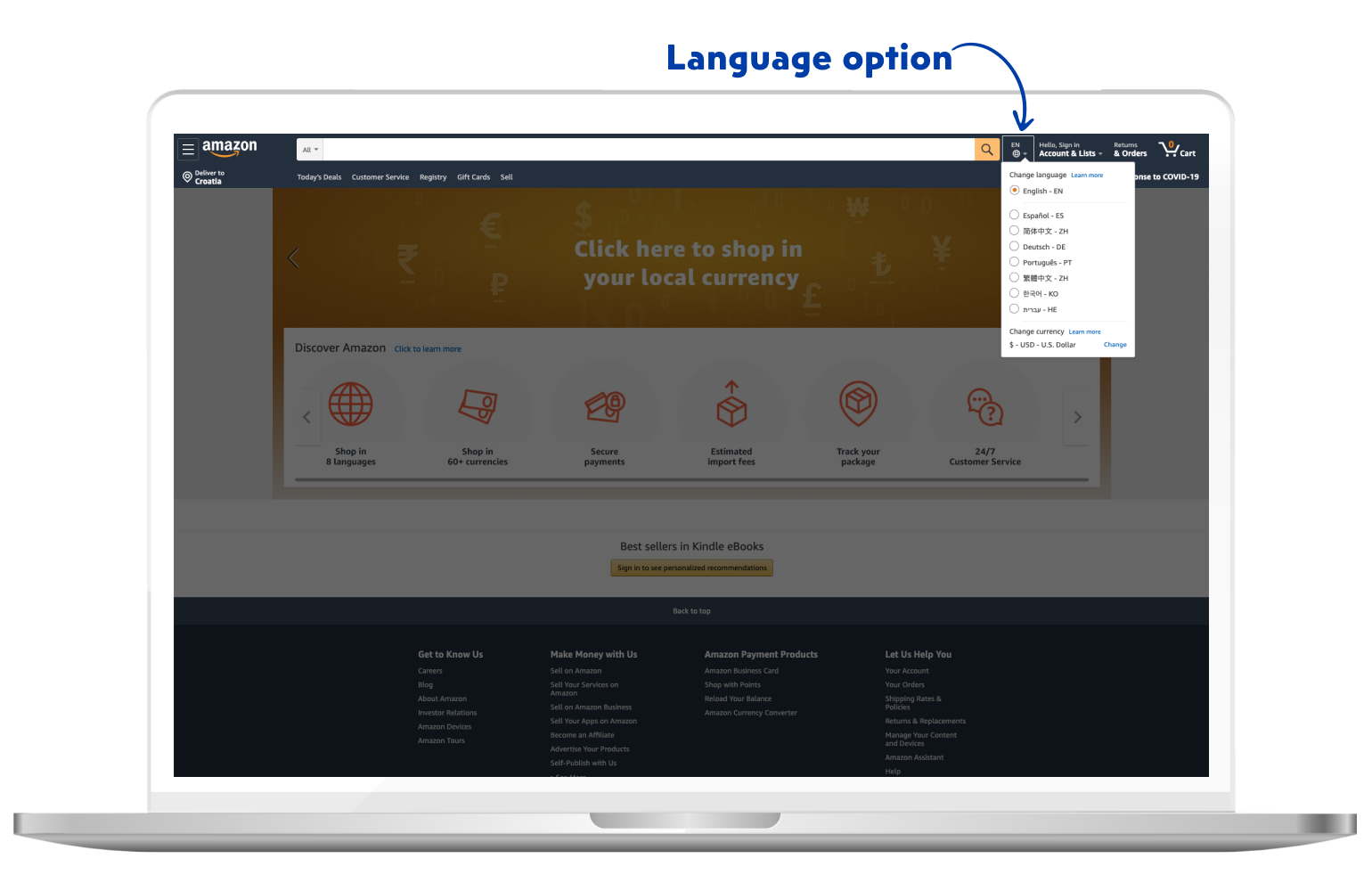
As seen on the image above, Amazon features its website in several different languages.
Logo
In essence, your logo summarizes what your brand is about. With the right usage of colours and a great design, you can create an excellent impression on your customers – right from the start.
Here are some things you should pay attention to when designing the logo for your eCommerce website:
- Place the logo on the top left corner of your website. That section is the most visible and instantly draws attention.
- Your logo should always be placed above the text or alongside the text.
- Make sure to include your brand’s tagline below the logo (if your brand has a tagline)
- Don’t be afraid to change the version of your logo when you’re including it on other pages of your website (speaking of size and placement)
- Don’t place a lot of images near your logo as it may distract the reader
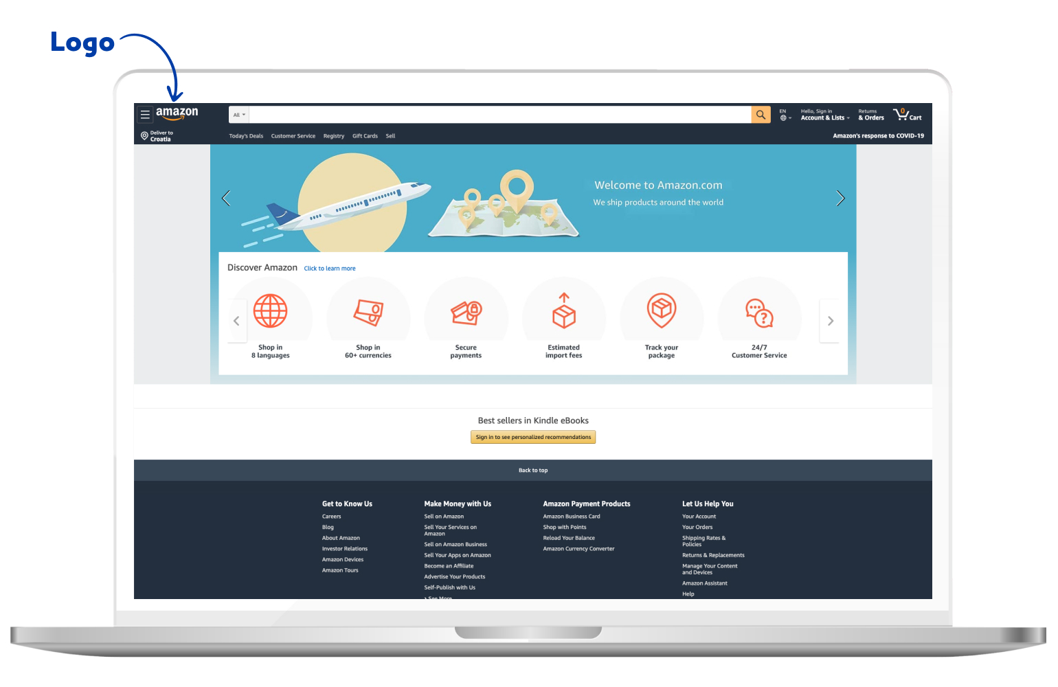
Also, Amazon features its logo on every page of their website, reassuring its customers of the authenticity and safety while shopping on their website.
Navigation
Navigation is an extremely important part of your eCommerce website, but still gets overlooked often.
Your main goal concerning navigation is to ensure that your customers have a smooth, friction-free experience while navigating through your eCommerce website.
Here are 4 best practices on improving your navigation:
- Design a logical and relevant homepage
The homepage should tell your customers very clearly what your website is about. It should be simple and straightforward and your customers need to know what you’re offering without too much scrolling.
- Include specific categories in your primary navigation
By doing this, you’re making it easier for customers. It will take fewer steps for them to get to the desired product. They should be able to see what exactly can they find on your eCommerce website without excessive searching.
- Don’t use too many categories, or too few
If you have too few categories, customers will often need to jump from one category to another. If you have too many categories, customers will be overwhelmed with a large amount of categories.
Try to find a “sweet spot”. It makes sense that if you have 20 categories, it won’t do you well. It’s the same if you have 2 categories. In both scenarios, the user experience will drop significantly.
- Use Cookie retargeting
Today, personalization is everything. Essentially, cookies track your customers’ behaviour and enable you to target them with personalized content.
ASOS does this exceptionally well. In first, if you’re checking out the “men” section of their eCommerce website, you leave your cookies ASOS catches that information.
The next time you visit ASOS, it will automatically redirect you to the “men” section of their website, automatically shortening the time needed to get to the desired product.
Loyalty program
Loyalty programs have been around for a while. They are an excellent way to collect user information and information on their buying habits. And for rewarding the customers – of course.
Many brands have increased their sales just by implementing loyalty programs. It shows it’s a good way to improve relationships with your customers.
Furthermore, mentioning terms like reward points and special offers may encourage customers to shop, considering they get rewarded for it.
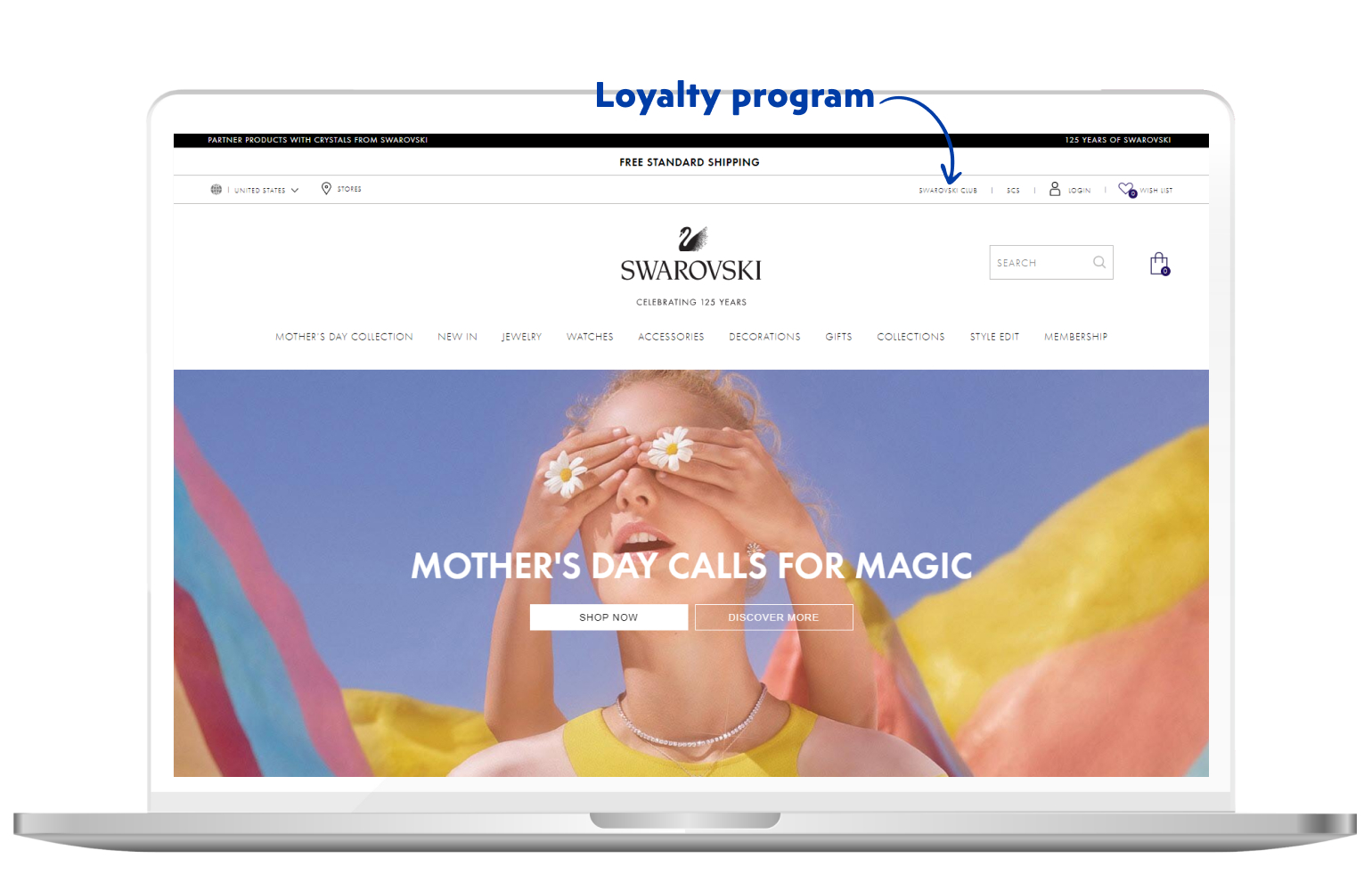
Swarovski has a loyalty program called “Swarovski club”. The participants are divided into several categories, with each higher category bringing more benefits to the customer. That way, they are encouraging their loyal customers to take extra action and reap the benefits of Swarovski club.
Nowadays, loyalty apps are a huge hit. Even though we’re focusing on the eCommerce websites in this article, be no stranger to mobile loyalty apps.
Starbucks puts a great example of utilizing loyalty apps. It may not be devoted fully to eCommerce, but they did see an insane increase in mobile transactions – despite the lowered growth rate.
They disbanded the “card only” loyalty program and focused on using the app. On top of that, they do have a loyalty card – the Gold Card. It’s a reward for those customers who earn a certain amount of points and they get to show off their loyalty in the form of the Gold Card.
It represents more than just a reward for loyalty, it’s somewhat of a status symbol amongst Starbucks customers.
Of course, one does not need to have a loyalty app in order to establish a loyalty program. You can incorporate it into your eCommerce website. It will take some more time and money to get it done right – but it pays out in the long run.
Login and registration
For shoppers who create an account on your eCommerce website, it’s much easier to provide a unified shopping experience.
Account creation is voluntary, so it’s a good practice to show them the benefits of creating an account on your eCommerce site.
To make the login and registration as accessible as possible, place it on the top bar. That section of your homepage gets the most views and it’s easier to capture your customers’ attention.
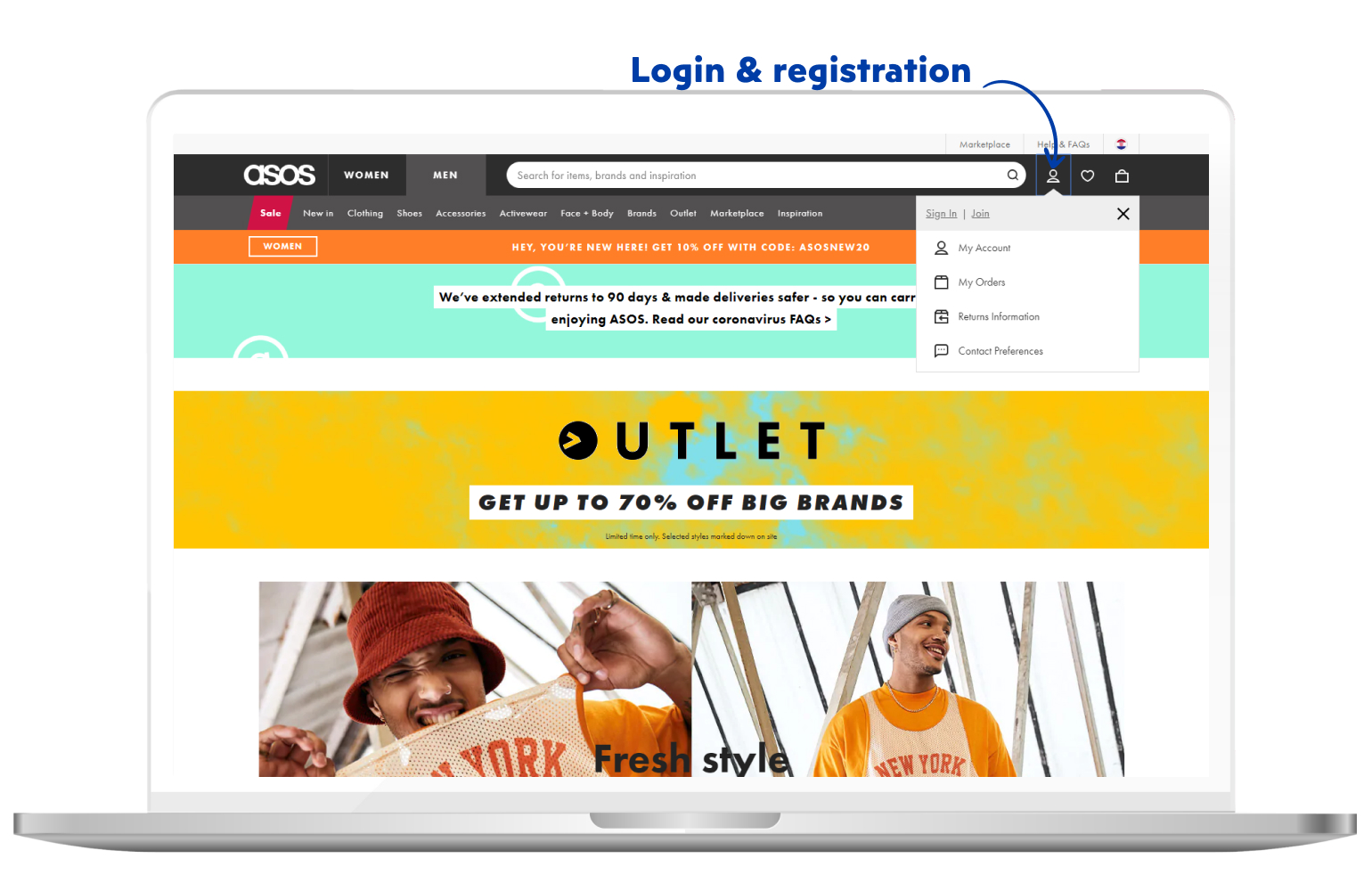
ASOS does a great job with their login and registration feature. It’s simple and intuitive, offering only the most important information.
Search bar
The search bar is one of the most basic features of every eCommerce website, yet still gets overlooked on many occasions.
Improving your site search may massively improve your conversion rates and potentially lead to higher customer satisfaction.
The search bar itself is only the start of the search journey. It’s a good practice to put the text inside the box, such as “enter your query” or simply “search”.
Another useful feature worth implementing in your search bar is autocomplete.
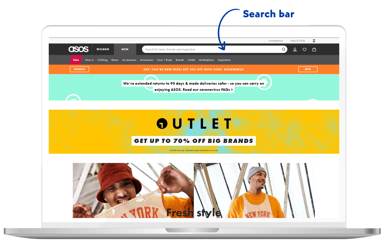
ASOS again poses as an excellent example. In their search bar, they are recommending which type of queries should the customer search for.
By applying the autocomplete feature, you improve the customers’ search experience by reducing the work they need to do. As your customers type in the search bar, it would be good to show them suggested products based on their entered query.
Unique value proposition (UVP)
The unique value proposition is the part that tells your customers why they should buy from you and not the competitor.
The importance of UVP is clear. It’s crucial to seal your potential customers’ shopping decision. It’s not necessary to place them on every page of your website, but it should be present throughout your eCommerce website.
When trying to find a UVP, try to look at it from the customers’ perspective:
- Think about the product presentation from their point of view
- Find out what’s really important to them
- Find out why should they buy from you and not the competitors
When creating a UVP, consider that it needs to be unique, it needs to capture the attention of your customers and needs to be difficult to copy or imitate.
An example of UVP is:
“We deliver the packages the next day from your order. If by any chance, you don’t receive the package the next day – you do not pay the shipping cost anymore!”
By creating an impactful UVP, you’ll more easily place yourself above the competition.
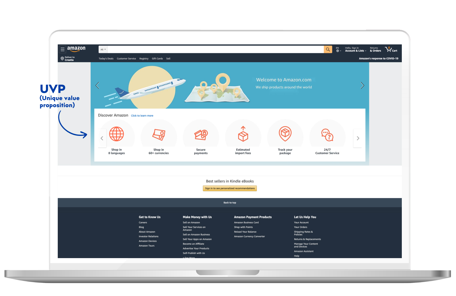
Amazon shows their UVP on the homepage. It’s a good practice of using UVPs on the homepage, as it may reassure the customers to continue shopping on that website in particular. Some of the most powerful benefits are named, such as 24/7 customer service, shopping in various countries, secure payments and package tracking.
Shopping cart
According to BigCommerce, shopping cart in eCommerce stands for a piece of software that simplifies the purchasing process.
The shopping cart accepts payments and distributes the purchase information to the retailer, payment provided and other third parties.
We can say that an eCommerce shopping cart is very similar to the one we use in the grocery stores. The difference is that this shopping cart has way more tasks to fulfil. It plays the role of the shelves, the building, the cash register and often the debit/credit card machine sending information back to the bank.
It’s a good practice to simplify them as much as possible. Don’t use any distractions, as it may divert your customers’ attention from the actual shopping and delay the whole shopping process.
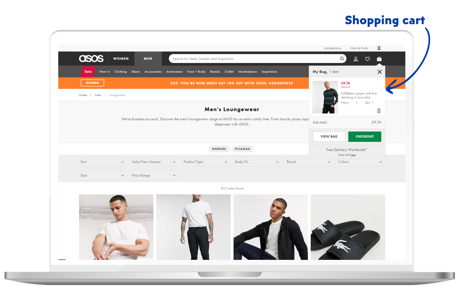
ASOS shows a great example of using the shopping cart. It’s shown without redirecting to another page, thus making shopping an even easier process. CTA buttons are clearly visible and the color of checkout CTA is extremely different than the usual colours on the website.
Risk reducers
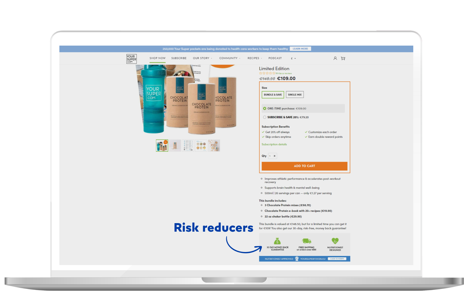
Risk reducers are elements on your eCommerce website which give your customers peace of mind.
Some examples of risk reducers are:
- Lowest price guarantee
- No questions asked return policy
- 30-day full refund policy
Make sure to highlight them next to an extremely important part of your page, such as “add to cart” button. You can also mention “free shipping”, but it’s become so common the many customers take it for granted.
That’s why you always need to have something a little bit more unique.
Call To Action (CTA)
In essence, CTA is a direction you give your eCommerce website visitors in order to convert them to your customers.
Customers often search for CTA buttons, in hopes to know more about what’s the next step they need to take. If you present your products or pages without a clear CTA – you won’t see great results.
Therefore, every time you want your customers to take a certain action, just say what they need to do. If you want them to buy, you could write “buy now”. If you want them to read your article, it’s useful to say “read the article”, and so on.
CTAs come in many different variations.
Let’s say your user visited the product page and he’s not quite sure about buying immediately. It would be a good idea to point out the “add to wishlist” CTA button, as they will surely appreciate the fact that you’re taking care of them and their future decisions.
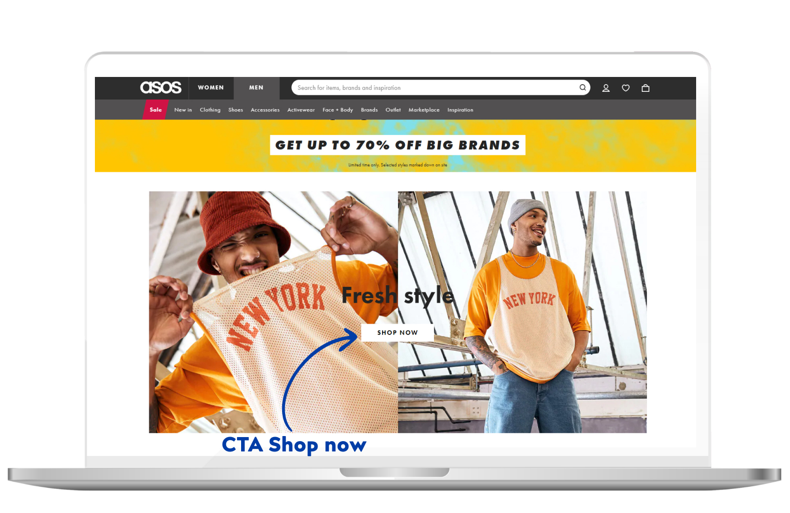
Some basic CTA buttons in eCommerce are “Add to cart”, “Contact us” and “Buy now”. ASOS makes their initial CTA very clear, showing it directly on their homepage, right after the customer enters the site.
It all depends on what action you want your customers to take, but essentially it all comes down to purchasing.
Featured products
Featured products are products with a specific attribute from the administrative UI. They are usually grouped together under the attributes such as “best value”, “on sale”, “trending products”, and so on.
Featuring products on your eCommerce website homepage will immediately attract your customers to those specific products, as the majority of your customers will almost always visit the homepage before taking any additional steps.
Featuring them on the homepage will make them even more attractive to your customers and will most likely boost sales of your featured products.
This thesis has been proved countless times, so without a doubt, we can say that it’s an excellent practice.
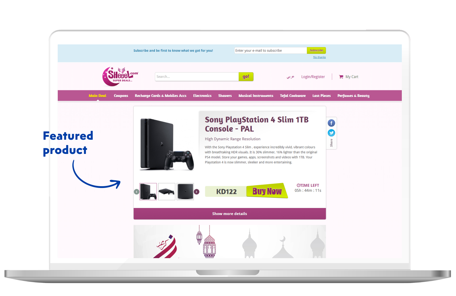
As seen on the image above, Sheeel focuses their customers’ attention on one featured product, making it appealing to the customers. Featured products are usually “high-ticket” products, raking in more profit per product sold.
Text content
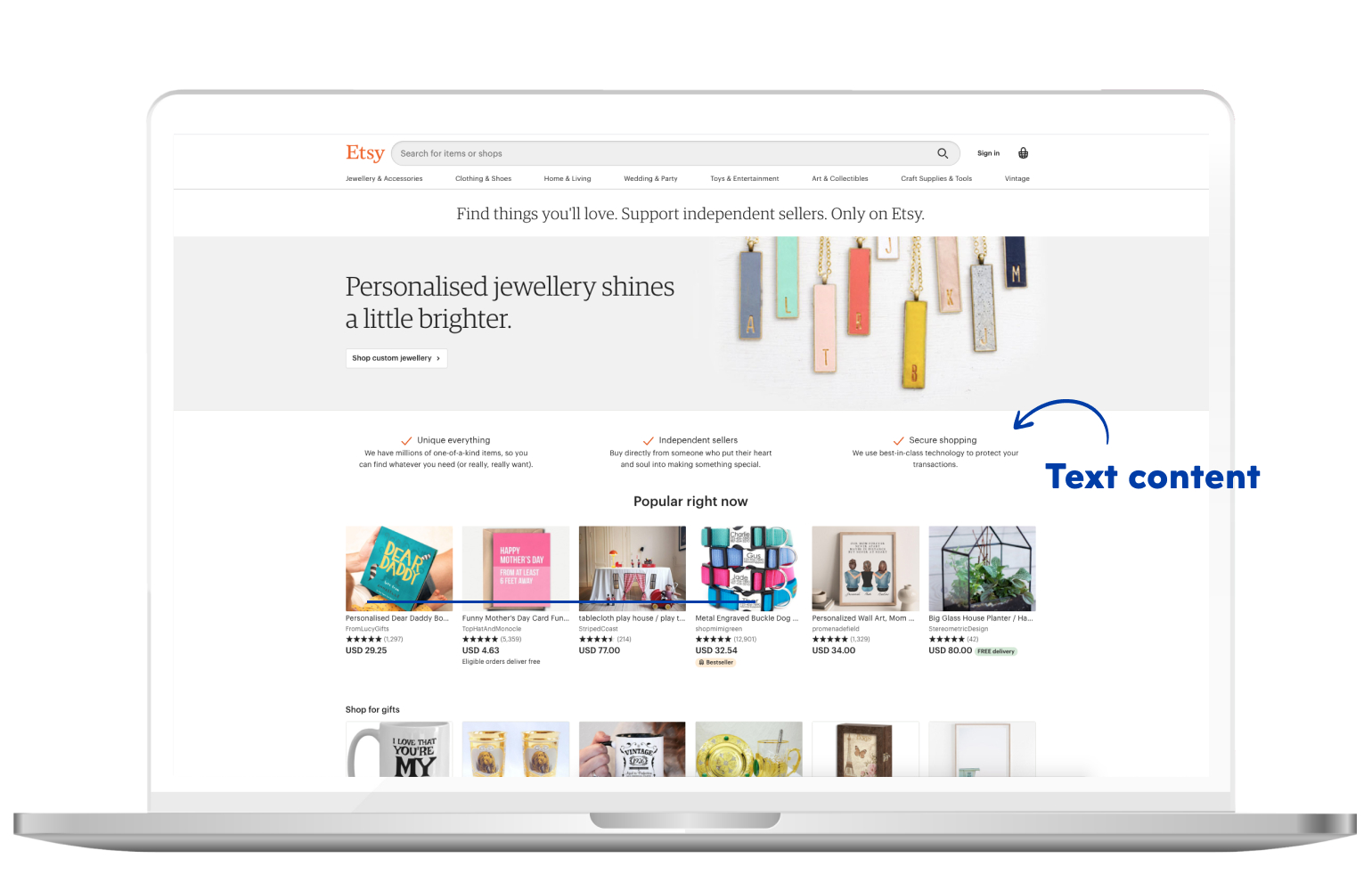
When it comes to text content on your homepage, it’s good to consider it as the first page of a book. It should be well-written and engaging, urging readers to read on.
Now, how much text do you need to have on your homepage? There is no exact number of words needed, but for the sake of SEO, a minimum of 300 words if necessary.
The text content is actually one of the most important segments of your eCommerce website. A good copy can get you far.
So let’s see what kind of text content you may have on your website (we’ll go through some of them in-depth later in the article):
- Heading – short and engaging, not more than 8-9 words
- Call to action – tells the customer what to do, contains a heading and a short text up to 50 words
- Testimonials – they demonstrate the opinions of your customers on your products/services, usually up to 100 words
- Product summary – summarizes your main product categories. It ensures your customers that they’re opening the entering the right category. Usually, they’re up to 30 words.
- Resources – if your customers still aren’t ready to decide on their next purchase, you can point them to additional resources, such as blogs.
- UVP – we spoke more about them earlier in the article, usually, they’re about 30-100 words. Make sure it’s unique indeed.
Newsletter
Newsletters consist of product-focused content that, in this case, eCommerce companies send through their email to their newsletter subscribers.
Through newsletters, you can inform your customers on company-wide updates, promote your new products and provide them with additional resources.
You can use the newsletter to share tips and suggestions to your customers, along with personalized product recommendations. It will improve your customers’ overall experience and better your customer relationship.
Not to mention you can position yourself as a niche-leader by providing the best possible customer experience. Take a look at your competitors’ newsletters, see what they’re doing and then do it even better.
It’s the same with SEO and ranking your article as number 1 on the search results page. You need to see how does the article on the top position look like, what kind of content does it contain and how they’re delivering the content.
When you have a grasp on the topic, you try writing an even better article. And that’s it. The whole essence of eCommerce – providing as much value as possible.
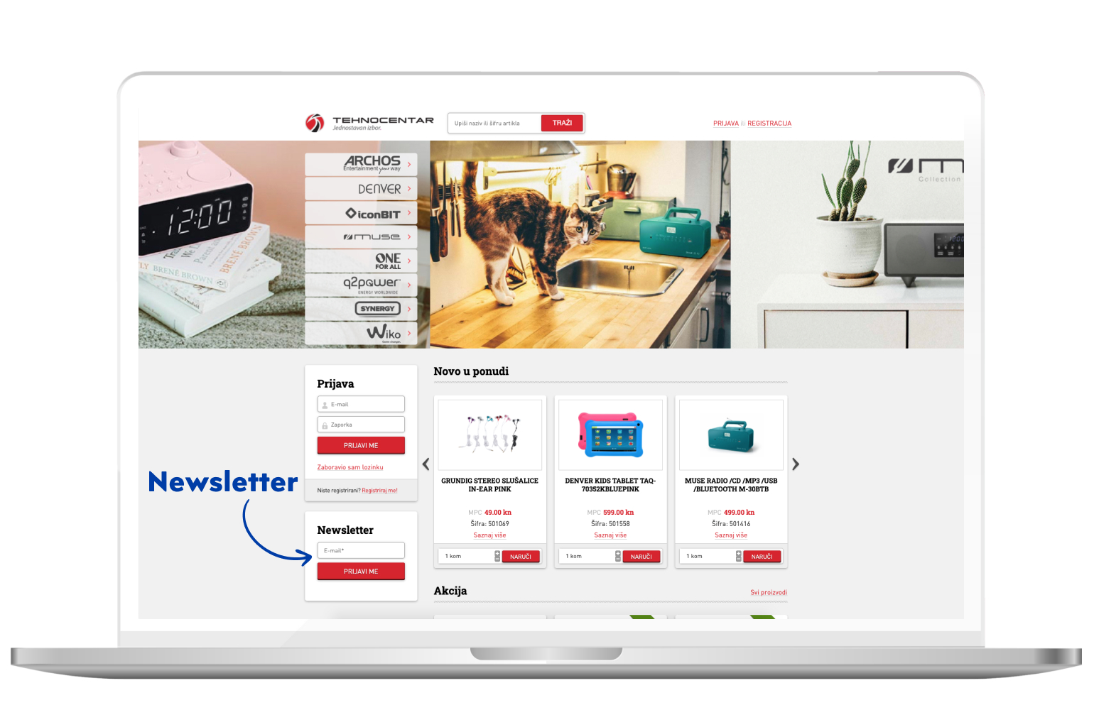
Our client, Tehnocentar, displays their newsletter on the sidebar, that way continuously capturing their customers’ attention and redirecting them to the newsletter.
Newsletters are something that needs to be of high-value. Your customers are already subscribed to tons of newsletters and you need to give them a reason to subscribe to yours. And after that, you need to ensure that they’re still here, still reading and reacting to your newsletters.
Usually, the newsletter subscription box is placed either on the top of the website or on the bottom, also known as the footer. In most cases, it’s placed in the footer of the page.
About us page
Firstly, “about us” pages are very popular with new eCommerce website visitors. Today, customers don’t care only about your products and services. They want to know who is behind the brand and that does the business stand for.
Furthermore, they help you show your customers why you’re unique. It’s a perfect opportunity to stand out amongst your competitors.
Also, if the visitors have been through similar situations, they’ll often connect with you and be instantly more attracted to your brand story.
Lastly, “about us” page solidifies your brand image. It’s a great way to state exactly what your brand is and what do you want it to look like.
FAQ page
An FAQ page is a page which contains answers to the frequently asked questions, received from the customers’ end.
By answering the questions upfront and relieving your customers of some of their most common concerns, you can massively increase your customers’ satisfaction levels and the amount of trust they put in your business.
Reducing the number of customer queries and complaints is also one of the benefits of having an FAQ page.
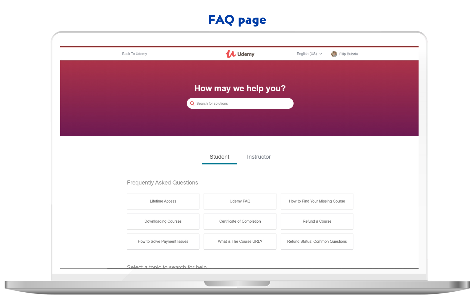
Furthermore, it improves the SEO of your eCommerce website. Questions and answers on the FAQ pages are quite specific and tend to be really popular amongst customers. If you answer all of these questions, you have a chance of improving the visibility of your eCommerce website on the search engine results page.
Terms & Conditions, Privacy policy
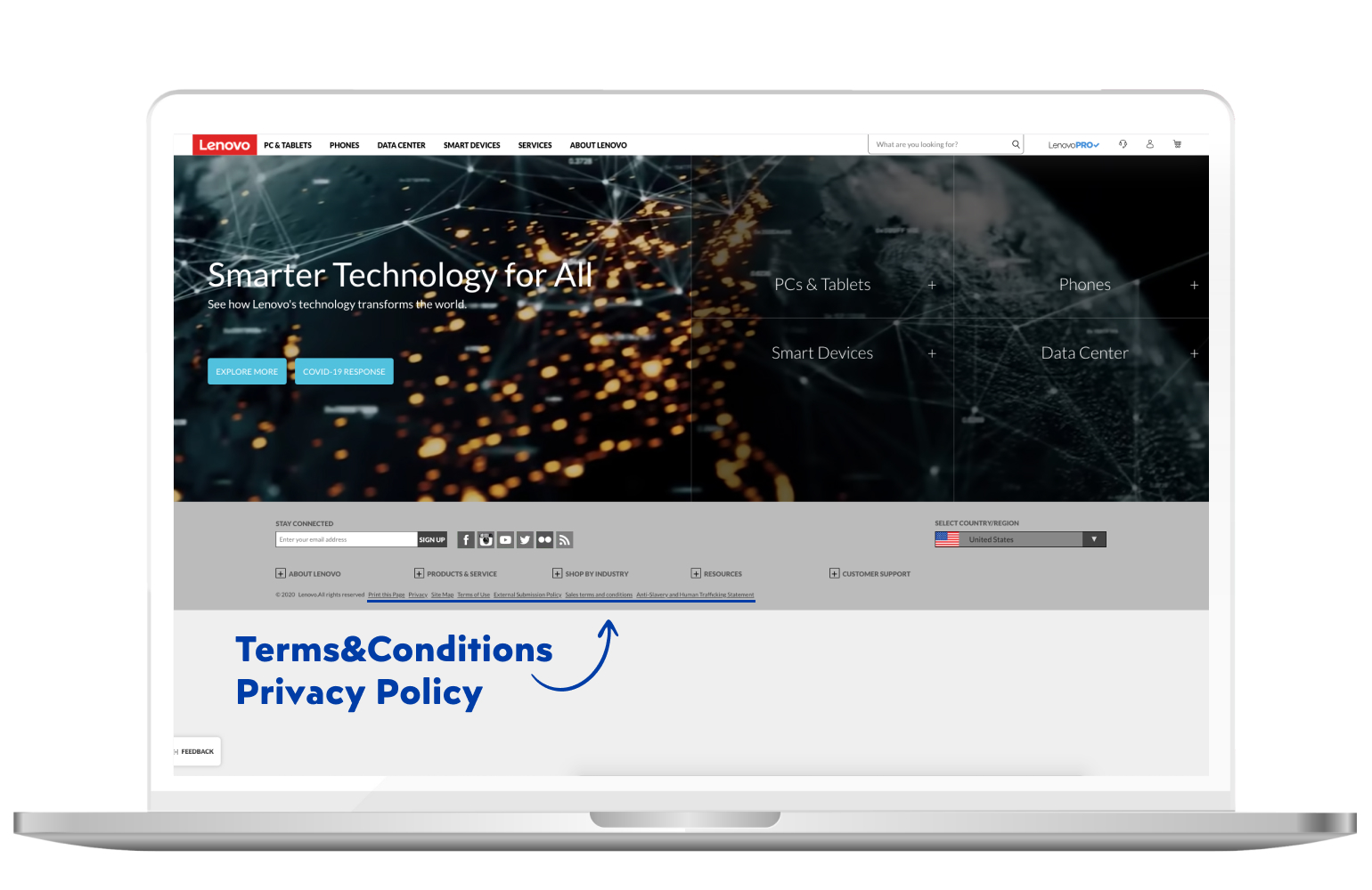
These two are the essential parts of every eCommerce website. They are usually included in the footer.
You need to have them because:
- T&C prevents abuses, such as spamming, posting defamatory content or infecting your website with malware
- It declares you as the owner of your content
- It informs customers that abusive account will be terminated
- A privacy policy is required by law if you collect users’ personal information
- It’s required by third-party service providers you may or may not use
- Users care about their privacy, especially when it comes to online shopping
These are some basic reasons why every eCommerce website should have these elements.
Live chat
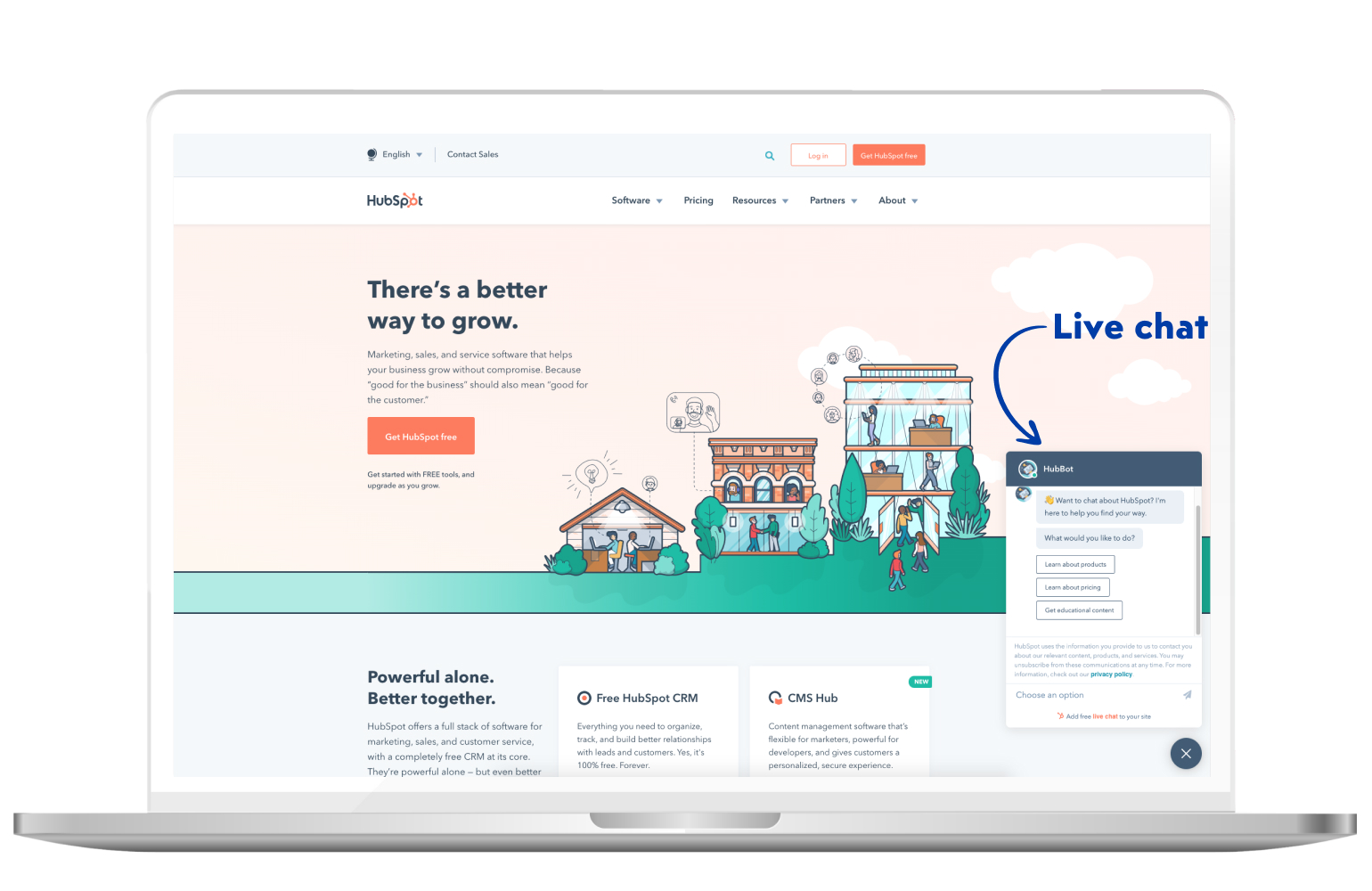
Live chat is another important feature, used by many eCommerce companies.
It’s a tool of communication between you and your customers. By implementing, you enable your customers to (you as well) to enter a live chat during their shopping session. That way, you can solve any number of customer complaints in real-time.
According to Econsultancy, live chat is one of the most successful customer service channels. It has the highest satisfaction level compared to all of the other service channels – 73%, followed email with 63%.
Using live chat may work out great for your eCommerce website, as it could provide them with a seamless shopping experience. All complaints solved in real-time – sounds great, right?
Social media login
Social media login is one of the most used features on eCommerce websites. Basically, it enables your customers to register an account using their preferred social media account.
It works well for both the business and the customer. It shortens the time the customer spends creating an account and can now shop much faster, while it provides you with much more information on the customer, so you can offer them personalized offers.
It’s clearly a win-win situation.
Also, it works great for your business in many different ways. For instance, if you’re requesting your customers to register an account when they buy something (which we don’t suggest you do) – customers can go through the whole checkout process much faster if they’re logged in.
It does reduce the cart abandonment rate, but still – we advise you don’t require them to be registered to complete a purchase.
Furthermore, it provides comfort and pours trust on your eCommerce website. If your website isn’t popular in the industry and you’re just starting out – it would be great to offer your customers a social media login option.
Customers won’t be afraid to register their account, as they trust a brand which pays attention to their everyday habits and which platforms their customers use.
Contact page
Considering you’re running an eCommerce business almost exclusively online, it’s more than essential to have a contact page. It has become a norm for eCommerce websites, regardless of what kind of products or services are they offering.
It’s good to enable more than one way of contacting, such as email, phone, online form or social media.
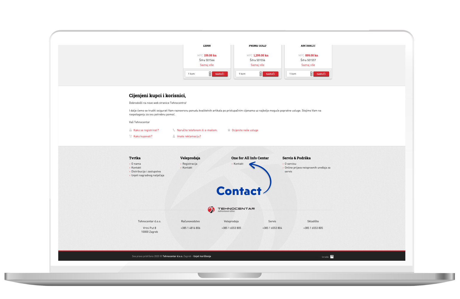
Once again, Tehnocentar shows a good example of placing contact information. It’s located in the footer section of the homepage. By placing it on the footer, customers’ attention is mainly drawn to the products.
Category page
In simple words, the category page is what separates your homepage from your product pages.
Considering you have a marketing funnel, the category page is the next step after your homepage. Here, you narrow down your options and guide your customers to their desired destination.
Let’s use the example of a grocery store again. We can compare the homepage to the store entrance. Your category pages would represent the store aisles, while the product page is the product placed on one of the shelves.
But what makes a good category page?
Let’s take a look.
Product filtering
Product filtering is a feature which enables your customers to narrow down their search, thus shortening the time and number of actions needed to reach the desired product.
Filters can help customers hack their way through thousands of products and laser-target the one that matches their need and interest.
That way, it can improve your eCommerce website user experience and conversion rate of your products.
To create useful filters, think about which features and characteristics define your products and which would be of the highest importance to your customers.
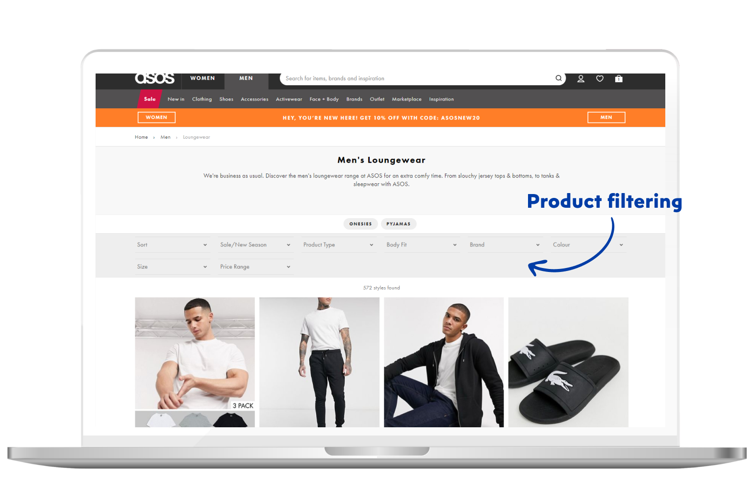
Beyond basic filters such as size, colour and price, there are many more. For instance, let’s say you’re selling hardware, laptops to be exact.
Would it be useful if the customer can filter them by colour? Not so much.
You can use filters such as RAM (4GB, 8GB, 16GB), CPU (AMD, Intel…), storage (HDD, SSD) and so on. In the example above, ASOS uses filters that are specific to their brand and business niche.
You get the point. It’s about what matters to your customers.
The main objective of product filters is to create a smooth customer experience and make it as simple as possible.
Generally, you can create thousands of filters. But do you really need to?
No.
You need to show only relevant filters – relevant to your customers of course.
Also, when the filters are applied, make it easy for the customers to remove them or add another one. Emphasize on the usability of your eCommerce website.
Breadcrumb navigation
Unlike other features, this one has an unusual name. The name itself comes from the fairy tale of Hansel and Gretel, written by Brothers Grimm.
You’ve probably read it as a child, so it’s safe to say that you remember how Hansel threw small pieces of bread through the forest so he could find his way home.
The main goal of breadcrumb navigation is to help users navigate through the website seamlessly, both back and forth.
What that means is that it should be visible which were the previous webpages the customer visited, based on a hierarchy of your pages. That way, customers instantly know where are they currently and how did they get there.
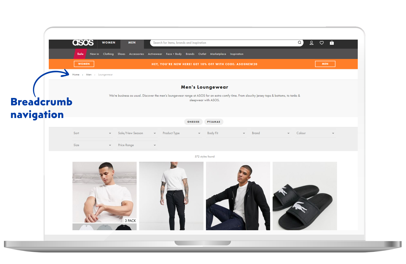
Breadcrumb navigation is usually displayed on the top of the page.
When displaying it, always start with the homepage. It represents the beginning of your customers’ journey. But don’t show it on the homepage – it just doesn’t make any sense.
Next on, let’s talk about images on your category page.
Image size consistency
The layout of your category page is extremely important. Both text and images should be designed and assembled properly.
Many retailers actually do the exact opposite and don’t maintain the consistency of image sizes on their category page.
While it may look “stylish”, it’s not effective.
Besides the high resolution of your images, you should also bear in mind that your image sizes should be consistent. And that refers to both category and product pages.
Also, the amount of whitespace at the border should be consistent too. That way, customers have a clear overview of your offers and can move down the funnel much more easily.

Number of products
Even though your eCommerce website may not be as large as Amazon, you can still have hundreds or even thousands of products on your website.
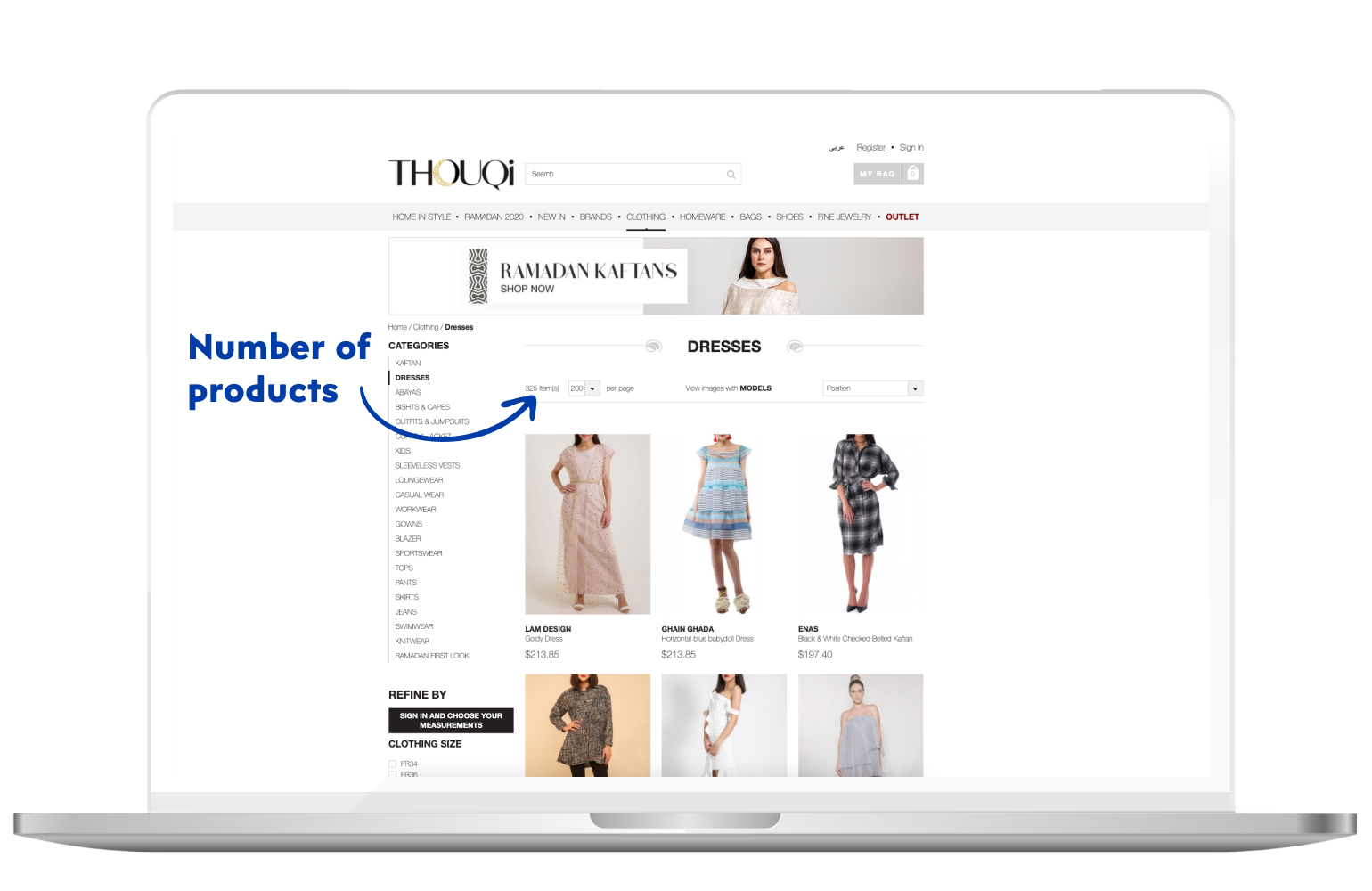
When a customer opens the specific category of their choice, be sure to display the number of products in that category.
You can’t show all of your products on one page, but showing just a number of products will do the work.
It’s usually displayed at the top of the category page and by far – that’s the best practice.
And the last feature of the category pages we’ll be talking about is the page description.
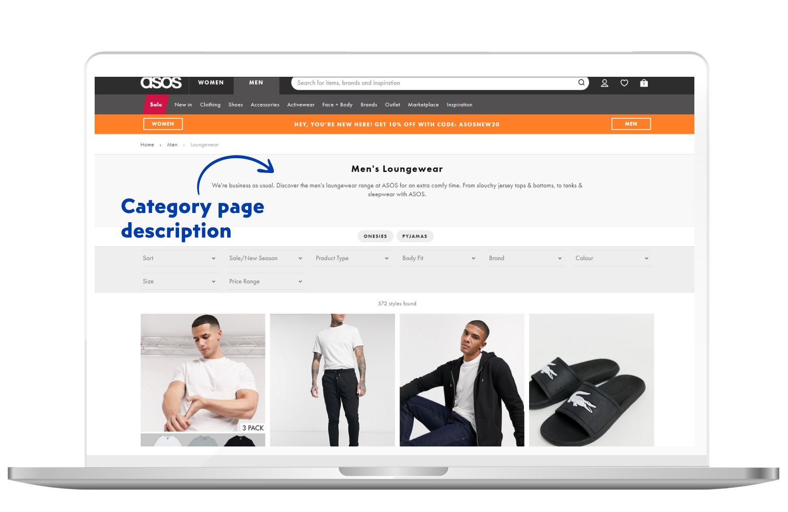
Page description
It’s common practice to include a short description of each category. It’s mostly used for the search engines, but it will also give your customers a short overview of what that category really is about.
As we mentioned, it’s used primarily for the sake of search engine optimization.
Let’s put it this way.
If you’ve decided to buy new shoes, you’ll probably start searching for queries such as “men’s shoes” or “women’s shoes” while maybe adding a certain brand into your query.
And let’s be honest – you definitely won’t be searching for “Nike modern casual navy blue running shoes”.
For search queries that specific (they do happen), you have your product pages. But let’s hold on to categories for a few moments.
Optimizing your category pages for such keywords (men’s shoes, women’s shoes) will make it much easier for the customers. Also, the search engine will instantly see what your category page is about and how it is connected to your product pages.
And that’s about it. Now let’s move on to the product page and its features.
Product page
You’ve probably noticed, as the article goes – we’re moving down the funnel. All the way from the homepage and right to the product page.
There’s much to say about the product pages so stick around and find out more.
Product pages are usually what we call – landing pages. If a customer searches for a specific product, there’s a chance he’ll land exactly on your product page. And there are some practices you should pay attention to.
And now, for the sake of simplicity, we’ll use the grocery store example once more.
Your customer has entered the store (homepage) and is looking for a specific product. As their search continues they enter a specific aisle (category page) and they find a product they’ve been looking for (product page).
We all know that a certain aisle how dozens, or even hundreds of different products and the same thing is with the category page. The customer now needs to pick one product (or maybe 2 or 3) he loves the best.
Now, what does that product need to contain? We’ve previously discussed the importance of product information management and it’s safe to say that it’s become one of the most important aspects of an eCommerce business. So, feel free to read more about it in our definitive guide to product information management.
Before we go further into the topic, we’d like to point out the importance of eCommerce analytics. It’s essential to any eCommerce business, no matter the size of it. By measuring the right metrics and adjusting your tactics accordingly, you’ll have greater chances of succeeding in the crowded eCommerce landscape. For much more detailed information, check out our in-depth article on eCommerce analytics.
And now, let’s dive in.
Product title
Product title is what defines the identity of a certain product. The more the product is described, the conversion rate on that product tends to be higher than without a descriptive product title.
By utilizing the product titles, you give your product much-needed clarity.
Descriptive and informative product titles bring in much more value to the product. Also, it’s crucial to keep your product titles short and simple.
Also, for the sake of SEO, consider integrating specific keywords in the product title itself.

Most often it’s useful to mention the key attributes of the product in its title. Remember how we said previously that you definitely wouldn’t search for “Nike modern casual navy blue running shoes”?
Well, those searches happen. Maybe the words are not in the same order, or maybe there is an extra word in the query. Customers do like to get specific.
So, to make it easier for you, you can follow this simple product title formula:
- Name of the brand
- Name of the product
- 1st key attribute (colour, material…)
- 2nd key attribute (size, length…)
If you visit a few eCommerce websites and check out their product titles, you’ll see this formula is widely-known – and it’s working.
Now that we’ve covered product titles, let’s move on.
Product images
Product images are the first thing your customers see when they arrive at the product page. This gives you a perfect opportunity to capture their attention with beautiful imagery.
In addition, product images help your customers to choose which product fits them best, so make sure to use only the best images.
There are several good practices of using product images on your eCommerce website, so let’s take a look:
- Zoomable images
Details are extremely important. Zoom-in feature will allow your customers to get a better look at your product. Sometimes, details such as texture are visible only when the picture is zoomed-in so think about incorporating this feature into your product page.
- Use more than one image
The importance of product images is pretty clear. Just remember the last item you bought online. You probably wanted to see the product from different angles. And to do so, the product page needs to contain more than just one image.
Try to capture the product from all the important angles so the customers know exactly what they’re buying.
- Show the product in use
A picture speaks a thousand words. A common saying, but it’s true. And when it comes to product images, you choose which words will it say.
So, you definitely want to show how the product is used. For example, let’s say you’re selling pens. You can either photograph the pens from different angles (which won’t make much sense), or you can photograph someone using a pen while writing down their notes.
It’s good to include a picture of the pen itself, but as we said, you need to have more than one image.
Now, if a picture speaks a thousand words, how many words does a video speak?
Much more, obviously.
So, another good strategy is to use product videos. Keep them in the highest possible quality and make sure they’re relevant to your customers’ needs.
- 360-degree images
Whenever there’s a possibility to use 360-degree images, you should definitely use them.
We like to show everything based on examples, so let’s do another one.
Let’s say you’re selling furniture. A customer is in need of a new sofa and he’s arrived at your product page. Now, one way is to include 10 pictures of the sofa from different angles. It will definitely work well.
But, to improve customer experience even more, you can use 360-degree images. That way, the customer can easily take a look at the sofa from any angle he desires.
It benefits both the customer and you as a retailer. Your customer experience is instantly improved, followed by the rise in the conversion rate for the specific product.
As for the customer, he can see exactly what he wants.
And that’s a huge bonus for customers. You give them control over their shopping experience.
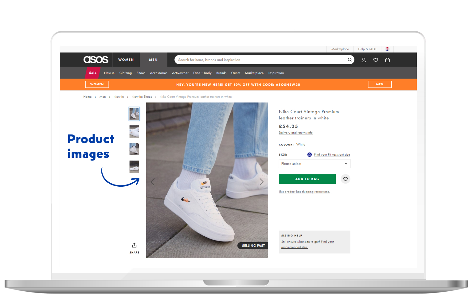
ASOS does a great job with product images. They always display images of their products in use. Besides that, you can find the images of the product itself from several different angles.
Product pricing
Product pricing is something that’s entirely up to you as an eCommerce merchant. The price often depends on the material, size, production cost and value of the product.
We won’t say which prices should you put up on your product page, but there are some key features that you would surely want to have included when it comes to pricing.
First off, if there’s any discount or a promotional offer active, you should display it. It’s common practice to display the discounted price alongside the original one while pointing out the discount percentage.
Sometimes, it’s better to display the discount without a percentage, showing exactly how much is the price lowered.
For instance, if the product price is lowered by 17% and that 17% amounts up to $50, you may want to display the discount of $50.
It’s a common psychological pricing strategy. There are many more so make sure you catch up on the psychological aspect of sales.
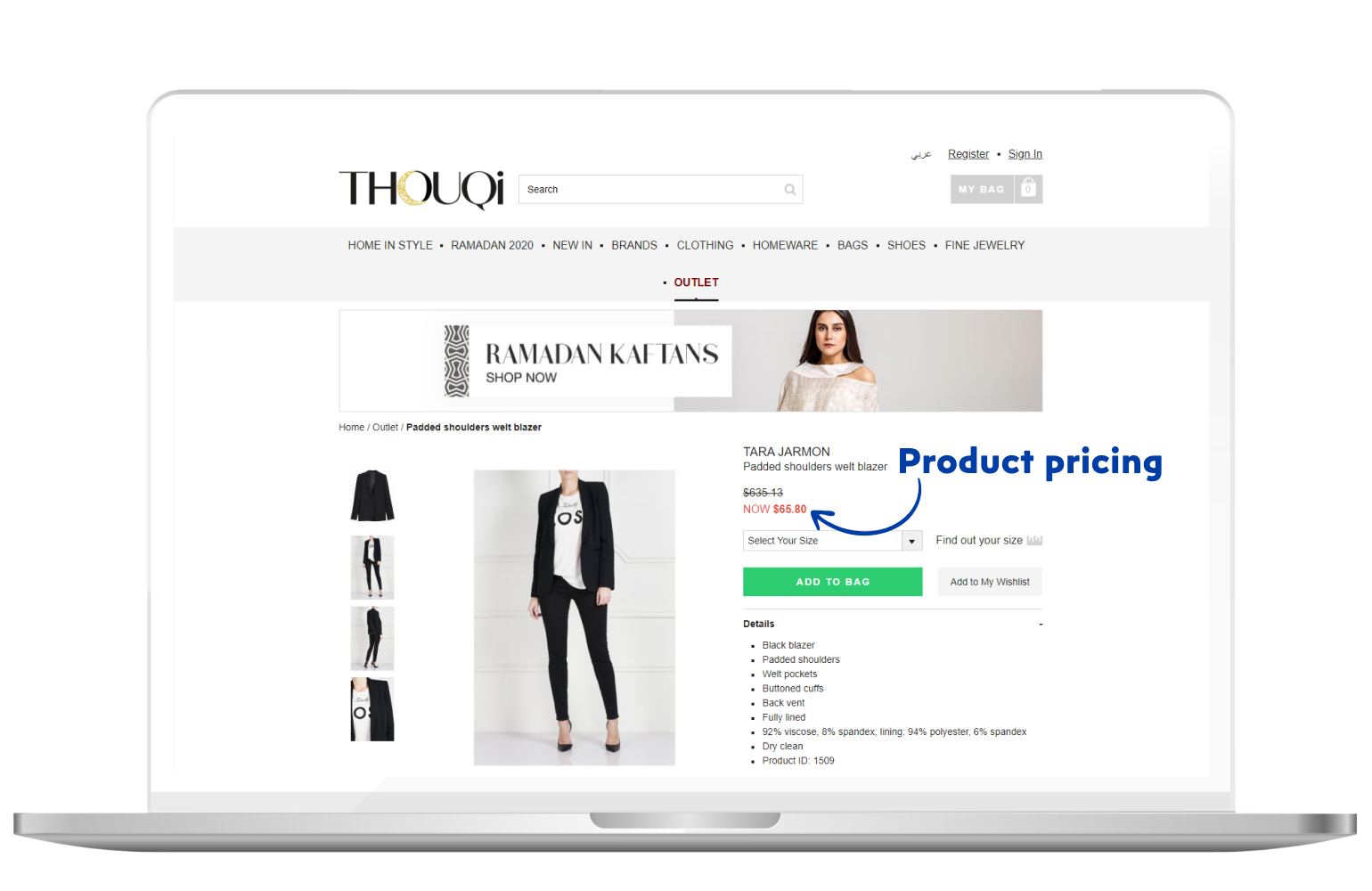
One of our clients, Thouqi, shows the discounted price in a different color. They also show the original price, but the discounted price is featured and much more visible, encouraging customers to take advantage of current lower prices.
Product variables
When it comes to product variables, it usually refers to different sizes and colors of the product. Of course, that differs from product to product.
Anyways, make sure your customer has the ability to choose different combinations of product variables, as it may impact your sales in a positive way.
That way, you’re giving them control, enabling them to customize the product to their likings.
CTA buttons
We talked about call-to-action buttons previously in the first chapter of the article, so now we’re going to take a look at them from a different perspective.
In essence, the CTAs you use must be aligned with your desired goals – and with the customers’ interests.
There is no “right way” to creating your calls-to-action, but they’ve been around for a while so now we know what are some of the best practices.
The only known rule is to keep it short.
For example, “Shop now”, “Buy here”, “Add to wishlists” are all short and sweet CTAs.

Now, why use “Shop now” instead of just “Shop”?
That’s another psychological strategy. People tend to respond to urgency and scarcity. Feel free to test it, but we strongly recommend that you consider urgency and scarcity when designing your calls-to-action.
Another important part of your CTA button is its color.
There is no “right” colour for the CTA button, so make sure to choose a color that stands out. You will need to perform A/B split tests of your button colour to see which one works best for your eCommerce website.
Speaking of CTA button placement, make sure it’s “above the fold”. In essence, “above the fold” means that customer doesn’t need to scroll down to find the CTA.
Also, don’t give your customers’ only one option such as “Buy now”. A good practice is to include an “Add to wishlist” CTA right next to it (or below it). If they’re not ready to buy immediately, it’s safe to include a wishlist option on the product page.
That way, they’re still in your marketing funnel, only a step away from buying the product.
Trust signals
Essentially, trust signals are the parts of your eCommerce website which help your customers feel safe when buying a product or service.
We can take your logo as an example. If your logo is displayed on every page on your website, it’s going to have a positive impact on your customers’ feelings of safety. So, make sure the logo is constantly visible.
Furthermore, you can use testimonials. They have a massive impact on trust, therefore you should definitely use them on your product pages. It’s safe to say that customers do their research before deciding whether or not to purchase from your website.
Testimonials are something that we all search for when buying online. It’s especially relevant to high-cost products and services.
Just remember the time when you visited some agency’s website.
They offer valuable services, but they cost much more than a regular product on an eCommerce website. Almost all of them are using testimonials to make sure you’re making the right decision.
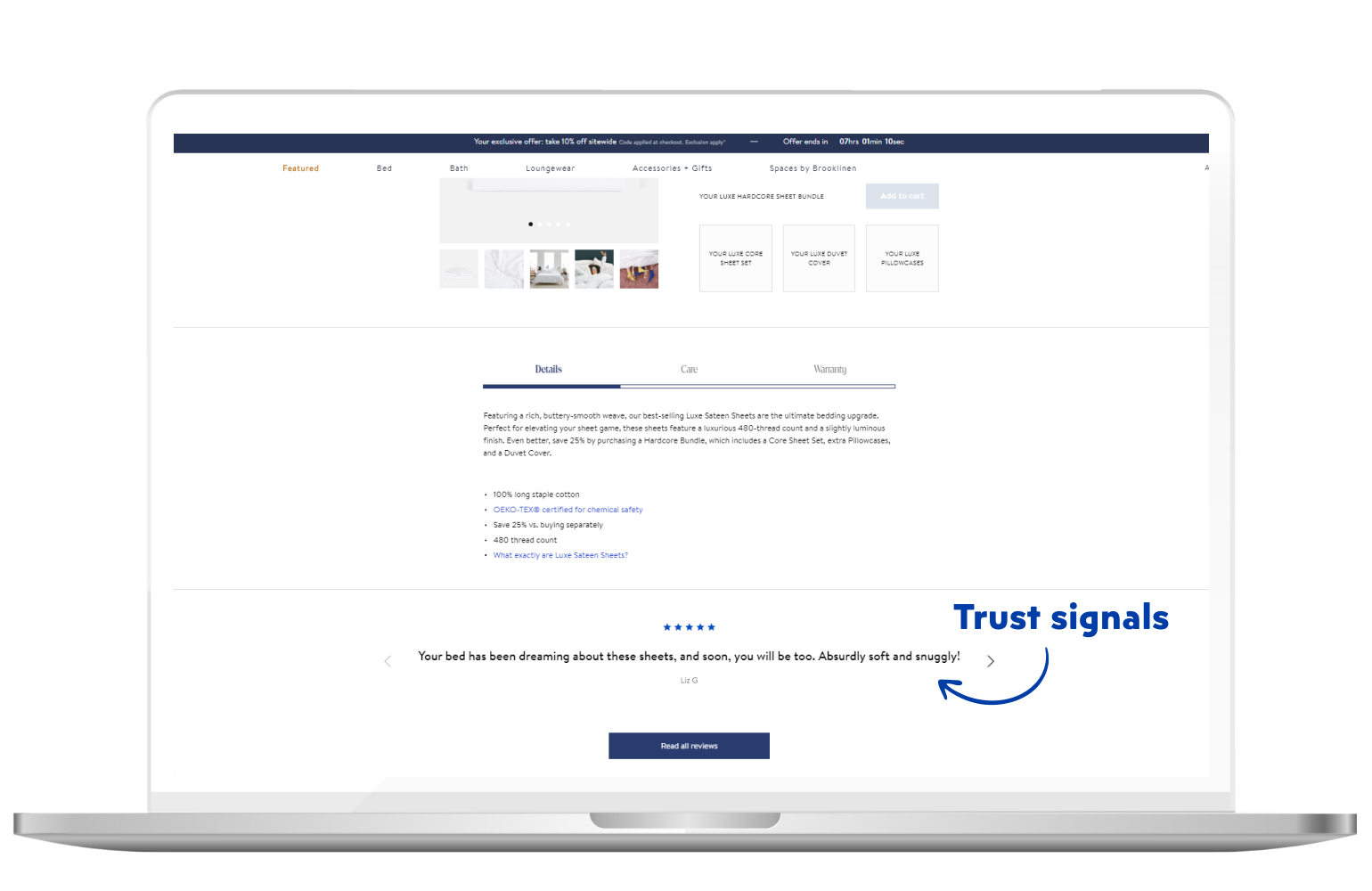
If you take a look at our website, you’ll be able to find many testimonials from our satisfied clients and just by knowing we have more than 150 satisfied and successful clients, you’ll instantly know that you’re in the right place.
Moreover, make sure you keep in touch with your customers after they buy a product. Ask them for a review. If they liked the product, there’s a chance they will write a review.
Make it clear for them that you’re listening to what they’re saying and showing that you care about their shopping experience.
Product reviews
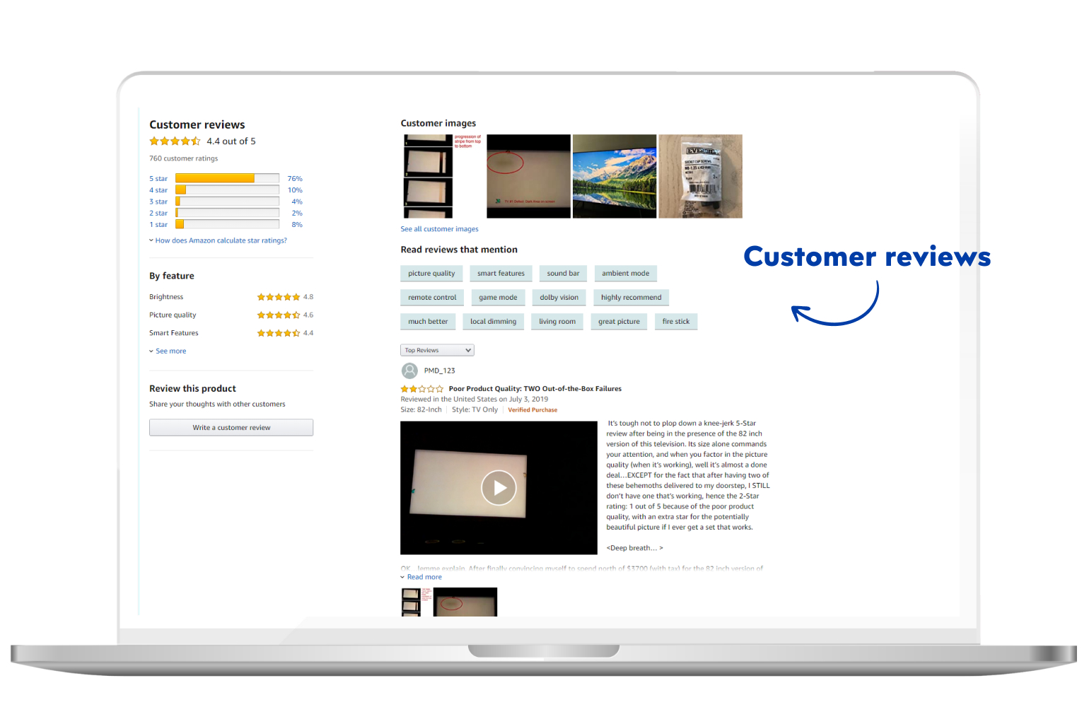
Product reviews are a powerful marketing tool. Sometimes, they’re even more important than the copy on your product page.
For example, if you saw a product with 773 reviews and a few seconds later you see the same one with only 4 reviews – which one would you rather buy?
It’s a no-brainer. Product reviews are one of the most effective driving factors for product sales.
Having a huge number of reviews establishes you as a reliable merchant and builds trust between your business and your customers.
Many customers, including ourselves, go through product reviews before deciding on whether to buy the product or not. Many customers decide to purchase a product after getting reassured that it’s exactly what they were expecting, they value other shoppers’ reviews.
So, the question is – how to obtain a high number of product reviews?
A good practice is to reward your customers for leaving a review. For example, you may give them a 10% discount on their next order or add some points to their loyalty app. There are several ways to reward them, so make sure they leave your store even more satisfied then they expected.
Product recommendations
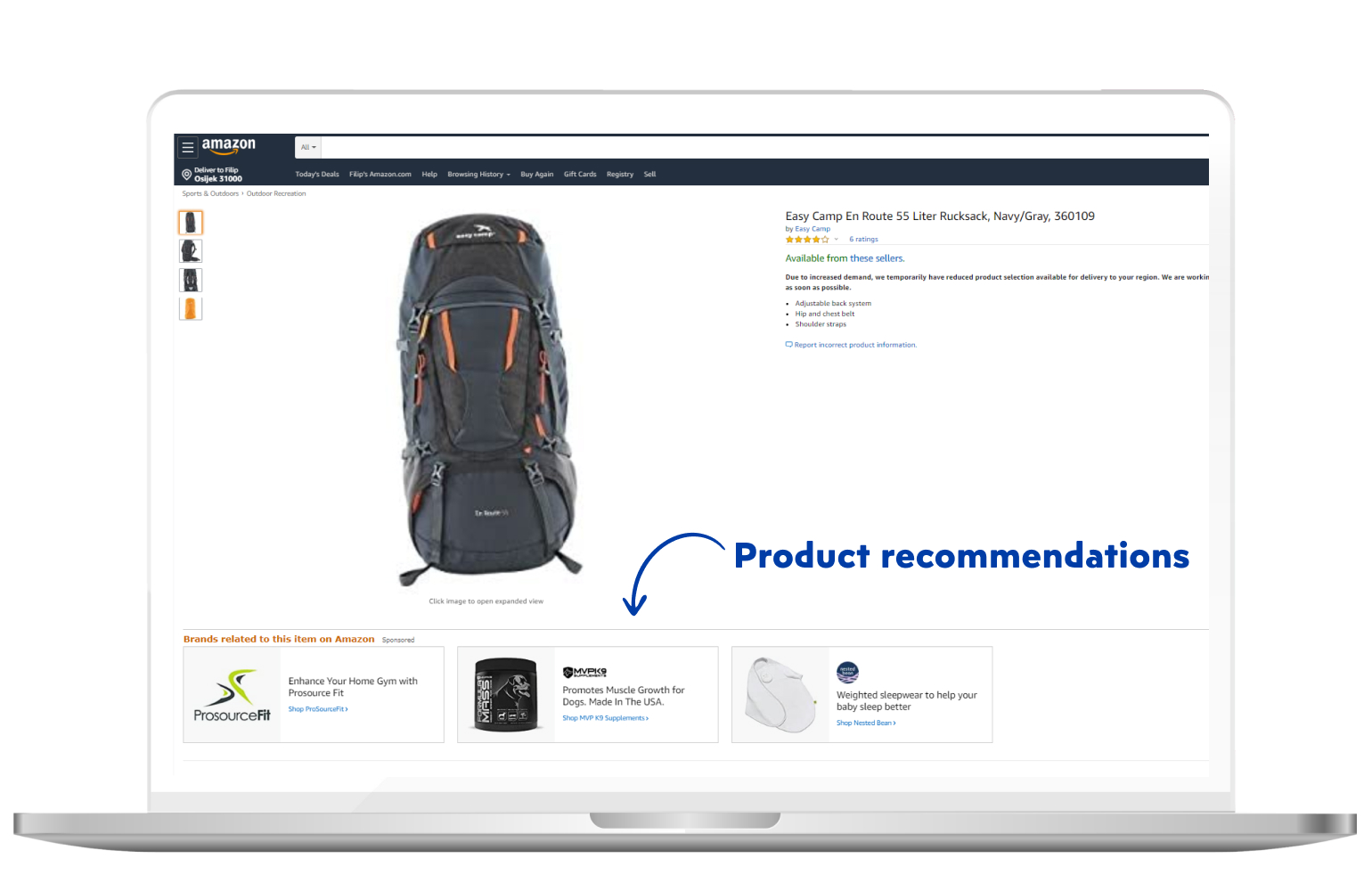
Product recommendations stand for additional products recommended for you on the product page. They are insanely important, as we can see from the example of Amazon.
Research by CMSC Media states that 35% of what customers buy on Amazon comes from product recommendations.
By recommending your products to customers on the product page, you get a chance of selling them a more valuable product or even offering them a bundle of products.
If by any chance your customer doesn’t want the purchase the product that’s currently displayed on the product page, you may even have an opportunity to retain them. You could offer them a product that would be even more suitable for them.
Product recommendations nowadays are fully personalized, so it’s definitely one of the safest and most effective ways of generating sales revenue on an eCommerce website.
We’re finished with the product page, so let’s move on!
Keep reading, there’s a lot more useful information waiting for you.
Checkout
It has been a long journey, but we’ve almost reached the end of the marketing funnel.
Congratulations on keeping your mind focused on improving your knowledge of eCommerce!
But without further ado, let’s check out the checkout.
Checkout is the final step in the shopping process. For example, we’ll use the grocery store once again.
Let’s say the customer entered the store, walked to an aisle, picked up the desired product and is heading to the checkout. The customer then checks out the products from his shopping cart. You can see so many similarities with the eCommerce stores.
The same thing happens online. When the customer arrives at the checkout, they’re asked a few essential questions. Now, which questions?
Billing and shipping
First things you want to know are where should you deliver the product and what’s the billing address of your customer.
They enter the data in the fields and quickly move on
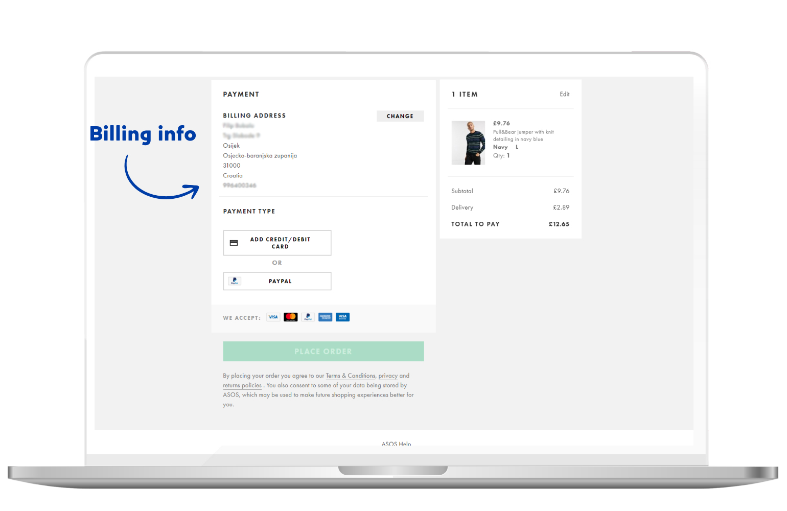
Next, they need to choose the shipping method. You may offer several different shipping options, with each one varying in price. Free shipping is the most common practice nowadays, but some specific methods do require payment.
For example, a standard shipping method may be free, but if the customer wants to have the product the next day, it will certainly cost more.
That decision is entirely up to your customers, as it depends on their current situation. Of course, you can always note that you offer next-day delivery for an additional payment. But still, it’s up to the customer.
Payment gateway
Simply put, a payment gateway is the payment processing merchant service. If we take the example of the grocery store once again, we can compare the payment gateway to a cash register.
There are several key tasks for any payment gateway:
- Encrypting data exchanged between your business and the customers, thus keeping it safe for the external threats
- Requesting authorization from the customers’ credit card company or a financial institution to proceed with the transaction
- After the payment is secured and authorized, it automatically proceeds to the next page
- Calculating the tax costs
Security is and needs to be of the highest importance to any eCommerce website. And implementing such a feature is a task for an experienced company, so if you want to ensure your business’ and customers’ data are secure – reach out to us and we’ll take care of it.
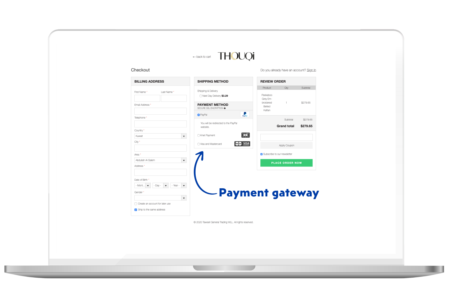
Furthermore, try to provide your customers with more payment options. If your customers want to buy a specific product, but they can’t use their preferred payment method, you’ll see a decrease in sales and conversion rate.
Nowadays, it’s even possible to pay with cryptocurrencies in many different stores worldwide. You don’t have to go to those lengths when it comes to payment, but having a few different payment methods available should do the work.
Some of the most popular payment methods today are:
- PayPal
- Stripe
- Visa Checkout
- American Express
- Masterpass
- Apple Pay
- Google Pay
- Amazon Pay
You don’t have to implement all of them, but consider using at least 2 or 3.
Saving items from the checkout
If by any chance your customer decides to not continue with the purchase, make sure you give them an option to save their cart in case they want to place an order in the future.
From here on, you’ll be able to retarget those customers by utilizing email marketing or push notifications.
And that’s about it regarding checkout.
There are still some important features we need to talk about so stay with us!
Blog
Having a blog on your eCommerce website could easily turn out to be a useful and profitable feature.
Even though your main goal is to drive traffic to your product pages, there are many reasons why you should have a blog on your eCommerce website and we’ll name a few:
- Improving your website’s SEO
- Placing yourself as an industry expert
- Creating an online community
- Building brand loyalty
- Boosting conversion rates
- The best of all – it’s free
In any case, let’s go through some basic elements you can implement in your blog.
Search option and blog categories
The sidebar of your eCommerce website blog should contain a search bar, a list of categories and a list of featured posts.
That way, your customers can navigate through the blog in a really simple manner. Treat your blog categories the same as your product categories. They should create a clear overview of the topic of the category.
When it comes to featured posts, it depends on how you determine which post will be featured. Usually, it’s the one with the best content and with a clear purpose – promoting a service or a product.
Also, it could be the post that resonated the best with your customers. One of the best practices is to always feature the newest posts alongside the most popular.
That way, all of your content will receive the same amount of exposure on your website.
Another important thing to say is that the amount of voice search queries has been rising continuously. Check out our article on voice search optimization to see how you can adapt to this growing trend and use it to your advantage.
Social sharing
Every eCommerce business aims to gain social proof. Social proof indicates that the products and business overall are legitimate and high-quality.
Try to include social sharing options on your blog posts. This will make sharing your content simple and customers will be able to share it with their friends and family. They will speak about a solution to their problem, not an eCommerce store with a specific product.
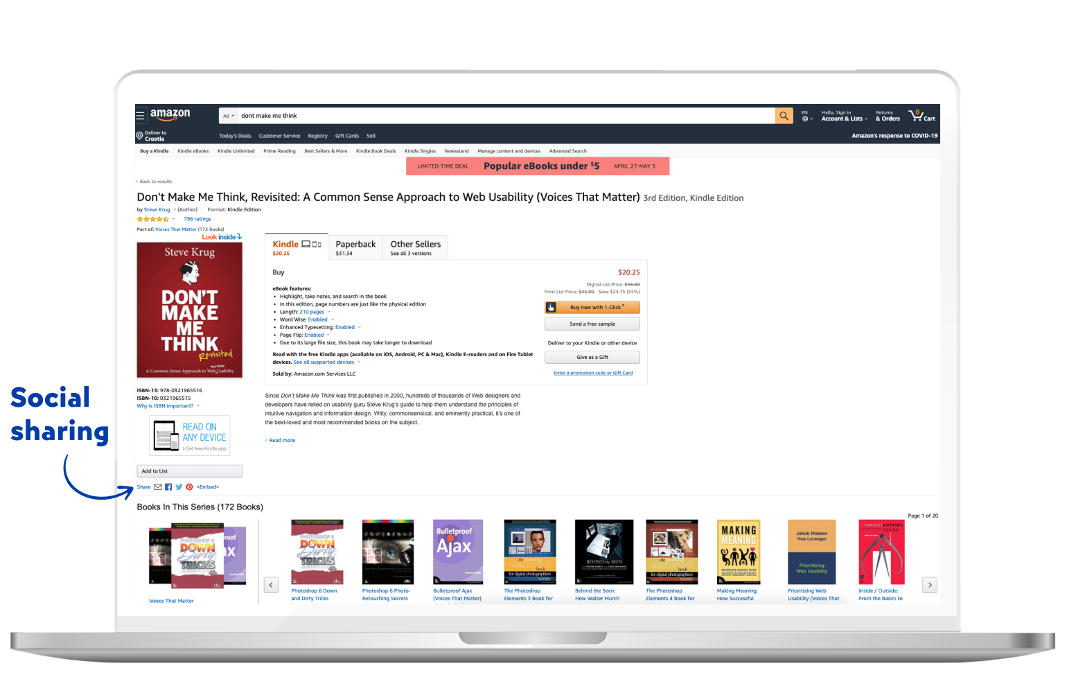
Social media channels might just be the best way to encourage customers to share their stories. Utilize your social media and use it to communicate with your customers.
And that would be it.
Taking the next step
Now, when you’re stocked up on knowledge on the eCommerce websites, their features, and several useful tactics and strategies – it’s time for the next step.
First of all, great job! You invested your time in a great way today! Kudos!
But more about the next step. Now all you need to do is turn your idea into a profitable eCommerce project. We have the knowledge and the experience and we’d love to hear more about your ideas!
We’re an expert eCommerce development agency, specializing in Pimcore development. If you recall the beginning of the article, we mentioned it’s one of the newest and most advanced platforms today, able to transform any idea into reality.


