How to Make Custom InDesign Plugins with UXP and React
In our previous blog post, we explored many advantages of custom InDesign plugins. We highlighted how they bridge the gap between InDesign and your data sources, automate repetitive tasks, and ensure consistent branding across your materials, such as brochures and catalogs. This blog dives into the details of building custom InDesign plugins using UXP and React.
Since UXP for InDesign is a relatively new technology, online resources and tutorials (beyond Adobe's official documentation) are scarce. This guide aims to fill that gap by providing a step-by-step approach specifically for displaying and filling in product data fetched from the web to an InDesign document.
Introduction to InDesign Plugin Development
Until recently, CEP and ExtendScript were used for making custom InDesign (and other Adobe apps) plugins. CEP (Common Extensibility Platform) provides a framework for building cross-platform extensions using web technologies (built around a custom implementation of Google’s Chromium Embedded Framework, which gives developers a way to include a version of Google’s Chrome browser in an application), while ExtendScript is a scripting language that works within CEP, allowing developers to automate and extend Adobe Creative Cloud applications using JavaScript-based syntax. And while plugins can still be developed using these technologies, it is just a matter of time until CEP becomes deprecated and then, eventually, removed.
This is where Adobe UXP steps in. First introduced into Adobe XD in 2018, the Unified Extensibility Platform represents a significant evolution from the earlier CEP and provides a modernized and unified approach to building extensions. Because UXP communicates directly with the host application, the issues associated with the CEP/ExtendScript interface disappear.
In general, plugin development is simpler with UXP. It is currently available for Adobe XD, Adobe Photoshop and Adobe InDesign (InDesign 2023 (v18.5) introduced UXP plugins for InDesign).
Getting Started with Plugin Development
In the rest of this blog, I will demonstrate how to make a custom InDesign plugin with UXP using React, that fetches and displays product data and offers the ability to fill in that data to an .indd document.
For a start, once you have InDesign (v18.5 or later) installed, you will have to install the UXP Developer Tools app.

It is a very useful app that offers a simple creation of new plugins, loading them into InDesign, watching for changes, packaging plugins for installation and debugging them. The debugging tool that it offers is incredibly useful, as it offers the developer tools not unlike those you can see on the web, with its own Elements, Console, Sources and Network tabs.
Once you install and open the app, you can click on the “Create Plugin” button to get started with creating a new plugin. Once you click on the button, a dialog prompt is displayed where you can input base information about the plugin (name, id, version, host application, host application version and starting template).
For the template, I will choose the react-starter one. Even though our plugin will be fairly simple and it could be made with vanilla JS, I want to show you just how similar developing InDesign plugins is to “regular” modern web app development, so I am choosing React.
Also, most of the examples and tutorials on official Adobe pages are made with vanilla JS, so I think it would be nice to show you how to do some of the things shown there using React. I will name this plugin “Product data fill”.
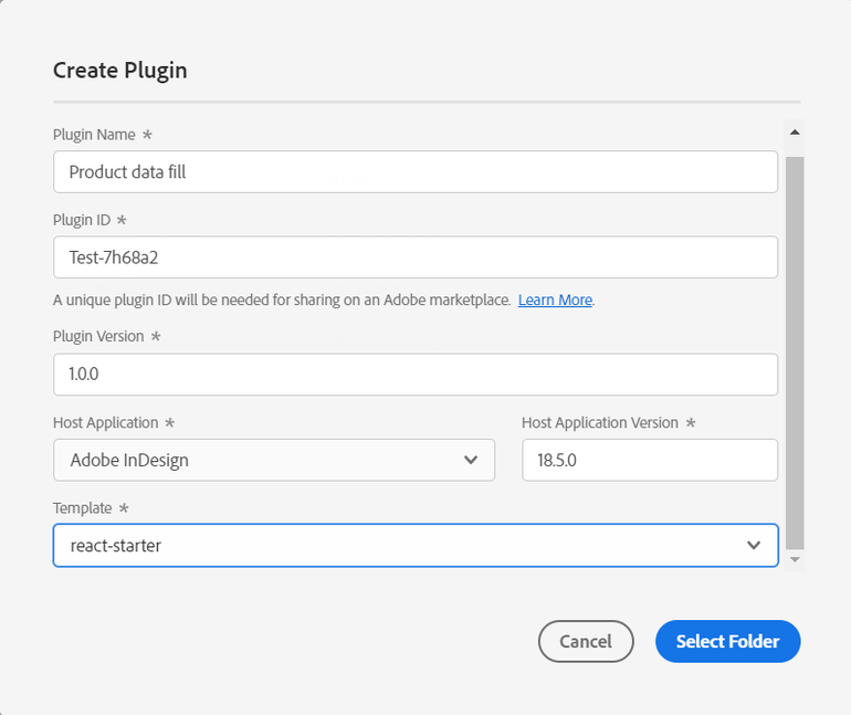
Once you choose the folder to save the plugin in, you can open the starter code with your code editor. As you will see, the react-starter template already has a lot of things set up for us, such as the webpack.config.js, the default panel template, and a base Home.jsx component.
I will not go through and analyze each of the files separately as a part of this blog, but I advise you to go through each of the created files once you load the plugin, “play” with them a bit, try changing some things, and familiarize yourself with them.
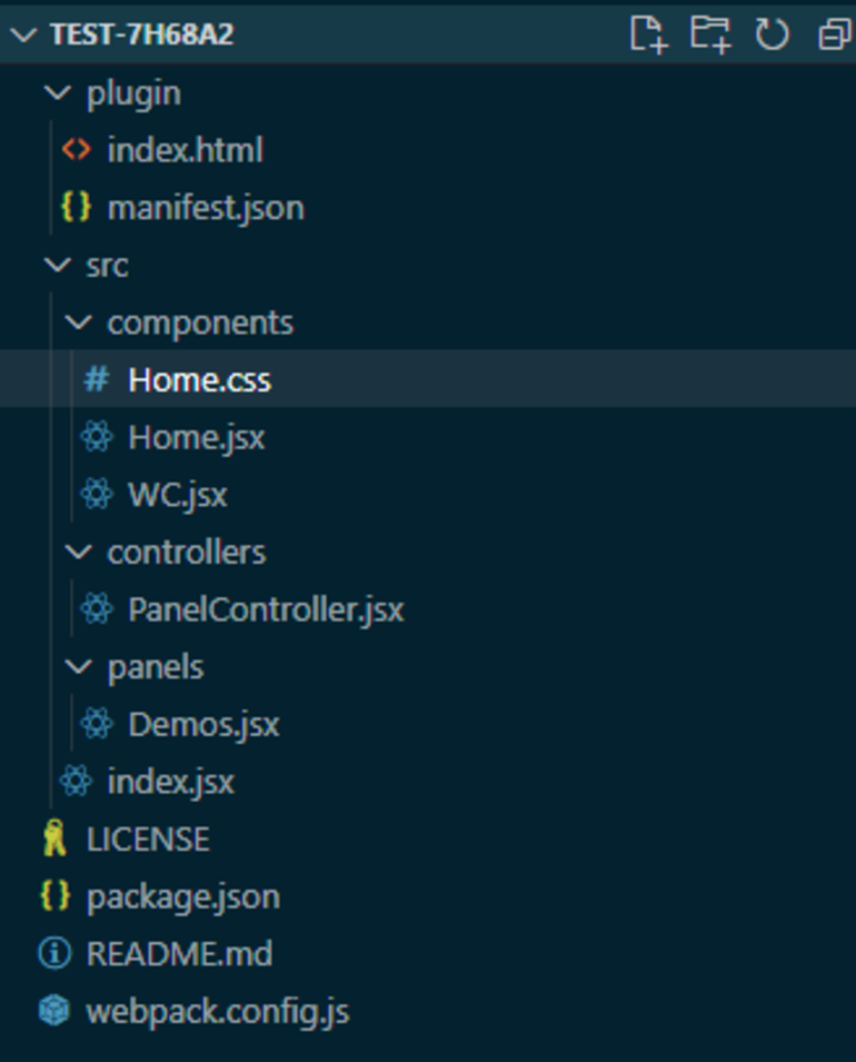
The first thing UXP Developer Tools tells you to do to get started is to go through the steps in the README.md file to set up your plugin so you can start working on it and that is exactly what I am going to do.
The first step is to run “npm install” (of course, if you don’t have NodeJS and npm installed, you need to install them first, yarn can also be used if that is what you prefer) in the root of the project to install all needed dependencies. The next thing I am going to do is run “npm run watch” to automatically build my plugin on every change. After that, you will notice that a “dist” folder appeared, with the index.html, index.js and manifest.json files. I am sure you already know what index.html and index.js are, but let’s take a better look at what exactly is in the manifest.json.
It contains metadata such as the plugin's name, version, icons, permissions, host, and entry points. For more information on the manifest.json contents, and everything that can be configured through this file, I recommend you take a look at this link.
Now it’s finally time to launch InDesign and load the plugin. Once you have InDesign and UXP Developer Tools launched, click on the three dots in the Actions column in UXP Developer Tools, click on Options, and under Advanced, select the plugin build folder. After that, just click on Load & Watch in the UXP Dev Tools app and you will see the plugin panel in InDesign!
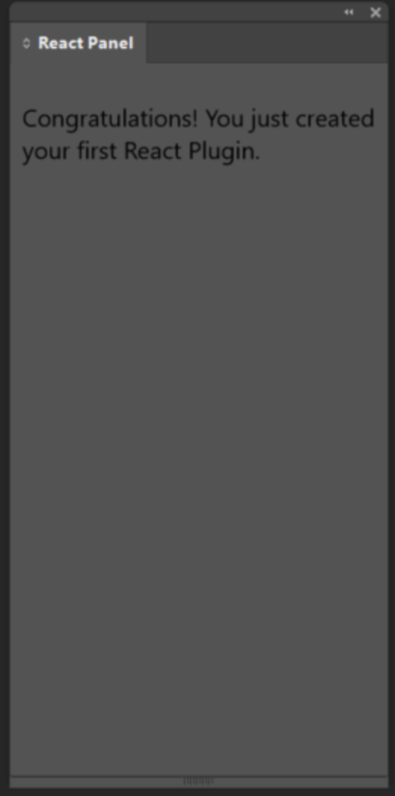
Now you are also able to click on the Debug button to open the debugger, which you will ideally have open at all times to catch eventual errors and debug and fix them accordingly.

Also, if you change anything in the code currently, you will notice that the plugin panel hot reloads on every change.
Fetching and Displaying data
Before we get into editing the .indd documents, let’s first override the default contents of the Home.jsx file.
In the code snippet above, you can observe the additions made to the Home.jsx file. At the top, I've included some essential imports (note: for axios to be installed, run npm install axios beforehand).
Next, utilizing React's useState, I define the "products" state and the "setProducts" function responsible for updating the state. Following that, there's an async function, "fetchProductData," where I employ axios to fetch product data and update the state with "setProducts." As this is a sample plugin created for the purpose of this blog, the data is fetched from https://dummyjson.com/products to simulate product data.
This process is an example of the aforementioned "gap bridging" - effortlessly loading and displaying data from the web (and placing it on the document - but that will be covered in a later section of this blog) inside InDesign using regular JS and React. And, as you can see, this section of the code is no different from writing code for a regular web application. However, to enable requests to the internet, a small modification must be made inside your manifest.json.
Within the "network" property under the "requiredPermissions" property, you can define an array of "domains" to which the plugin will grant permission. While you can also use "domains": "all" to allow access to any domain on the internet, it is a better practice to specify only the domains necessary for your plugin.
NOTE: you will probably have to unload your plugin and load it again after making changes to the manifest.json file (just clicking on “reload” is not enough).
Next, let’s go through the part that is rendered inside the plugin panel. Here, we have a simple layout with a heading, a button that calls the “fetchProductData” function on click, and if the products exist, we map through them and pass single product data to the “Product” component as props.
As you can see, everything is wrapped in a WC component that was already defined with the react-starter template. It is important not to delete this part of the code if you will be using Spectrum UXP components (covered in the next section) as React does not attach event listeners to elements that are Web Components which can lead to surprising results that feel broken as event handlers aren't called correctly. The simplest fix for this is to add a ref to the component and attach event listeners. But, as that would result in a lot of unnecessary code, the premade wrapper component (WC) takes care of the hard work for us.
Inside the “Product” component, I display some basic product data - title, brand, category and price.
And lastly, here is the Home.css file, where I have some basic styling for the elements.
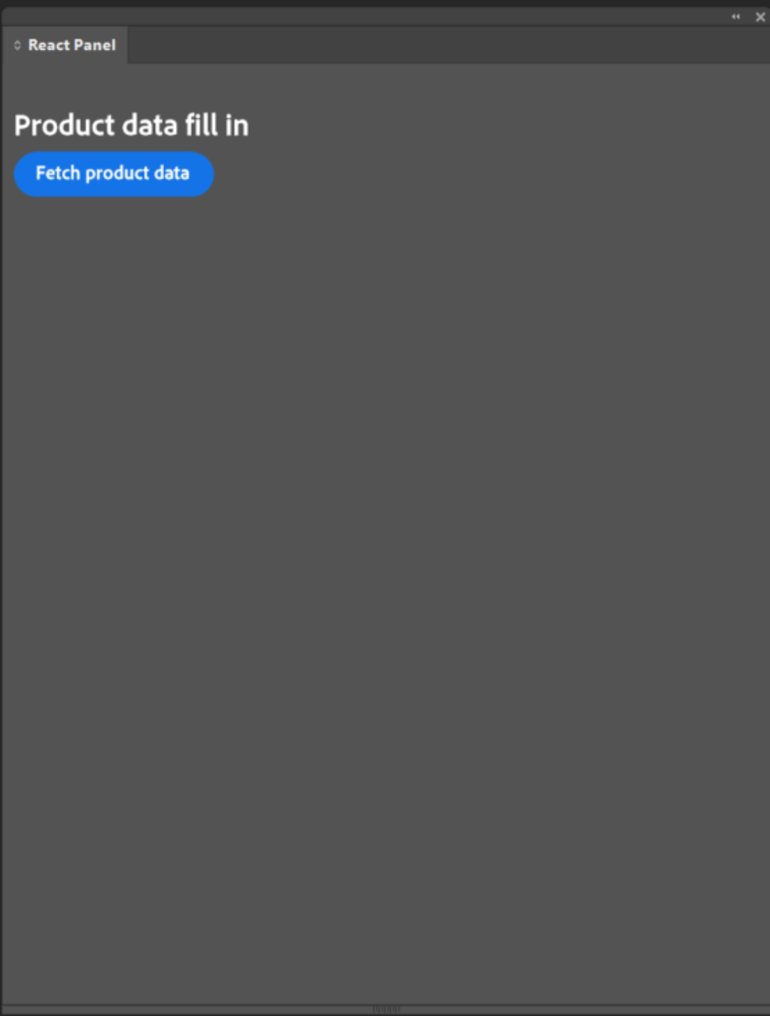
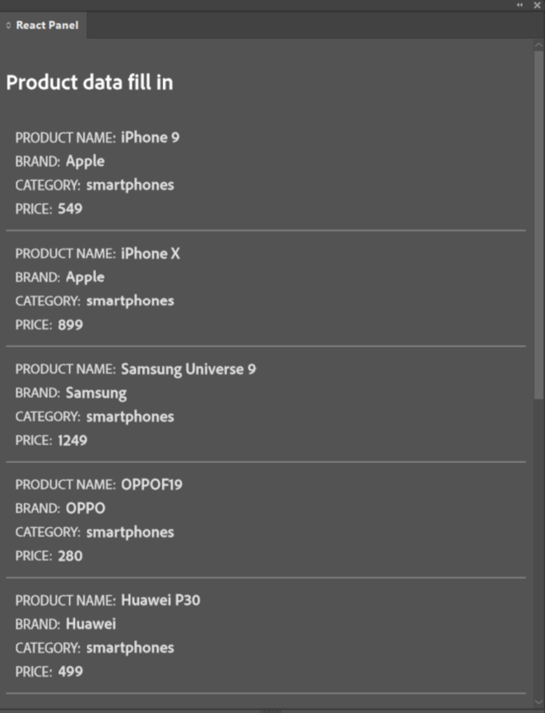
As you probably already noticed, I am using some “unusual” tags both in Home.jsx and Product.jsx, such as sp-heading, sp-button and sp-body - don’t worry, we’ll go through that in the next section!
Making a Perfect Plugin UI
In UXP, you can write the UI in three ways - using standard HTML Elements (but not all tags are supported, however, using the unsupported ones won’t break anything - they will just be treated like simple <div> elements), built-in Spectrum UXP widgets (an open-source design language and guidelines provided by Adobe), and Spectrum Web Components (recently added - an open-source library that has Spectrum-styled web components, currently in the beta phase). All of these can also be used at the same time.
The one I am using in this example plugin (sp- tags) and which I also personally recommend are the Spectrum UXP widgets. Spectrum UXP is designed to mimic HTML5 Web Components. This allows UXP to expose a consistent yet custom user interface without requiring a specific framework while still encapsulating the implementation details. To use them, you don't need to include any special libraries - they are immediately available in the global context. You can see all of the available widgets with more details on them here.
So - how exactly do these widgets make creating a smooth and consistent UI experience easier?
They eliminate the need to use a lot of CSS to customize everything because these widgets are already styled to look like a native part of InDesign. If you look at the Home.css file contents above you’ll notice that I have minimal CSS but the elements are styled - I do not specify the button styles or the font or text color anywhere with CSS. The only thing I did to get this button styling is specify it with the <sp-button> tag with the variant attribute set as “cta” (there are also a lot of other options for variant, such as primary, secondary, warning etc.).
For typography elements, the font size can also be simply set with the size attribute (XS, M, L, XXL etc.). You also have the flexibility to incorporate your custom styling using CSS for these widgets. But it's essential to note that, if you’re developing your plugin with React, classes are assigned with the standard "class" attribute, not "className" (while still using "className" for regular HTML elements).
Also, if you want to pass boolean attributes to these widgets, you also have to keep some things in mind. With the standard checkbox, <input type="checkbox" checked={checked} /> will still work, but it will not work when using sp-checkbox, for example, because checked is not treated as a boolean attribute. Instead, React falls back to the web standard for attributes: any value (even a string-coerced "false") is treated as true. Instead, the web expects “checked” to not be present at all if the checkbox should be unchecked. As a result, this means you need to write the code in this specific way so that React knows not to emit the attribute:
<sp-checkbox checked={checked ? true : undefined}></sp-checkbox>
One other important thing to note is that not all CSS styles and features are available in UXP - for a reference on which ones are, I recommend you take a look at this link.
Another great thing is that with Spectrum UXP widgets you don’t have to worry about different InDesign color themes. Let’s take a look at the difference between regular HTML elements and Spectrum UXP widgets on the darkest and lightest InDesign color themes.
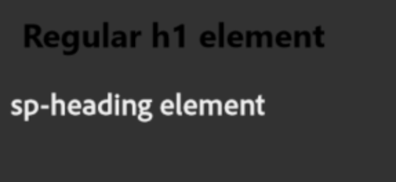
The regular h1 element is black by default and doesn’t change color automatically when the theme is changed, unlike the sp-heading element which automatically becomes dark on lighter themes and light on darker themes. While this is a neat feature, it is still possible that you will sometimes need custom-styled regular HTML elements and won’t be able to use Spectrum UXP widgets for everything.
If that happens, you can use specific media queries in your CSS to adjust the styling of elements for different themes. For example, if I want to make the h1 text from above white on the dark themes, I can easily do it like this:
Placing Data on the Document
Now, let's delve into the most intriguing aspect - placing the fetched product data onto the document!
The method I'll demonstrate involves populating existing elements on the document that are pre-filled with styled "placeholders”. These placeholders serve to specify where each respective piece of data will be inserted into the selected text frame. This approach ensures consistent styling for the newly placed content and provides both us and the plugin users with the ability to effortlessly fill in different data multiple times on the same element.
By implementing this approach, users will gain the ability to select individual elements, multiple elements, or an entire group of elements containing placeholders on the document. Once selected, clicking a “Fill in” button next to the desired product data will seamlessly populate the chosen elements with the corresponding information.
This feature proves incredibly useful for clients in need of a tool for catalog or brochure creation, especially when dealing with dynamic, constantly changing data from a web source. It eliminates the need for manual data entry, ultimately saving the designer a significant amount of time and mitigating the risk of input errors, typos, and similar mistakes.
For a start, I created five text frame elements that represent a single product on my .indd document. I filled each of the text frames with a placeholder and styled the text in different ways (note: I am not a designer so the purpose of these stylings is not to make the elements visually nice looking, but just to show you that the way we will be replacing the content inside the text frames will keep the styling as it is, eliminating the need to re-style the text every time the content is replaced).
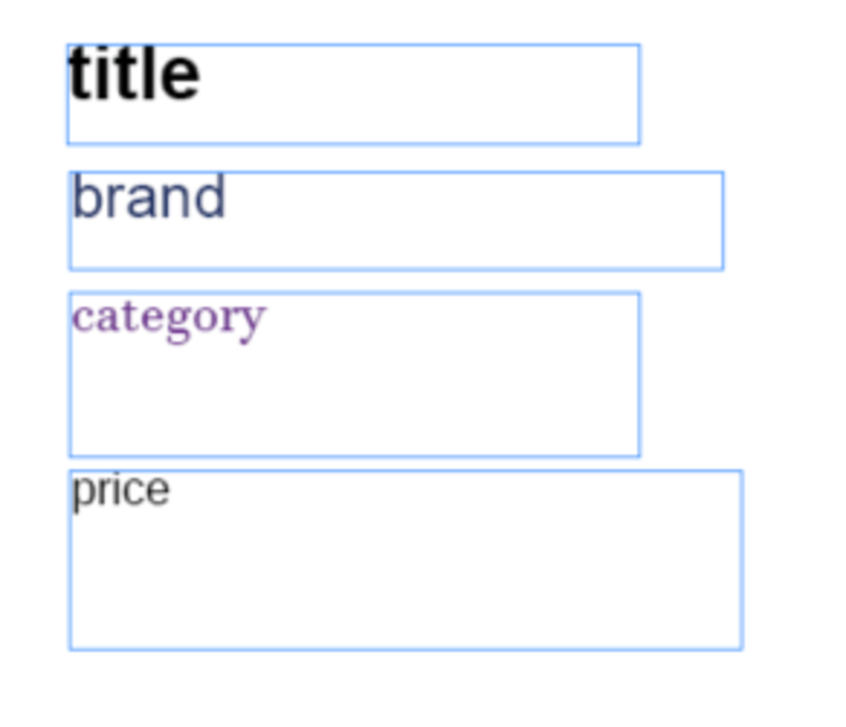
We will now take a look at the Product.jsx component with the newly added logic for data fill-in.
The first thing you need to do in your code is to get access to the InDesign Application object and you can do that by adding this inside the component: const { app } = require("indesign"); (we also immediately do that for the FitOptions too, which will be used in a later part of the code).
If you console log the “app” right now, you will be able to see a lot of properties and methods here, for more info on what each of these things is, I recommend you take a look at this link from the official InDesign API reference page for the Application object (the official InDesign API reference pages are a great source of information, but they do require a bit of familiarity with InDesign itself, otherwise it can be a bit hard to navigate and find the exact information you need).
After this, I define a simple array of allowed placeholder strings with const allowedPlaceholders = ["title", "brand", "category", "price"]; so that we can easily check if the content of a text frame is a placeholder or if it’s just some static regular text.
At the bottom of the rendered content, I added a simple sp-button in the “primary” variant which calls the fillInData function on click (<sp-button variant="primary" onClick={fillInData}>Fill in</sp-button>).
Inside the fillInData, we need to access the currently selected elements - and because we now have the app object available we can access the currently active document with app.activeDocument and the currently selected elements on the active document with app.activeDocument.selection. If you try and console.log the selection variable here when you have elements selected, you will see that it is an array of selected element objects. This is the output if I select a few text frames, a rectangle and a group of text frames.

So, if selection is not null and the length of the array is greater than 0, we use .forEach() on the array and pass each element to the replacePlaceholder function.
Let’s now take a better look at the replacePlaceholder function - this is where the “magic” happens! This function receives the item as a param (the element object) and the first thing we do is check if the element is a text frame - that can be done easily by checking if item.constructor.name == "TextFrame".
After that, we need to get the text content of the item and we have the .contents property for that (const itemContents = item.contents;). We also define the placeholder variable which is null initially.
Next, we check if the allowedPlaceholders array includes the itemContents string to determine whether the text inside the text frame is a placeholder. If it is, we set the placeholder variable to be the itemContents string and we also insert a label on the item with the same string value - item.insertLabel("placeholder", itemContents); In Adobe InDesign, a "label" for a text frame is a user-defined identifier or tag that you can assign to a text frame to help organize and manage your document. This label doesn't affect the appearance of the text frame or its content; instead, it serves as a metadata attribute for organizational purposes.
Precisely because it does not affect the appearance or the content, we use it to preserve the placeholder text value on the frame even after the placeholder text is replaced with new content - if we didn’t do that, the fill in would work only once initially, and that is something we definitely do not want.
You can set both the “name” and the value of the label - in this case I am setting the name as “placeholder”. If the item content is not a placeholder (e.g. when we replace the placeholder “category” string with the “laptops” string), we check if the item has a “placeholder” label and that the label is included in our allowedPlaceholders array, extract that label value and set that as the placeholder variable value with placeholder = item.extractLabel("placeholder"); If neither of these two conditions are true, we do not replace the content with anything and leave the text frame as it already is.
Once we know what the placeholder is and what data we need, we can access it from the productData object (passed to this component as props) and declare a new contentToPlace variable with const contentToPlace = productData[placeholder].toString(); (remember that we decided that the placeholders will be the same as the object keys in the fetched data - if this is not an ideal solution for you due to keys having long or unintuitive names, you can create a simple object with placeholder-key aliases).
Now, after we check if the contentToPlace is not null, we first need to remove the current content from the text frame. A simple item.contents = "" isn’t the ideal option because the text could be overflowing in the text frame, as it would remove only the currently visible text - that’s why we use a while loop here and remove the text frame contents as long as the item.contents.length is greater than zero.
That way we can ensure that there is no hidden overflowing text and that the text frame is truly empty. Next, we set the new text content with item.contents = contentToPlace; After that, we need to check if the newly inserted text is overflowing - we can do that with item.overflows, and if that is true we use the .fit() method to which we pass FitOptions.frameToContent to fit the size of the frame to the amount of content inside. We have access to the FitOptions object, which has been imported from the “indesign” module along with the app object (explore more information on FitOptions).
Lastly, we call the .recompose() method on the item, to ensure that the text frame is updated correctly.
In the last part of the function, outside of the first if block where we check if the element is a text frame, we check if the element is a group also by checking the constructor.name. Then we can access all of the elements in that group with .allPageItems as an array, loop through them with .forEach() and use recursion to pass each child element of the group to the replacePlaceholder function. This way we make sure that the fill in will work for any number of single text frame elements or groups of text frames selected and “ignore” all elements that are not text frames.
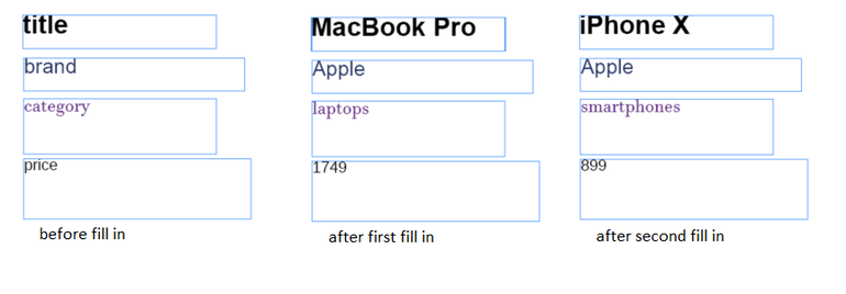
If you try it out now, you will see that clicking the button successfully replaces the placeholder text with real data while keeping the same styling of the text! Also, it will work in the same way no matter if you select a single element, multiple elements, a group of elements, or a group and single elements not part of a group. And, because we check if the content of the text frame is a placeholder before we check the label saved, you can easily just put a new placeholder inside a text frame even after you fill in the data and it will overwrite the previously saved label with the new placeholder.
Placing Images on the Document
For the last part of this blog, I will show you how you can store images from the web on a user’s PC and place them on the InDesign documents.
What we will to do to accomplish this is: get the product image binary data, get the current document path, create a folder for the images in the same place where the document is located (if it doesn’t already exist), create an image file in that folder and place that image in a rectangle element on the document.
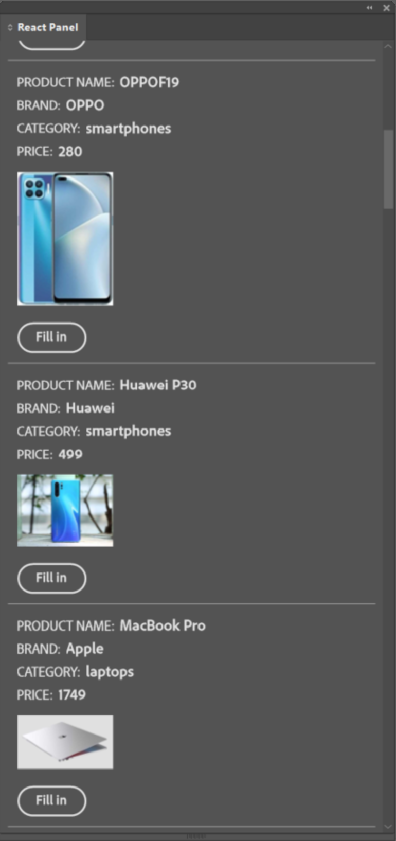
If you didn’t notice before, in the response from the dummyjson we receive, we also get an images array - we will display the first image from the array before the button by adding this part of the code: <img className="product-img" src={productData.images[0]} />
After that, we will have to make some additional changes to our manifest.json to allow the network permission to the image urls (https://cdn.dummyjson.com) and allow the access to the localFileSystem so our requiredPermissions will look like this:
"requiredPermissions": {
"network": {
"domains": ["https://dummyjson.com", "https://cdn.dummyjson.com"]
},
"localFileSystem": "fullAccess"
}
For accessing the file system of the user, you have two options: LocalFileSystem API and FS module. These modules are very similar in terms of the capabilities they offer, however, there is a difference in the way they carry out the task.
LocalFileSystem APIs work with an object reference called Entry. Having an object reference makes it easier to manage and perform multiple operations. Whereas the FS APIs are very similar to NodeJS path-based file system APIs which make them ideal for carrying out single operations. The link on the official Adobe pages can give you a better understanding of file operations.
In this plugin, I will be using the LocalFileSystem API so I also need to import it at the top of my Product component like this: const { localFileSystem, types, formats } = require("uxp").storage; (types and formats will be used when creating folders and new files).
Now that we have adjusted our manifest.json and imported what we need to proceed, let’s start by adding another if-check at the bottom of our replacePlaceholder function.
We will, again, check the item constructor name to determine if the element is a Rectangle and if it is, we will call a new async placeImage function and pass the item as a param to it and call it rectEl.
if (item.constructor.name == "Rectangle") {
placeImage(item);
}
Inside the placeImage function, first we will define all of the needed variables. We will need the activeDocument again, src - image url, imgName - the name of the product with ‘-img’ added at the end. Next we need to define imageBinaryData, documentPath and the folderEntry (initially set to null). I have separated the logic for imageBinaryData and documentPath into separate async functions so let’s first take a look at the getImageBinaryData function.
We pass the src (the url to the image on the web) to getImageBinaryData function as a param. Then, we use axios to make a GET request to that url, but we specify the responseType as arraybuffer (used to represent a generic raw binary data buffer). We need the binary data because we will be storing this image on the user’s PC. If the request is successful we return the response.data and if it isn’t, we console.err the error message and error and return null.
The getFilePath function receives the activeDocument as a param. We are able to access the file path as a Promise with the .filePath property. We use await to get the filePath fulfillment value and store it inside a resolvedFilePath variable. We can now access the .nativePath property on the resolved Promise value and return that value (or return null if the Promise was rejected). We need the location of the document so that we can create the new images folder at that same location so that everything is easily accessible, but any other location on the PC can also be used.
Now, let’s take a look at the second part of the placeImage function. Before doing anything else in the function, we check if imageBinaryData and documentPath are not null. Next, we will be using the .getEntryWithUrl() and .createEntryWithUrl() methods on the localFileSystem (what these methods do is pretty self-explanatory) - both of these methods return a Promise so we are going to wrap them in try-catch statements and use await to get the entry fulfillment value and assign it to the folderEntry variable.
As we don’t know if the folder with images already exists or not, we will use the .getEntryWithUrl() first in the try block of a try-catch statement. We pass the url string (documentPath + the name of the folder which can be whatever you decide - I am using the document name + ‘images’ here) to the method as a parameter.
If the folder doesn’t exist, this throws an exception, and then in the catch block we use .createEntryWithUrl() in another nested try-catch statement. As params, we pass the same URL string and, in a settings object, the type of the entry (as entries can be either files or folders, we need to specify that the entry should be a folder - remember that we imported types and formats along with the localFileSystem at the beginning).
If this is successful - a new folder is created in the location we specified and assigned to our folderEntry variable! The next time this function is called the .getEntryWithUrl() method will work, the existing folder will be assigned to the folderEntry variable (unless you manually delete or rename the folder) and code in the catch block won’t be executed.
The next thing we need to do is create the image file. Inside the if block where we check if the folderEntry variable truly is a folder with .isFolder, we have a new try-catch statement. We use the .createFile() method on the folderEntry and we pass the file name and the settings object where we specify overwrite as true (so if the product image changes after we already placed the image on the document we do not create a new file, but simply overwrite the contents of the already existing file) and save the returned value in the newFile variable. We proceed with using the .write() method on the newFile and pass the previously defined imageBinaryData and in the settings object we specify the format as formats.binary.
Lastly, we use the .place() method on the rectEl and pass the newFile to it - rectEl.place(newFile); And finally, to ensure that the image is proportionally placed in the rectangle element we use rectEl.fit(FitOptions.proportionally);
You can see the full code for Product.jsx with the image place logic here:
Let us now take a look at our finished plugin and try out the finalized fill-in logic.

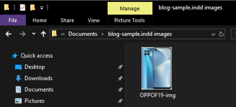
(Newly created folder with the newly created image on my PC after the fill-in)
Final Words
Given that UXP for InDesign is a relatively new technology, there is a limited availability of tutorials and resources online, aside from the official Adobe documentation. I trust that this guide has been valuable in enhancing your comprehension of creating custom plugins for Adobe InDesign - fundamental UXP concepts, communication between the plugin and the Web, crafting an effective plugin UI, and interacting with and manipulating InDesign documents.
Remember, this plugin only "scratches the surface" of what's possible with custom plugins. Your journey into plugin development holds endless opportunities for innovation and creativity. Embrace the learning process, explore advanced features, and unlock the full potential of custom plugins to take your InDesign projects to new heights. The possibilities are as vast as your imagination!


