How to Create and Utilize Pimcore Custom Reports
What are Pimcore Custom Reports?
Pimcore custom report is an engine directly integrated into Pimcore, allowing users to create tabular reports, chart reports, or both. It also offers filtering and export functionality.
Your reports can be exported as CSV files with or without headers, depending on your needs. As for the chart reports, Pimcore report can generate three types of charts:
-
Pie chart
-
Bar chart
-
Line chart
How to Create Pimcore Custom Reports?
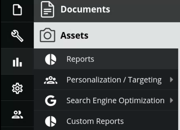
Generating a report is fairly easy, as it is made through Pimcore administration. In the marketing section, there are Custom reports and Reports. While Reports are used to see the results, Custom Reports are where you will make your reports.
As you add more reports, each will also appear in the marketing section of Pimcore administration. Having a lot of reports could easily lead to the marketing section ending up cluttered, but Pimcore offers a very nice solution to that - Group. More about that a bit later.
Once you click on a Custom Report, there is a button +Add that will prompt you to name the report once you click it. The name itself has to be alphanumeric, at least three characters long, and unique.

Popup window that appear after you select +Add
If you are worried about the report’s name looking ugly, don’t be! While that name is what your YAML file will be called and saved in var/config/custom-reports, you also have an option of choosing a Nice name which will be displayed in your administration - both in the marketing section and in Reports.
Both the Group and Nice name options will appear upon creating the report, under the General section of the report, among options for Icon class, Report class, Group Icon class and a checkbox with the option to include that report in the menu (as a part of marketing section).
In case you want to keep the section clean, you can simply keep all your reports unchecked. But, if you have a lot of reports that you all want to be included, and they happen to share characteristics, you can use the Group option — which will sort them under the shared group name.
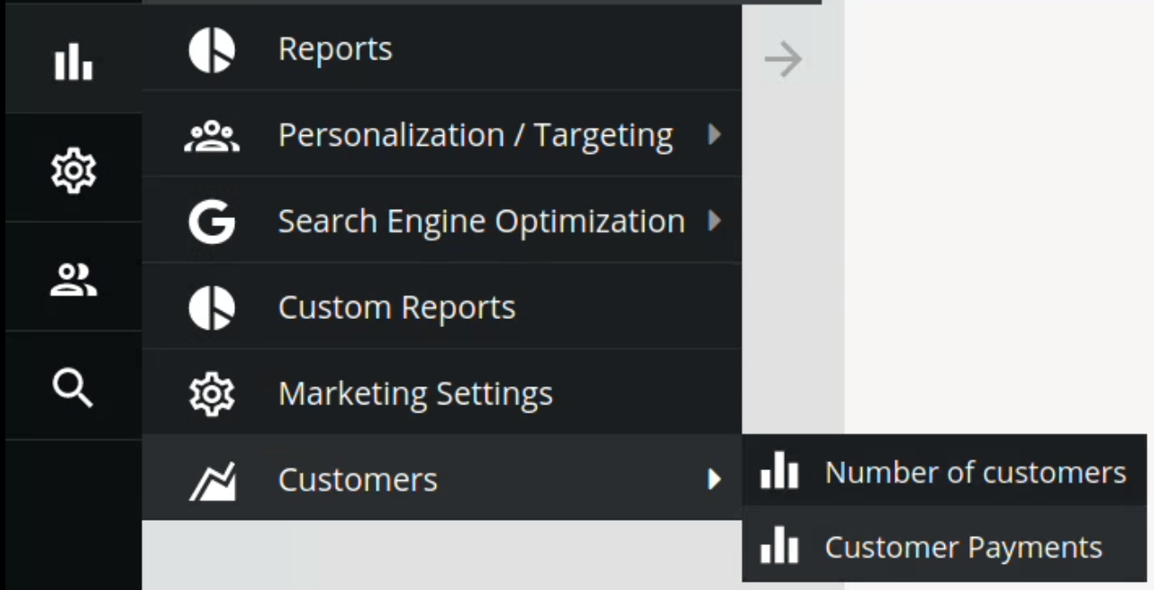
Customers (Group) under which are both of these reports (with Nice names)
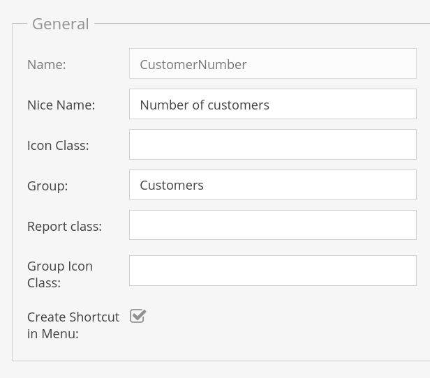
General section of the report
And this is where the fun part follows - you need to give your report Source definition. Pimcore offers two options here: Analytics and SQL.
While Analytics is directly connected to Google Analytics and is used to retrieve data from Google Analytics, SQL is where you can directly query your database, and Pimcore made sure to make it easy for you to do it.
Creating a report with SQL query
There are 4 text areas you will fill, depending on what you need in your report:
-
SELECT
-
FROM,
-
WHERE
-
GROUP BY
All their names are pretty self-explanatory, and you need to put your conditions in each according to your needs. While the query definitely won’t work without the FROM part of it the others are essentially optional, despite the fact that you will probably at least want to define what you want to SELECT.
As you add parts to your query, it appears below textareas in full. If you make a mistake while writing the query, Pimcore will make sure to point to your error in red font, the same one you would get if you tried to run it in your favorite database GUI.

Error example
Once your query is written, you will have to configure columns. What you chose in your SELECT field will be shown there, but you can choose whether you want to display, export or order the columns. If you uncheck the display button, your column will not appear below your generated report, and if you uncheck the export, it won’t appear in your CSV file.
You can also choose Filter Type and Filter drilldown, Display type, width, label and action.
Giving your column a label will change its name in the table report and if the labeled column is part of the chart’s legend, it will also be changed there.
The other interesting option is Action, which can, if figured correctly, open Asset, Document or Object.
Choosing the Perfect Chart
Once you are done with column configuration, you need to choose an appropriate chart for your report (in case you want it, of course).
If you pick a Pie chart, you have to choose Label and Data Column.
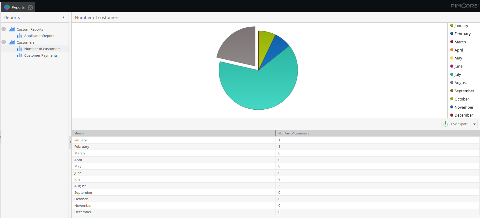
Pie Chart example
As you hover over the pie chart, it becomes somewhat interactive - you can see the exact stat shown. If you need to exclude one of the items, you can do so by clicking on it on the legend.
If you are in need of a line chart or bar chart, you will have to pick what you put on the X-axis and on at least one Y-axis (it is possible to add more rows to the Y-axis).
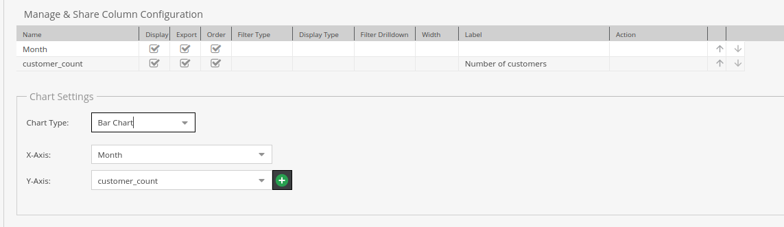
Example for column config and chart setting. Also an example of label usage.
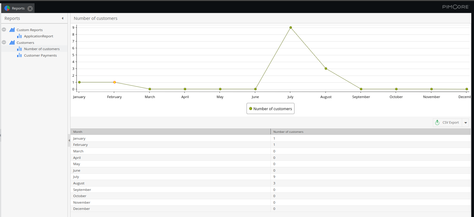
Line chart example
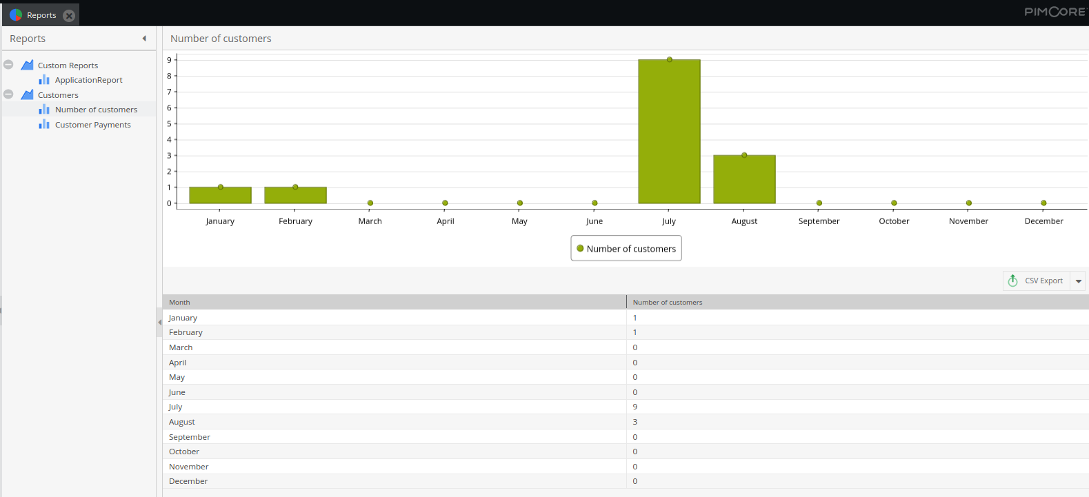
Bar chart example
Permissions and Sharing
The last part of setting the Pimcore report is configuring the settings. There is a checkbox Share globally, which will allow the reports to be seen by all users who have reports permission. Visible to users will give visibility to all listed users, just like visible to roles will do the same with everyone with the listed role.
And that’s the last part! After you are sure your report is ready, all you need to do is click save and check it out in the Reports section (or in the menu itself if you had checked the box for it to show).
This is what automatically generated YAML file looks like once you press save on your report:
As you change the report in Custom Reports and save it, the YAML file will change too.
Advanced Customization and Additional Information
If you are doing a few similar reports, while in Custom Reports, you can right-click on one of them and clone it and save your time. That is also how you delete your report.
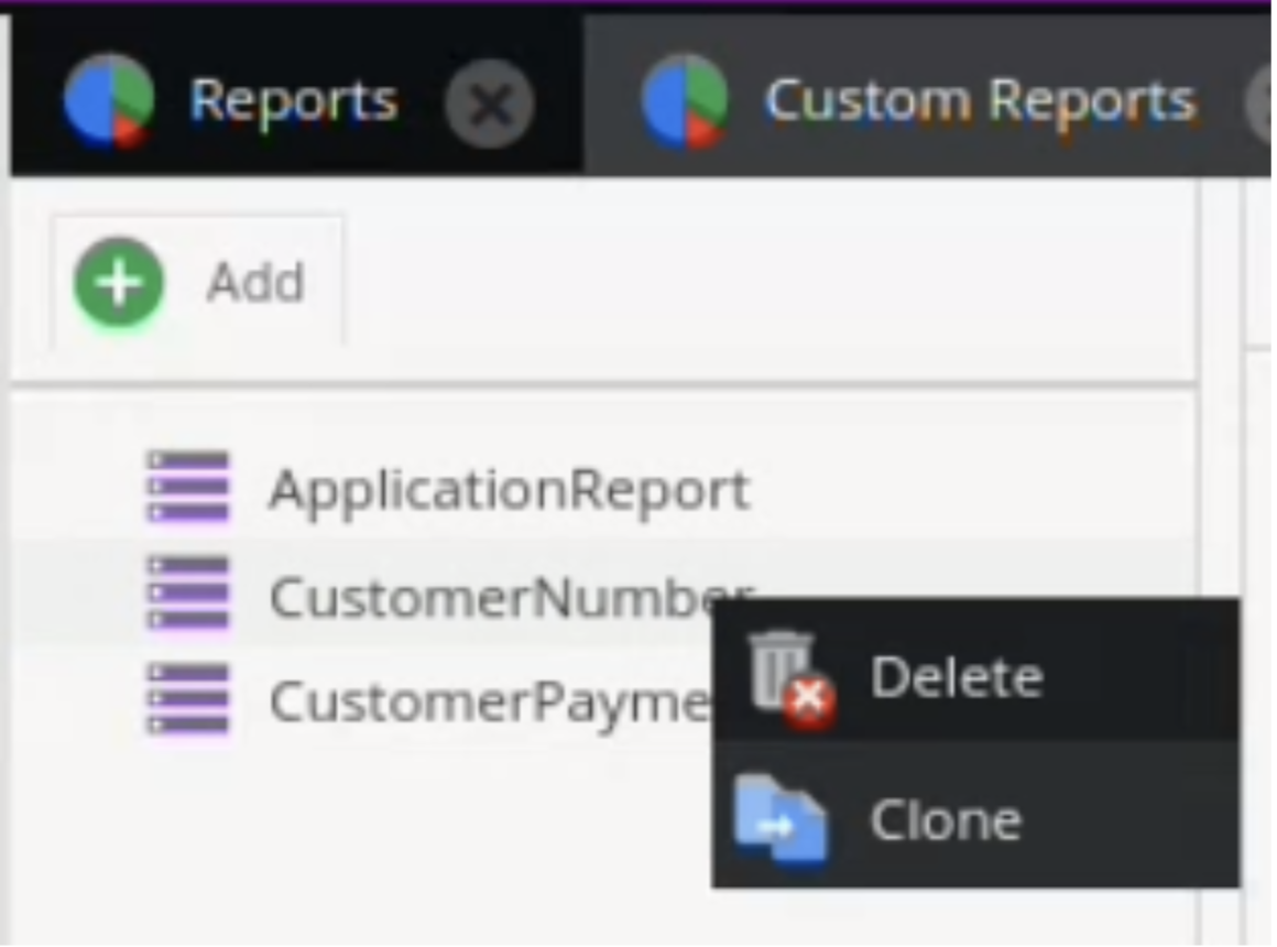
Clone (and delete) option
In case you are unsatisfied with how your reports look, you can specify a custom Javascript class that should be used when opening the report in Pimcore Backend. This class can be specified in the Report Class option and should extend the default java script class for the reports which is pimcore.report.custom.report.
It is also possible to implement custom source adapters for special use cases. Doing so is thoroughly explained in Pimcore’s documentation.
Conclusion
Pimcore custom report is a powerful tool that can be used in various data visualizations. One of its strongest suits is its highly configurable, while remaining rather simple to use.
We hope that with the help of this blog, you will successfully create and utilize Pimcore's custom reports. If you need assistance in this process, feel free to contact us.